p <- SCpubr::do_WafflePlot(sample = sample,
                           group.by = "subtype")
p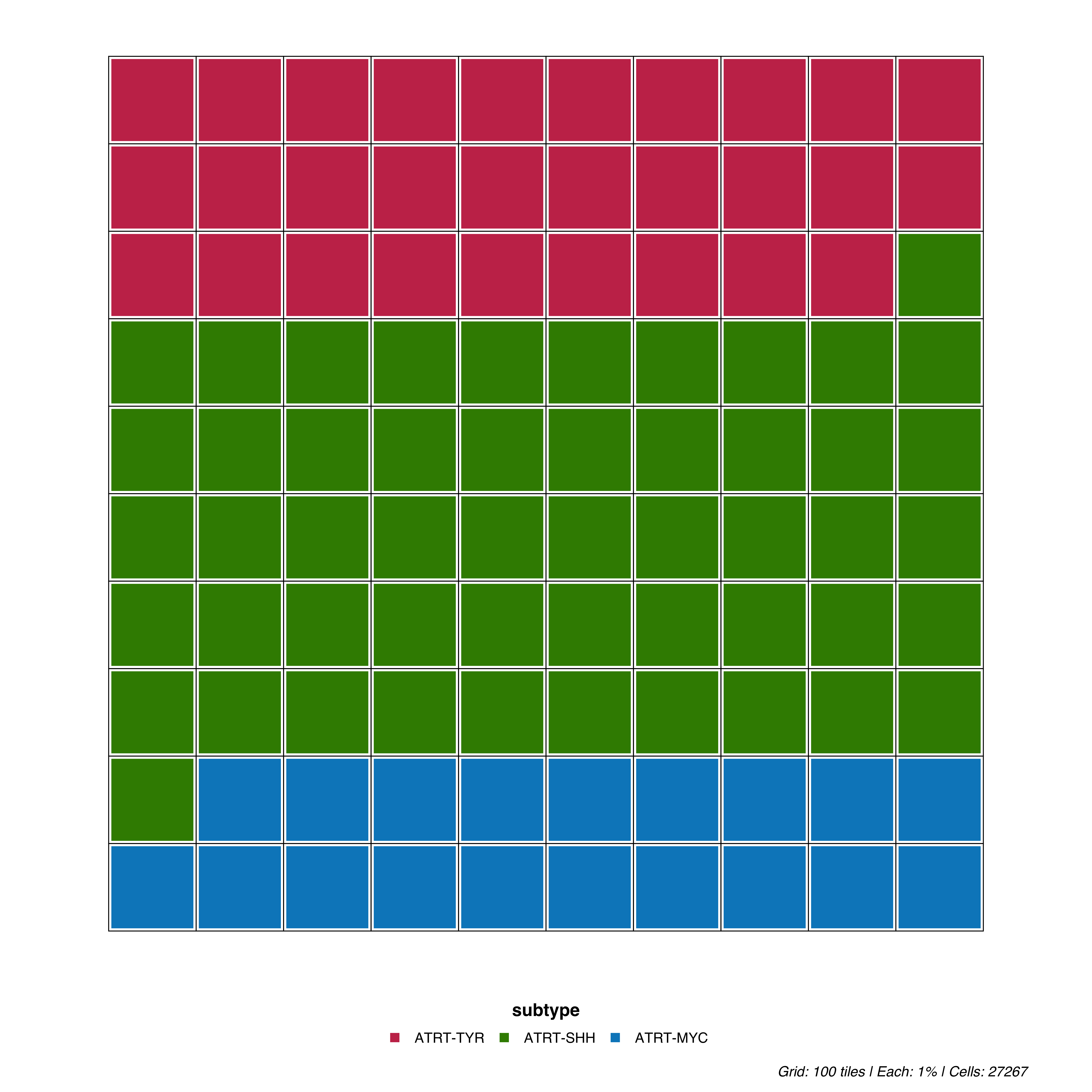
Waffle plots display proportions as a 10×10 grid where each cell represents 1% of the data. This pictogram format makes it easy to intuitively grasp relative proportions.
p <- SCpubr::do_WafflePlot(sample = sample,
group.by = "subtype")
p
Each tile in the 10×10 grid represents 1% of cells. The grid is filled proportionally by each cluster’s frequency.
Adjust the spacing between tiles:
# Thicker borders
p <- SCpubr::do_WafflePlot(sample = sample,
                           group.by = "subtype",
                           waffle.size = 4)

p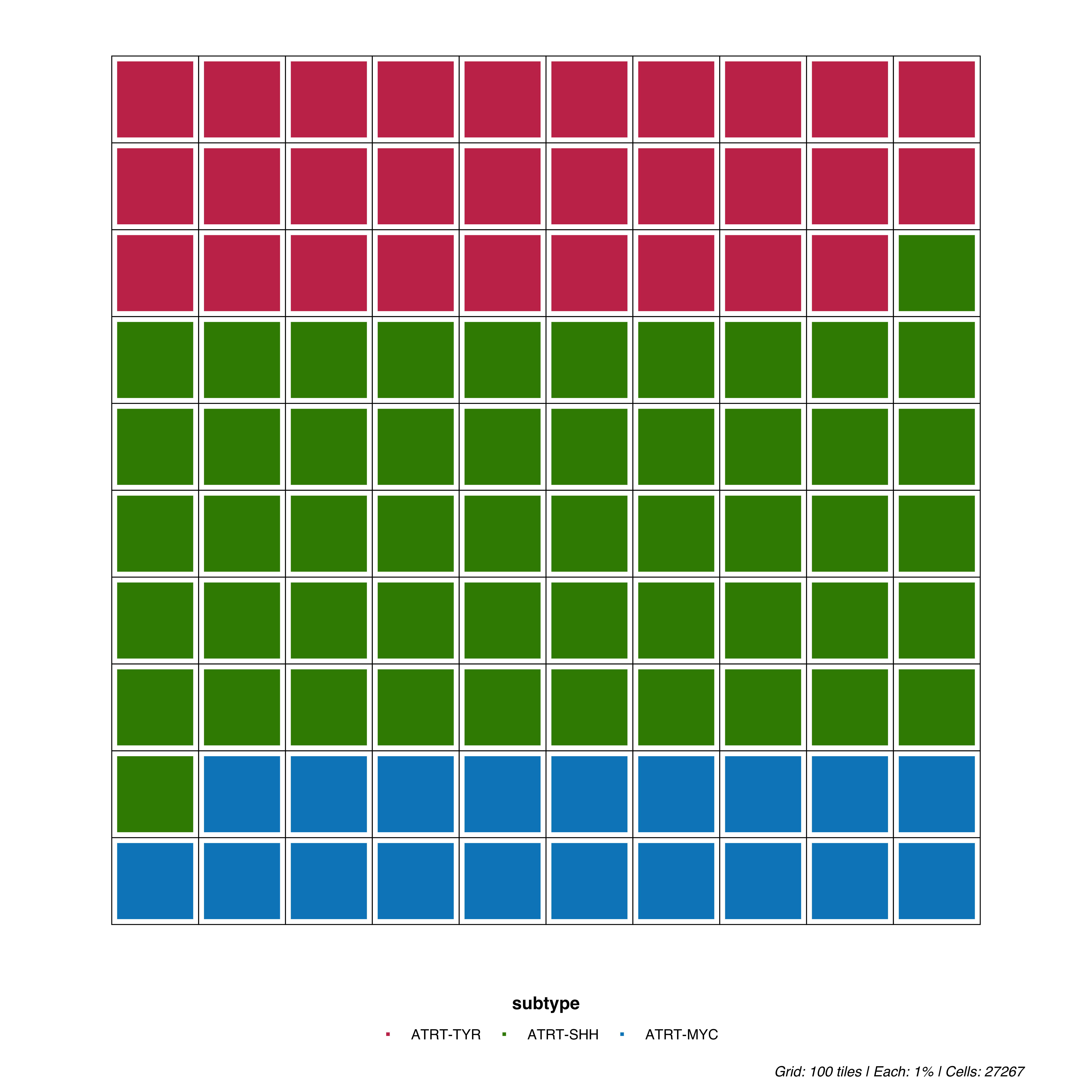
# Thinner borders
p <- SCpubr::do_WafflePlot(sample = sample,
                           group.by = "subtype",
                           waffle.size = 1)
p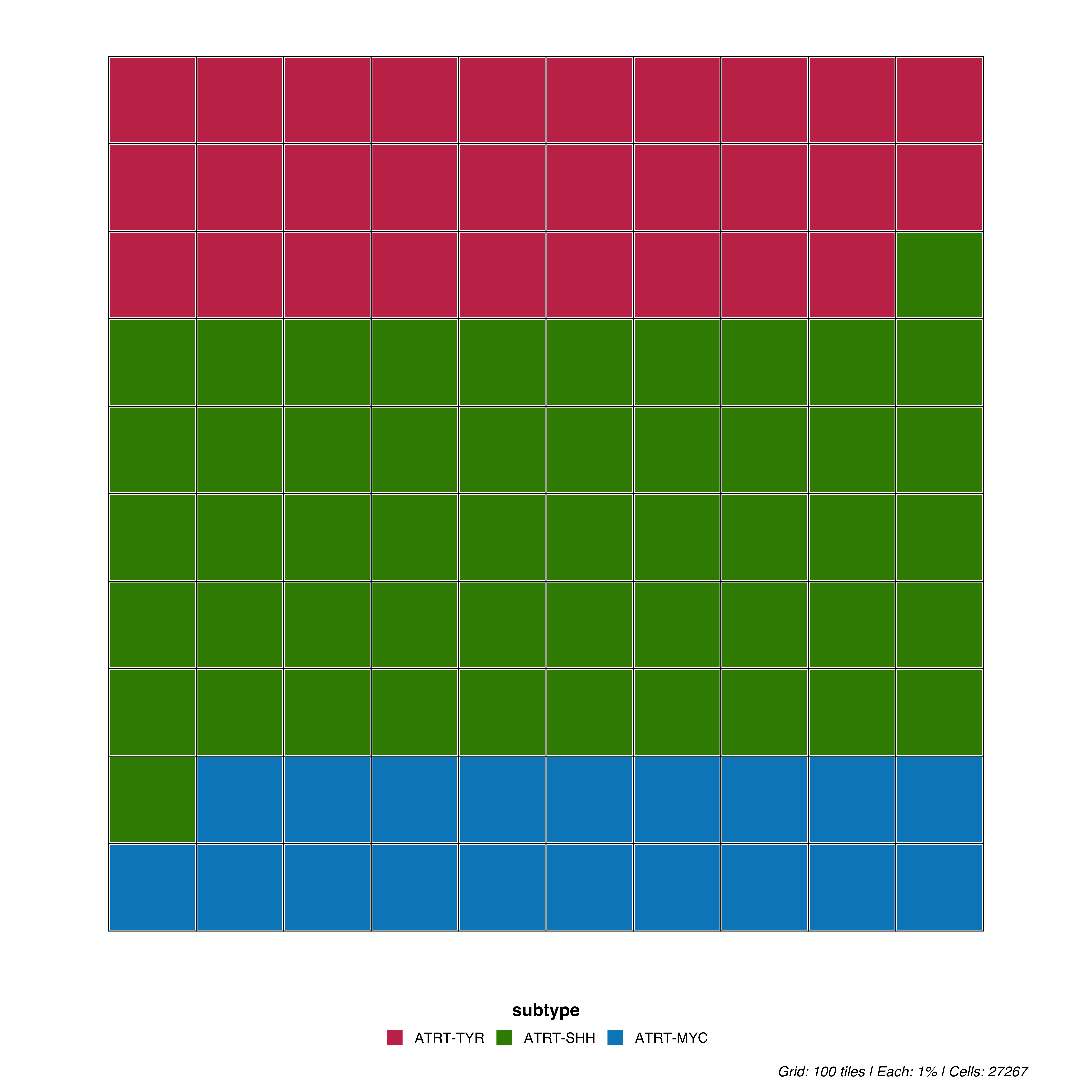
# Horizontal (default)
p <- SCpubr::do_WafflePlot(sample = sample,
                           group.by = "subtype",
                           flip = TRUE)

p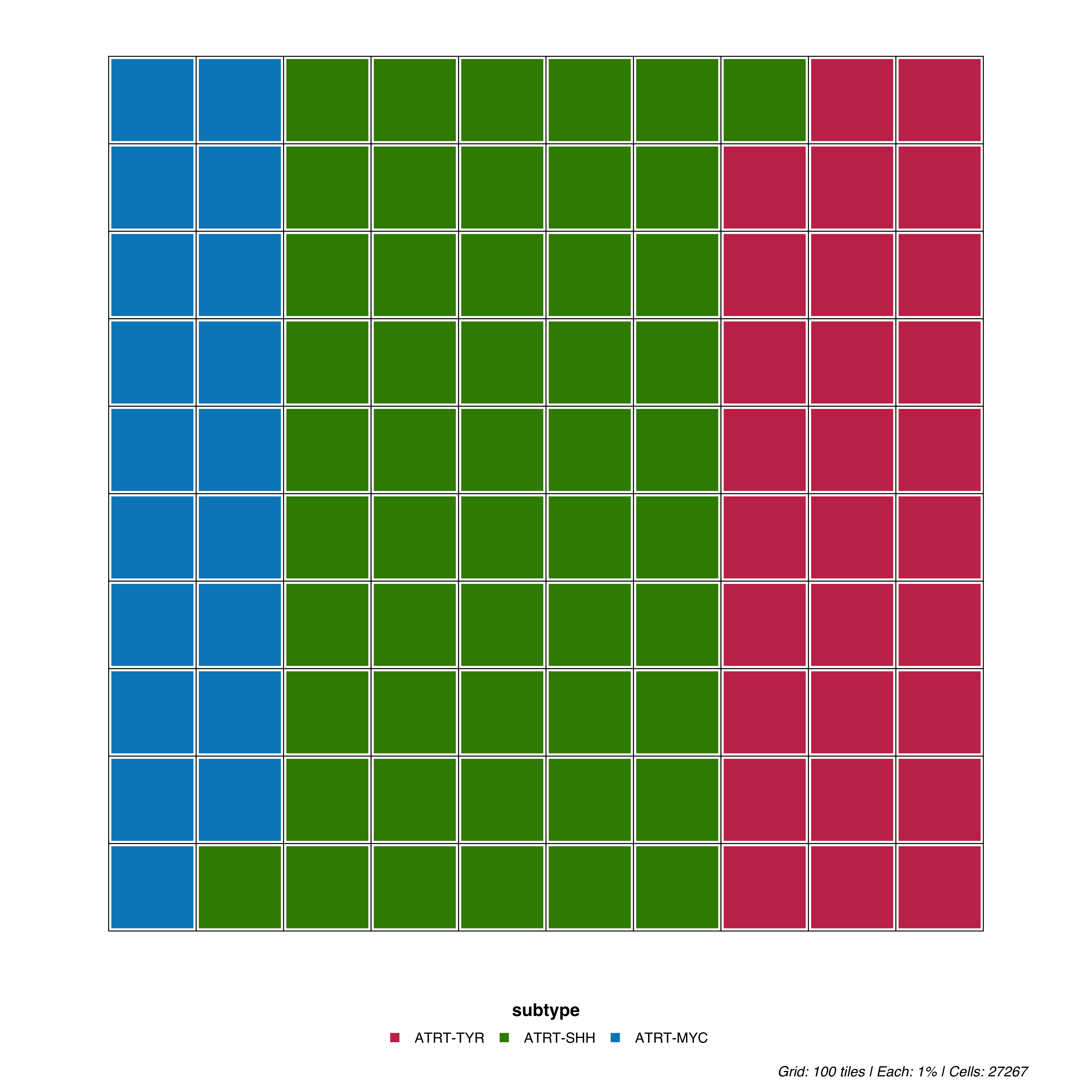
colors <- c("ATRT-TYR" = "#E63946", "ATRT-SHH" = "#457B9D", "ATRT-MYC" = "#1D3557")

p <- SCpubr::do_WafflePlot(sample = sample,
                           group.by = "subtype",
                           colors.use = colors)
p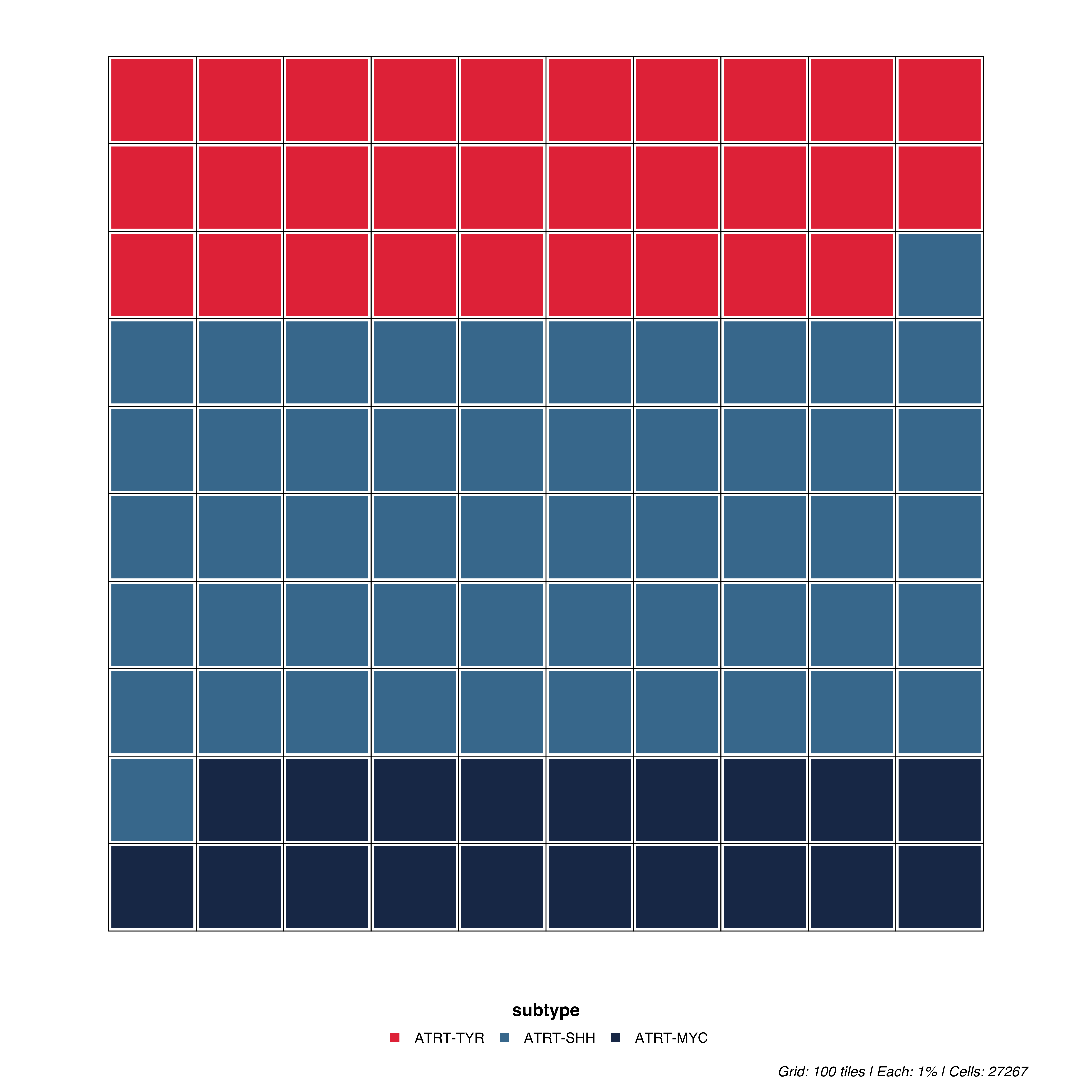
For parameters shared across many functions (color palettes, typography, legend styling), see Shared features.
| Parameter | Description | Default |
|---|---|---|
group.by |
Metadata column to visualize | — |
waffle.size |
Border size between tiles | 2 |