p <- SCpubr::do_DotPlot(sample = sample,
                        features = c("CDC25C", "KIF18B", "KIF14", "CENPE"))
p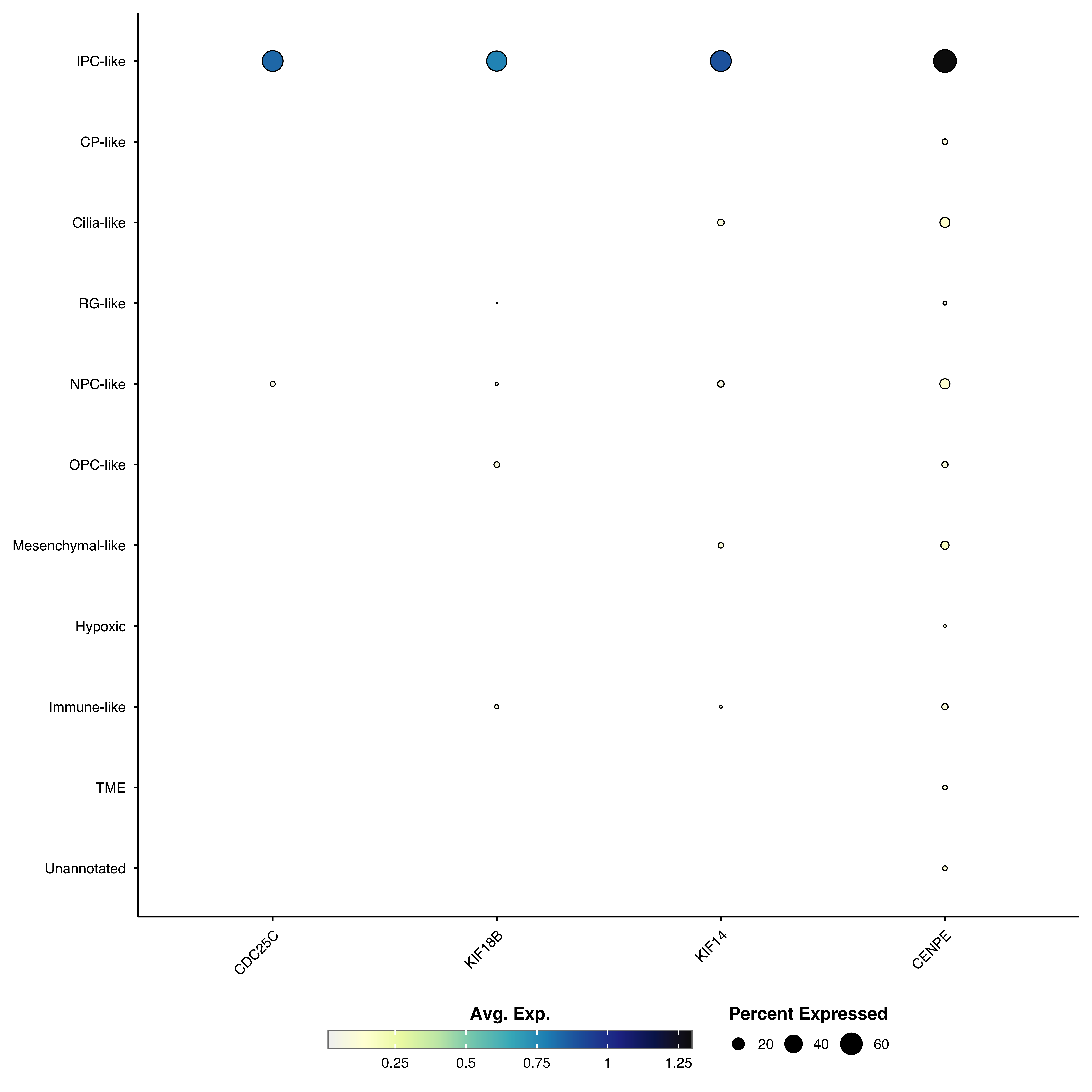
Dot plots visualize gene expression using two visual scales: color represents average expression, while dot size shows the percentage of cells expressing each gene. This dual encoding makes them ideal for comparing marker genes across clusters or conditions.
Plot marker genes across clusters:
p <- SCpubr::do_DotPlot(sample = sample,
features = c("CDC25C", "KIF18B", "KIF14", "CENPE"))
p
genes <- c("CDC25C", "KIF18B", "KIF14", "CENPE",
           "DNAAF1", "ADGB", "CFAP61", "CFAP157",
           "KCNQ5", "MEOX2", "MBP", "SNTG1",
           "S100A1", "MGP", "TNNT1", "H2AFJ")

p <- SCpubr::do_DotPlot(sample = sample,
                        features = genes)
p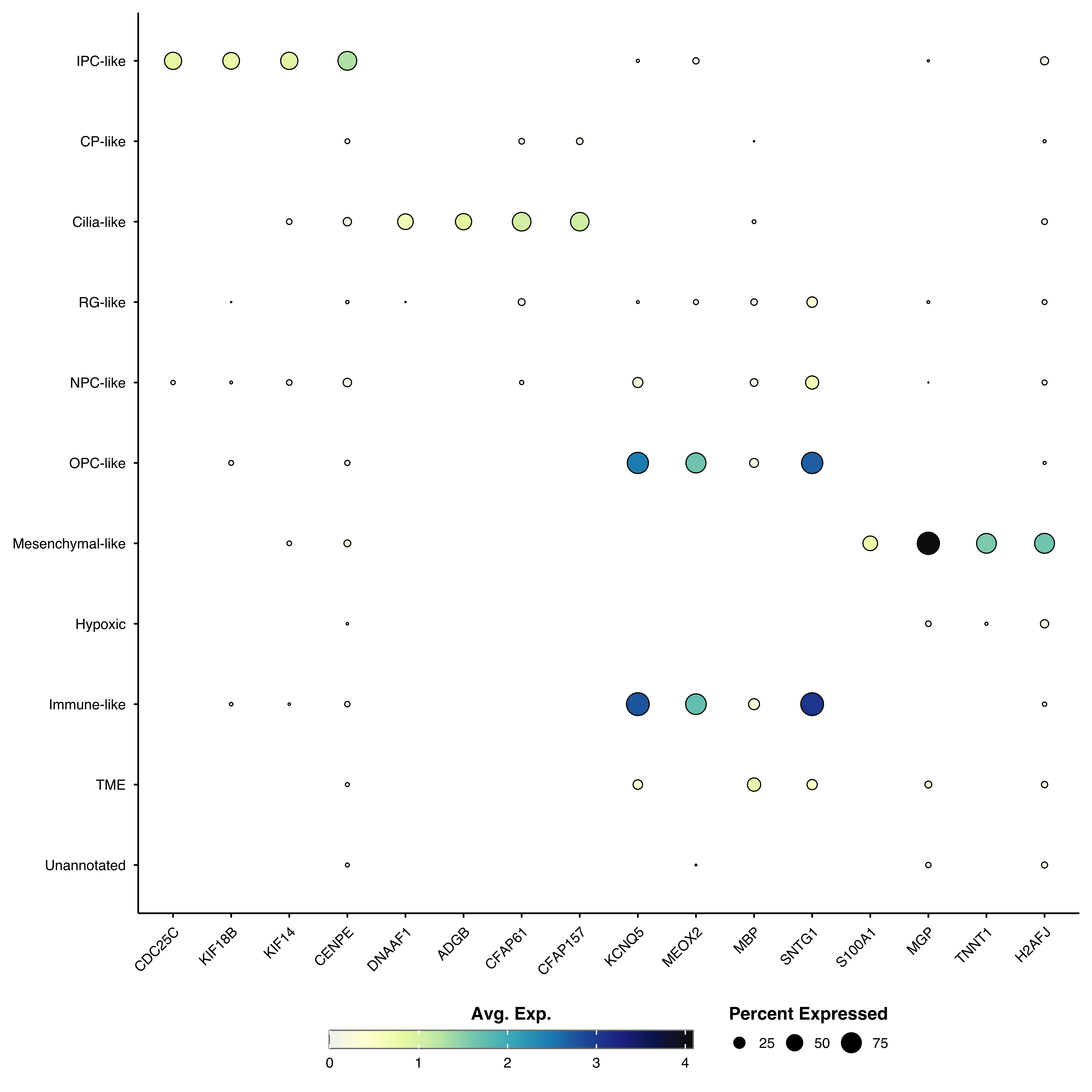
Provide a named list to organize genes into categories with faceted panels:
genes <- list(
  "IPC.like"      = c("CDC25C", "KIF18B", "KIF14", "CENPE"),
  "Cilia.like" = c("DNAAF1", "ADGB", "CFAP61", "CFAP157"),
  "OPC.like" = c("KCNQ5", "MEOX2", "MBP", "SNTG1"),
  "Mesenchymal.like" = c("S100A1", "MGP", "TNNT1", "H2AFJ")
)

p <- SCpubr::do_DotPlot(sample = sample,
                        features = genes)
p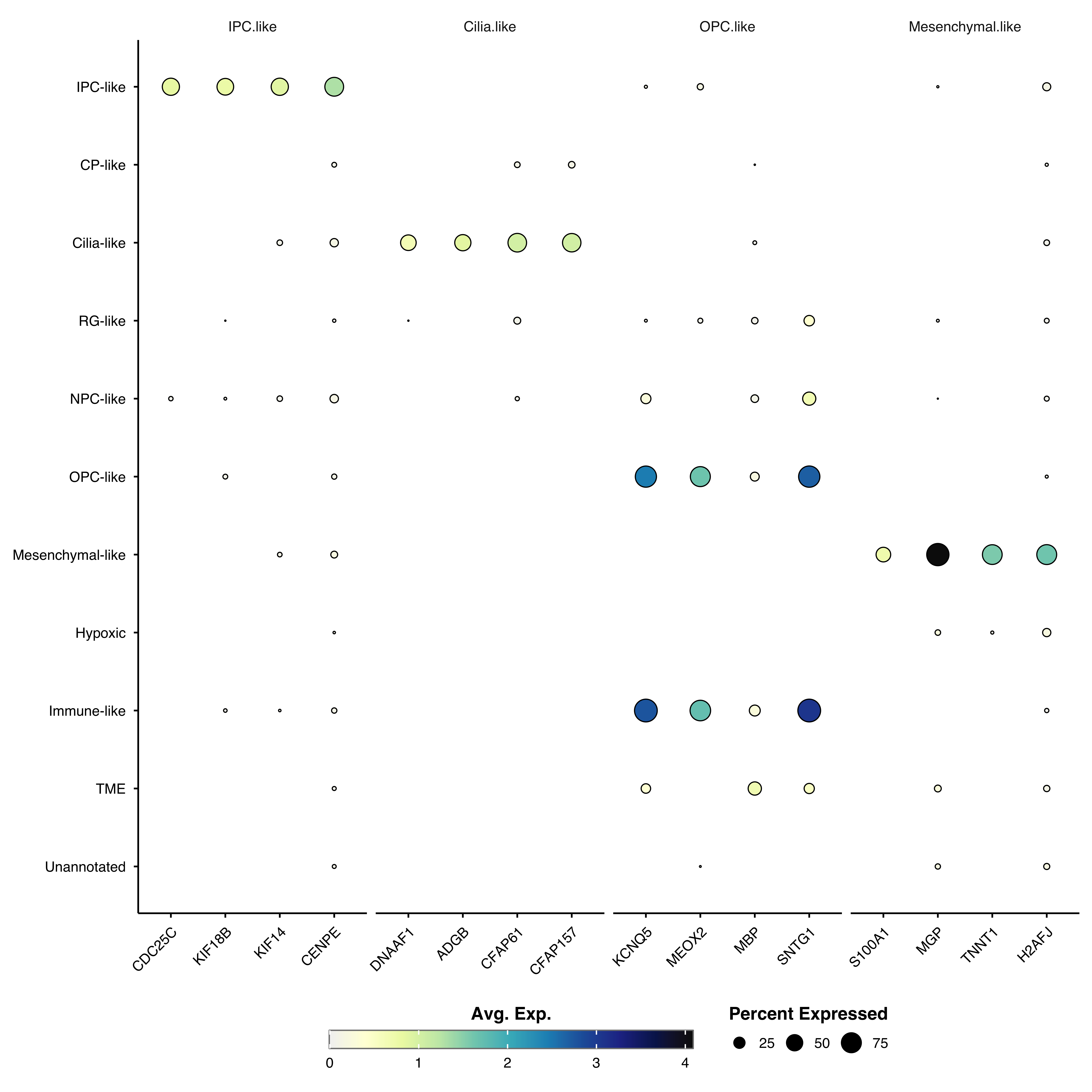
Group similar clusters together based on expression patterns:
p <- SCpubr::do_DotPlot(sample = sample,
                        features = genes,
                        cluster.identities = TRUE)
p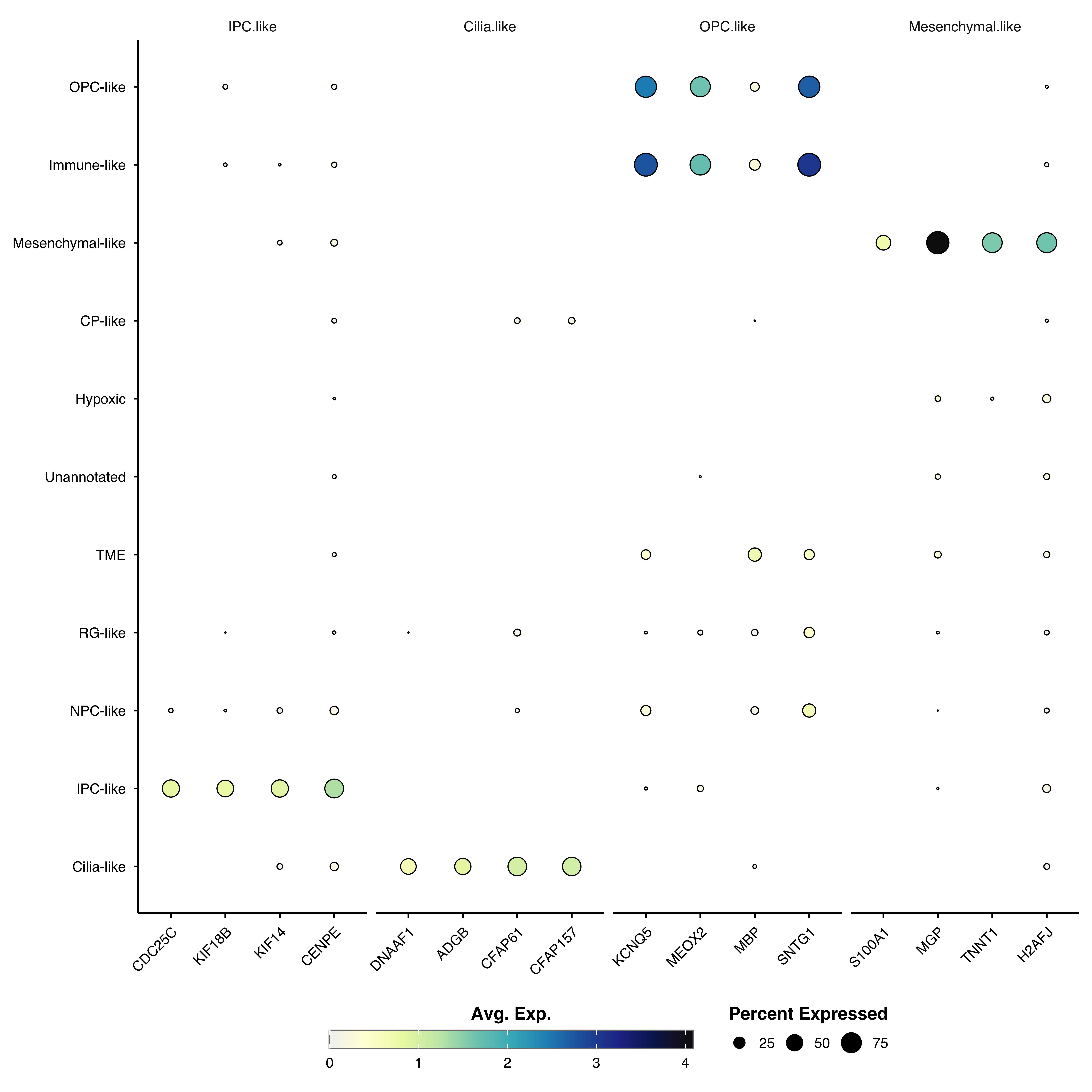
Reorder genes by expression similarity:
p <- SCpubr::do_DotPlot(sample = sample,
                        features = genes,
                        cluster.features = TRUE)
p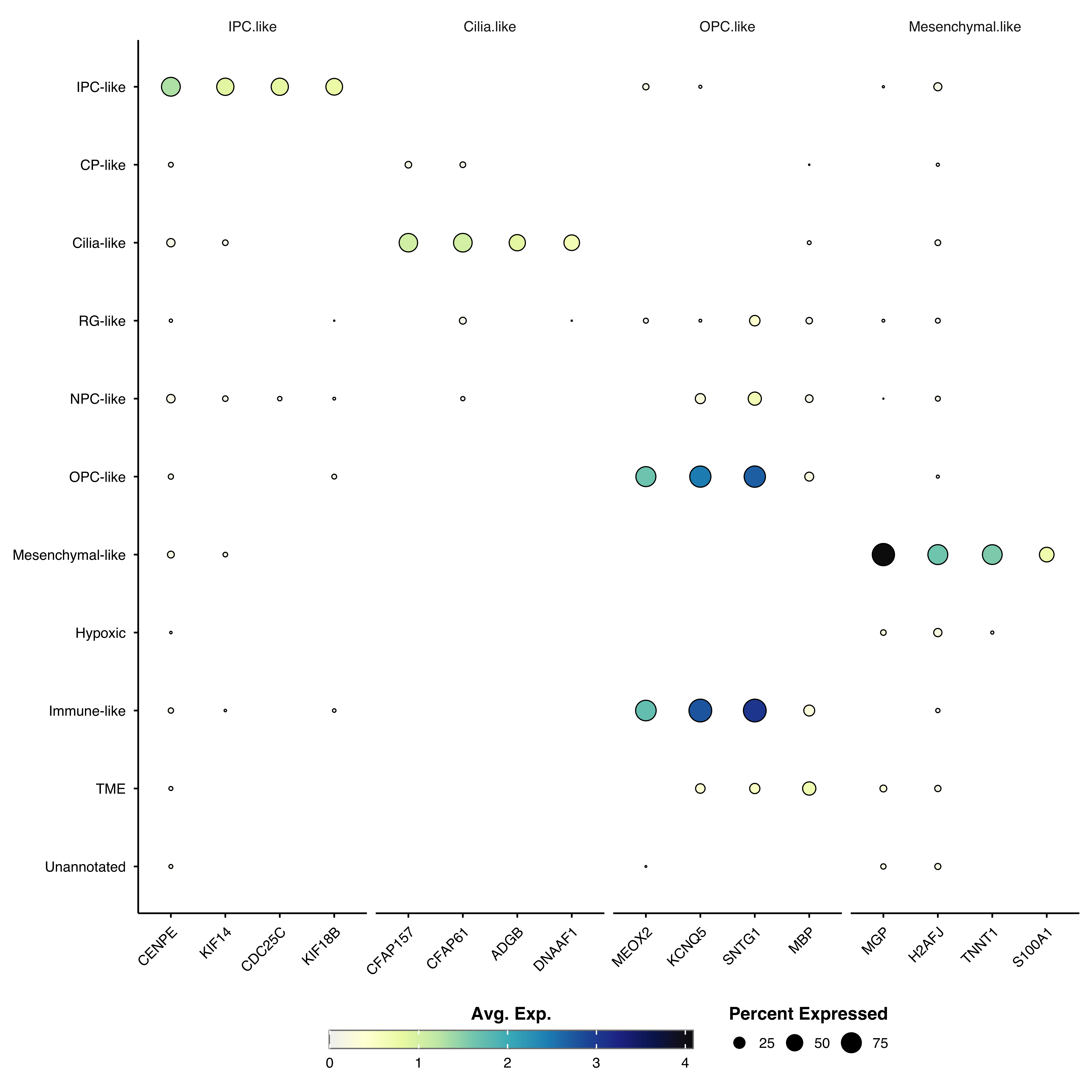
p <- SCpubr::do_DotPlot(sample = sample,
                        features = genes,
                        cluster.identities = TRUE,
                        cluster.features = TRUE)
p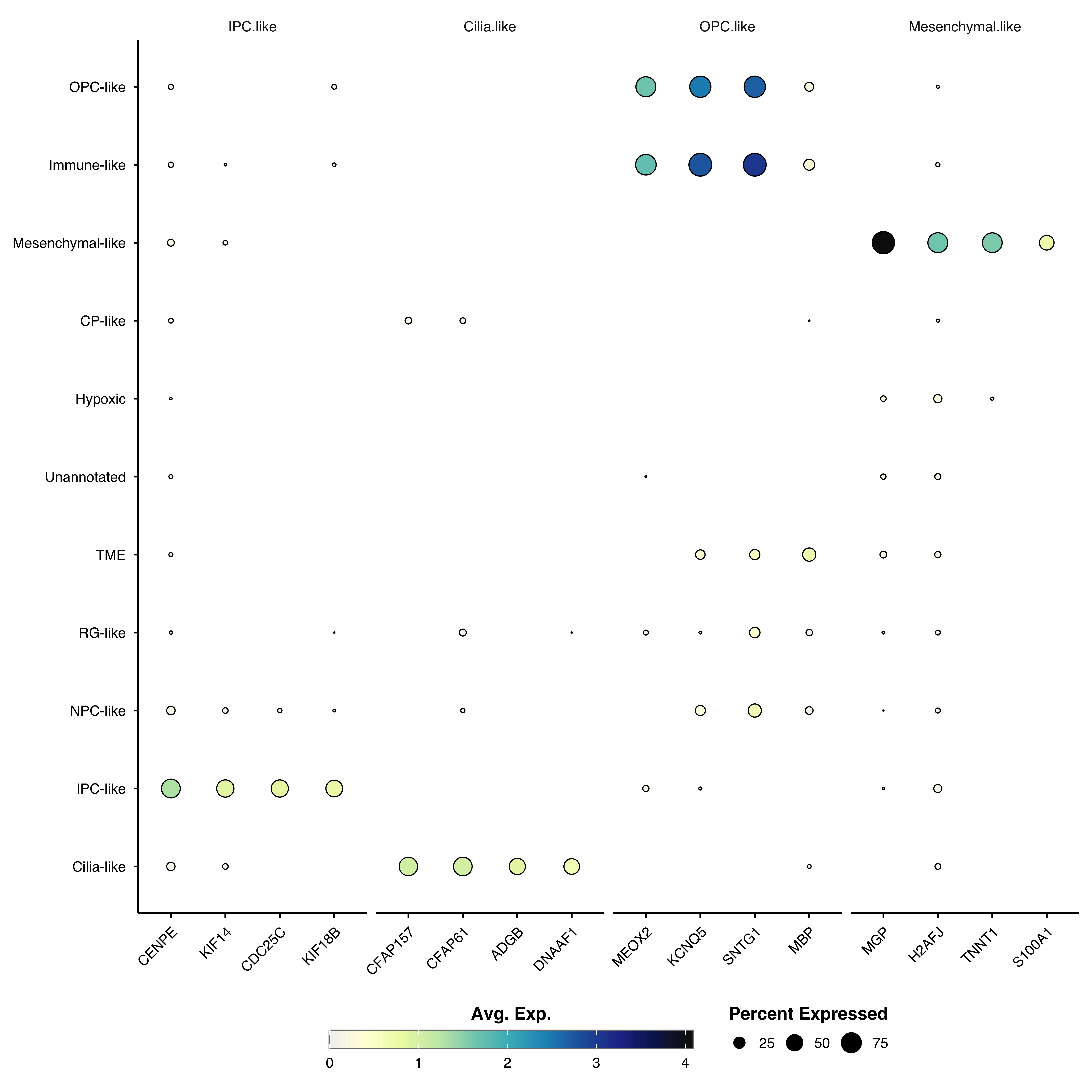
Show relative expression across groups instead of absolute values. This highlights which group has the highest expression for each gene, but prevents cross-gene comparisons:
p <- SCpubr::do_DotPlot(sample = sample,
                        features = genes,
                        zscore.data = TRUE)
p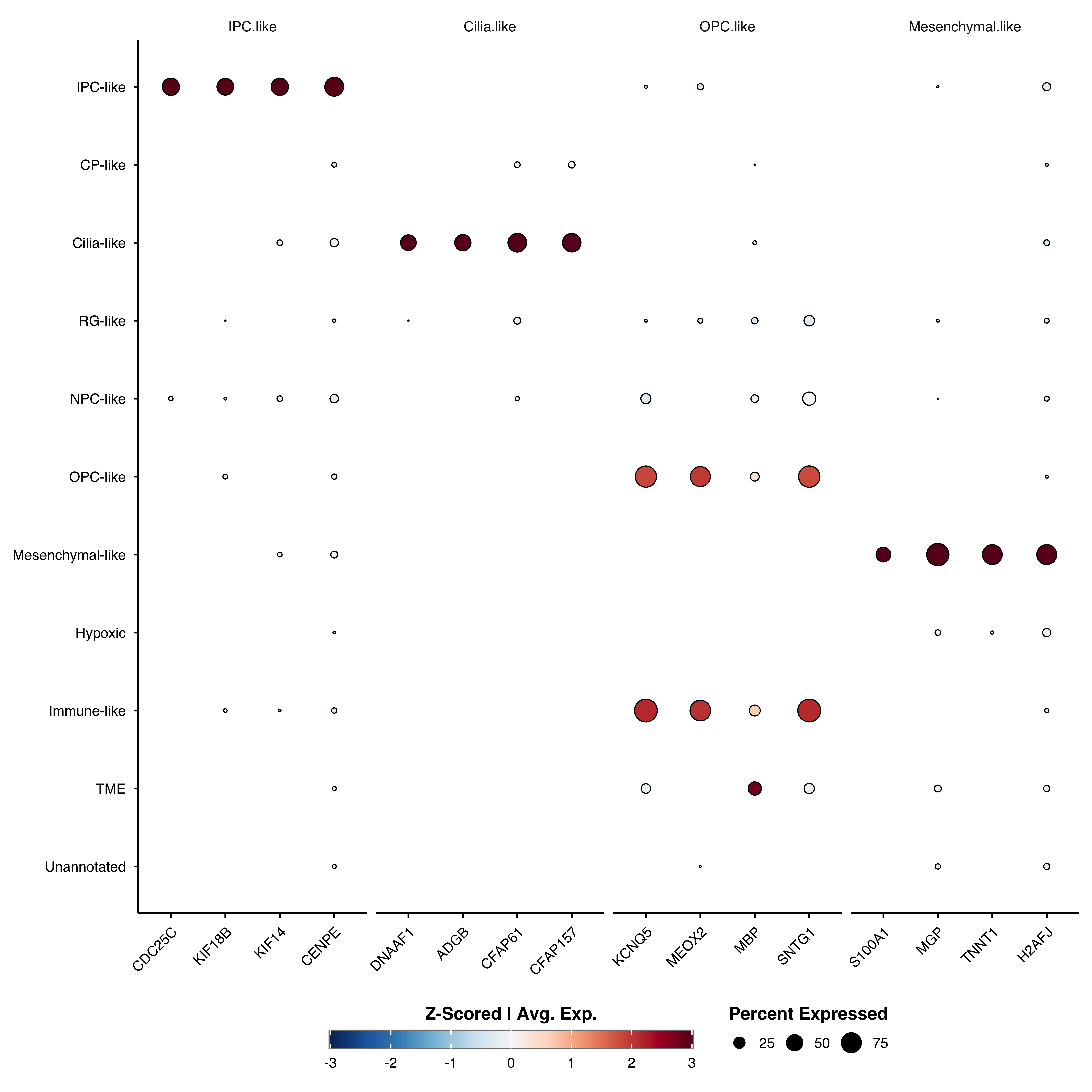
Z-scoring automatically enables enforce_symmetry = TRUE for a centered diverging color scale.
Create separate facets for each condition:
p <- SCpubr::do_DotPlot(sample = sample,
                        features = c("CDC25C", "KIF18B", "KIF14", "CENPE"),
                        split.by = "subtype")
p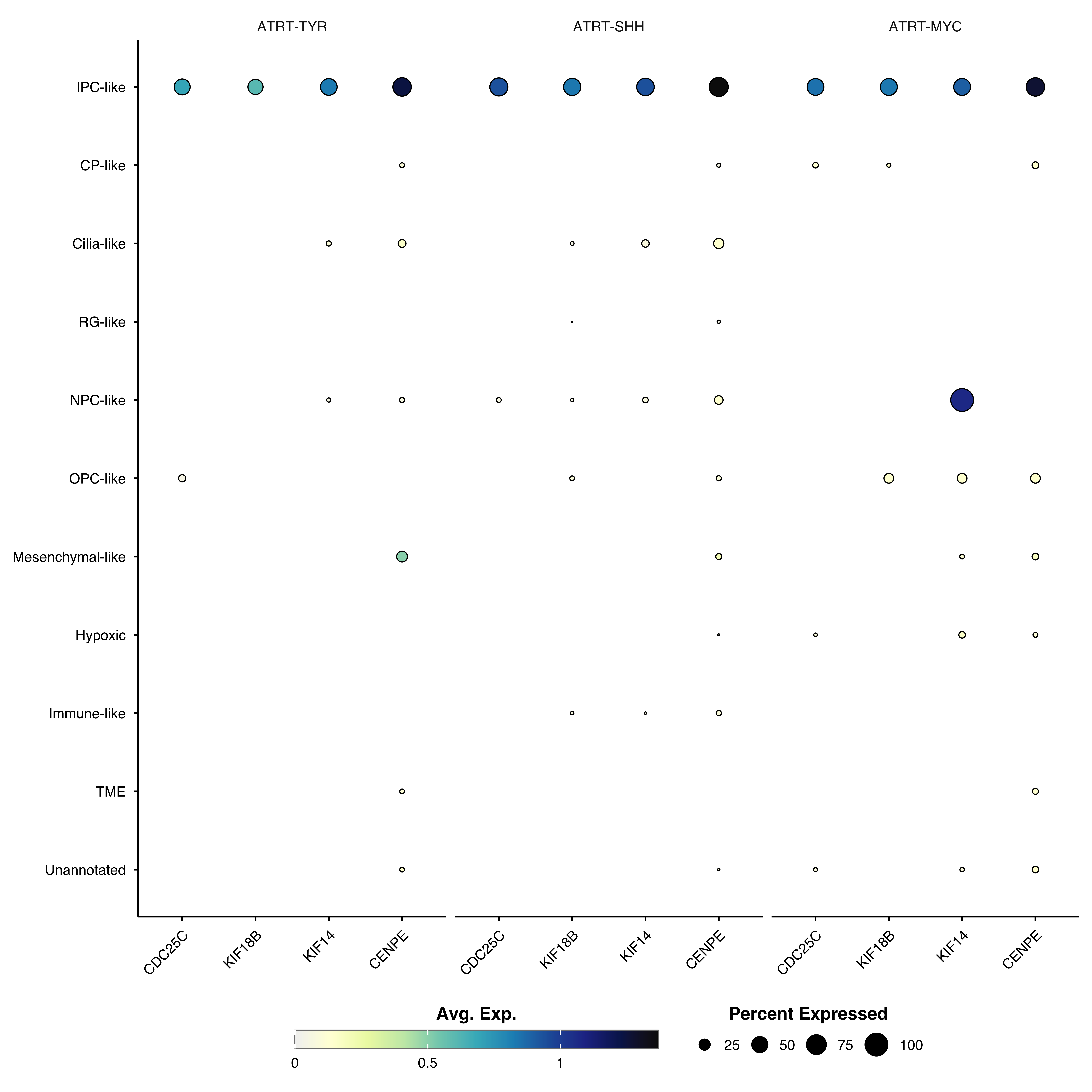
split.by cannot be combined with named feature lists, clustering, or z-scoring.
Remove dots below a minimum percent expressed threshold:
# Only show dots where >= 50% of cells express the gene
p <- SCpubr::do_DotPlot(sample = sample,
                        features = genes,
                        dot.min = 50)
p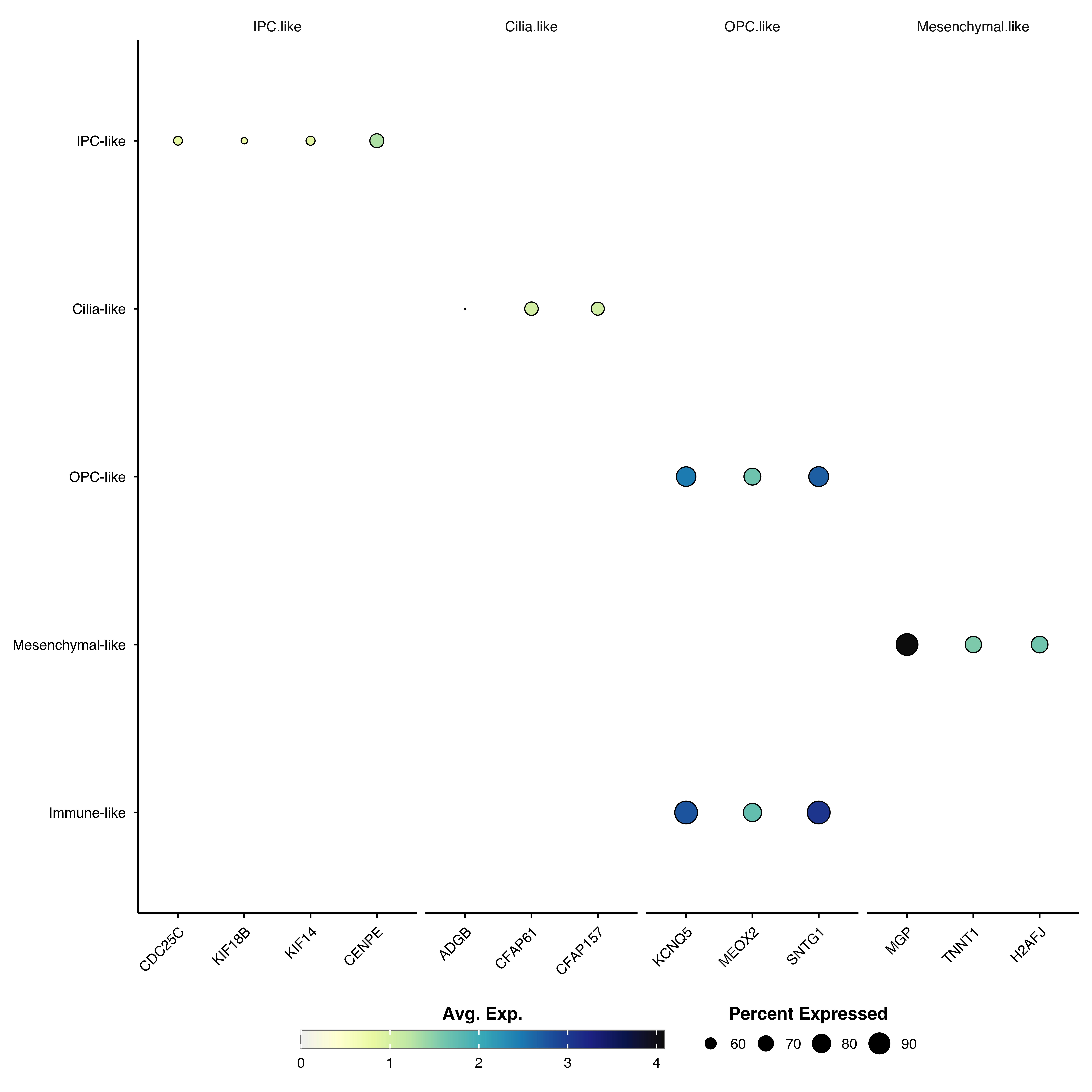
Swap genes and clusters:
p <- SCpubr::do_DotPlot(sample = sample,
                        features = c("CDC25C", "KIF18B", "KIF14", "CENPE"),
                        flip = TRUE)
p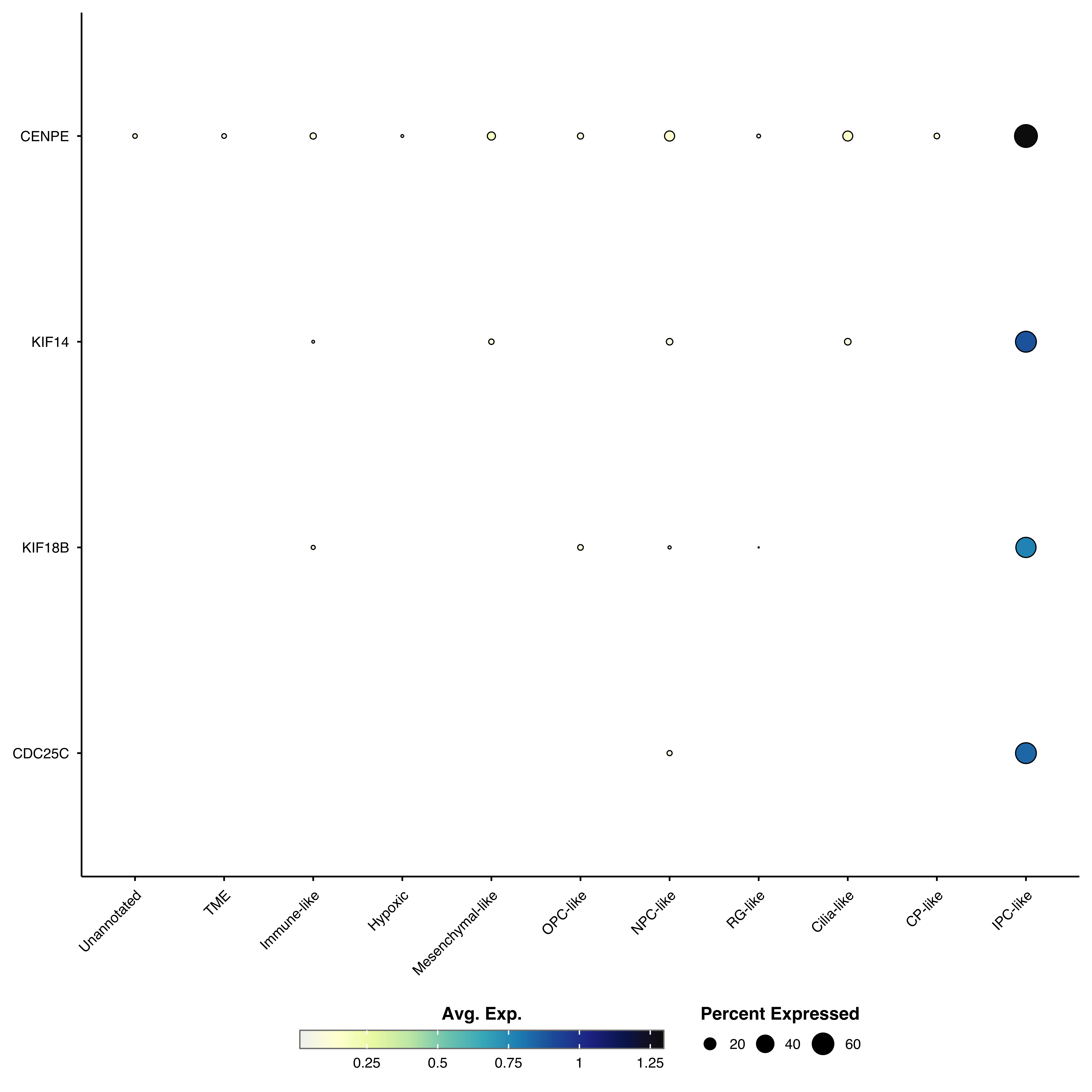
p <- SCpubr::do_DotPlot(sample = sample,
                        features = genes,
                        dot.scale = 12)
p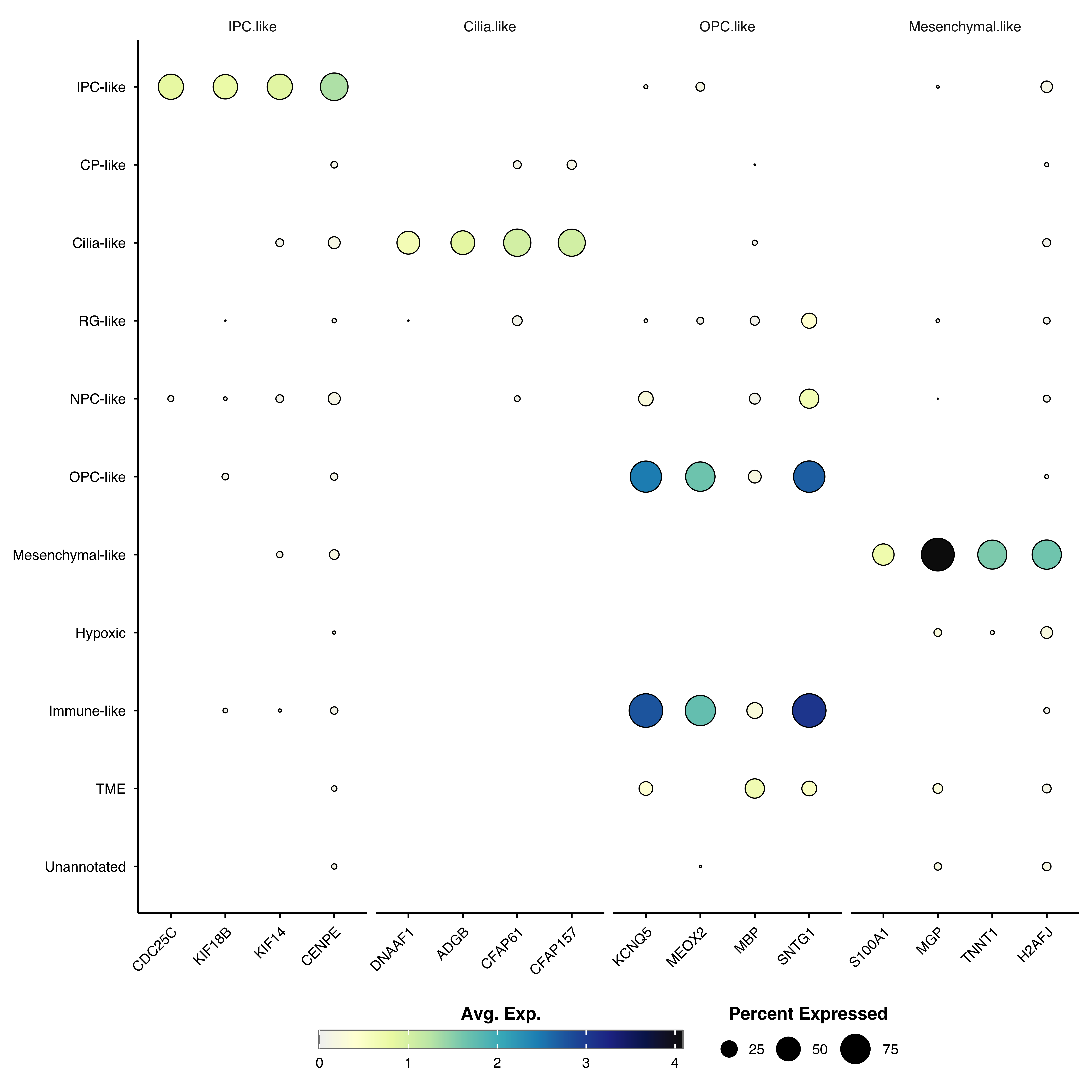
p <- SCpubr::do_DotPlot(sample = sample,
                        features = genes,
                        axis.text.x.angle = 90)
p
p <- SCpubr::do_DotPlot(sample = sample,
                        features = genes,
                        min.cutoff = 0,
                        max.cutoff = 3)
p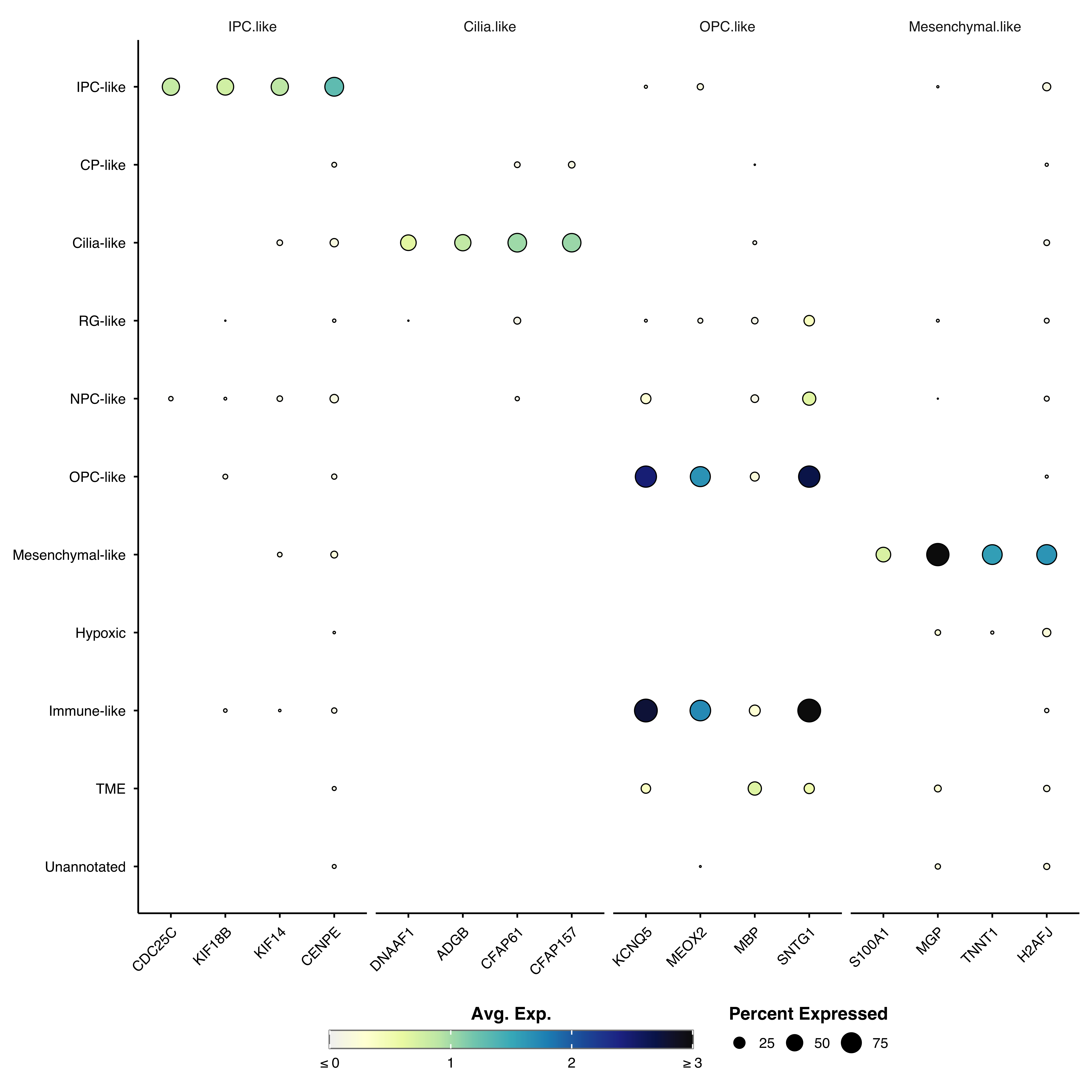
For parameters shared across many functions (color palettes, typography, legend styling, titles, grid, rendering), see Shared features.
| Parameter | Description | Default |
|---|---|---|
features |
Genes to plot (vector or named list) | — |
| Parameter | Description | Default |
|---|---|---|
cluster.identities |
Cluster groups by expression similarity | FALSE |
cluster.features |
Cluster genes by expression patterns | FALSE |
zscore.data |
Show Z-scores instead of average expression | FALSE |
| Parameter | Description | Default |
|---|---|---|
dot.min |
Minimum percent expressed to show dot (0–100) | 5 |
| Parameter | Description | Default |
|---|---|---|
dot.scale |
Maximum dot size | 8 |
axis.text.x.angle |
X-axis label rotation angle | 45 |