Cellular states plots visualize the relationship between enrichment scores for gene signatures. Cells are positioned based on their enrichment in 2, 3, or 4 gene lists, revealing cellular state transitions and plasticity.
This plot is inspired by the following publications:
Basic usage
Two-variable plot
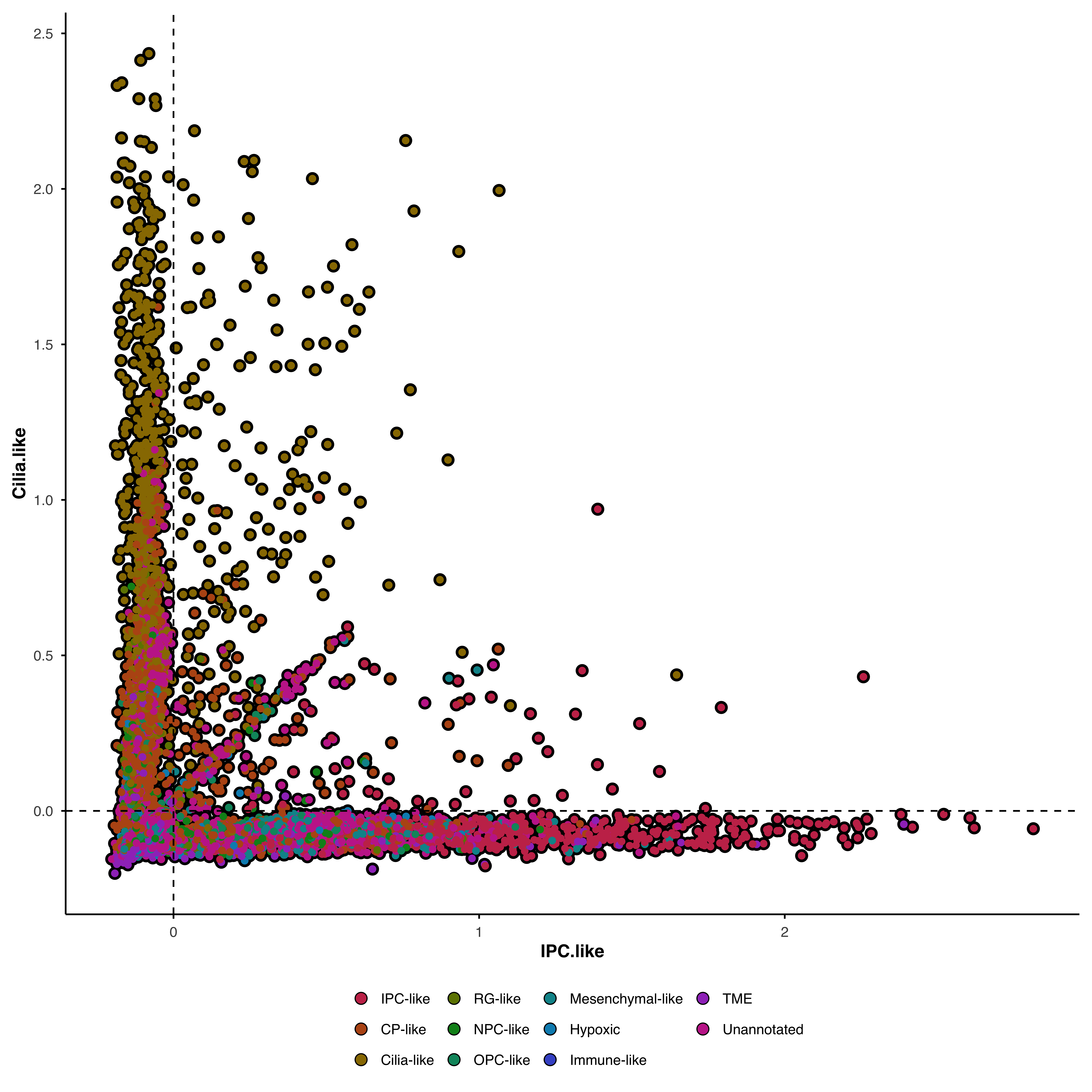
The simplest case: compare enrichment between two signatures.
# Define gene signatures gene_lists <- list ( "IPC.like" = c ( "CDC25C" , "KIF18B" , "KIF14" , "CENPE" ) ,
"Cilia.like" = c ( "DNAAF1" , "ADGB" , "CFAP61" , "CFAP157" )
) p <- SCpubr :: do_CellularStatesPlot ( sample = sample ,
input_gene_list = gene_lists ,
x1 = "IPC.like" ,
y1 = "Cilia.like"
) p
Cells are positioned by their enrichment scores: X-axis shows one signature, Y-axis shows the other.
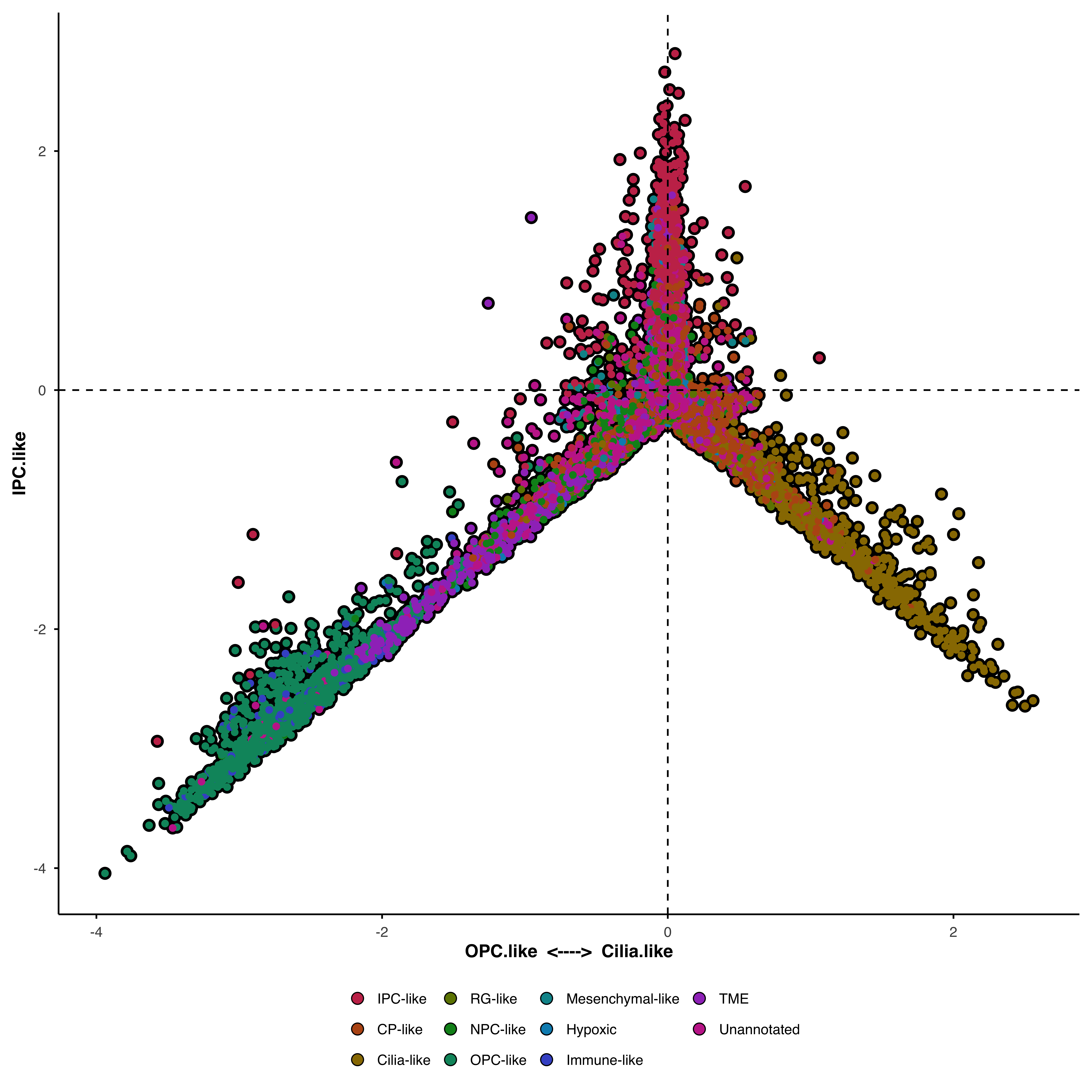
Three-variable plot
Add a second X-axis variable to create a butterfly plot . The X-axis becomes a dual axis where:
Right side → enriched in x1
Left side → enriched in x2
Y-axis → enrichment in y1
gene_lists <- list ( "IPC.like" = c ( "CDC25C" , "KIF18B" , "KIF14" , "CENPE" ) ,
"Cilia.like" = c ( "DNAAF1" , "ADGB" , "CFAP61" , "CFAP157" ) ,
"OPC.like" = c ( "KCNQ5" , "MEOX2" , "DNER3" , "SNTG1" )
) p <- SCpubr :: do_CellularStatesPlot ( sample = sample ,
input_gene_list = gene_lists ,
x1 = "Cilia.like" ,
x2 = "OPC.like" ,
y1 = "IPC.like"
) p
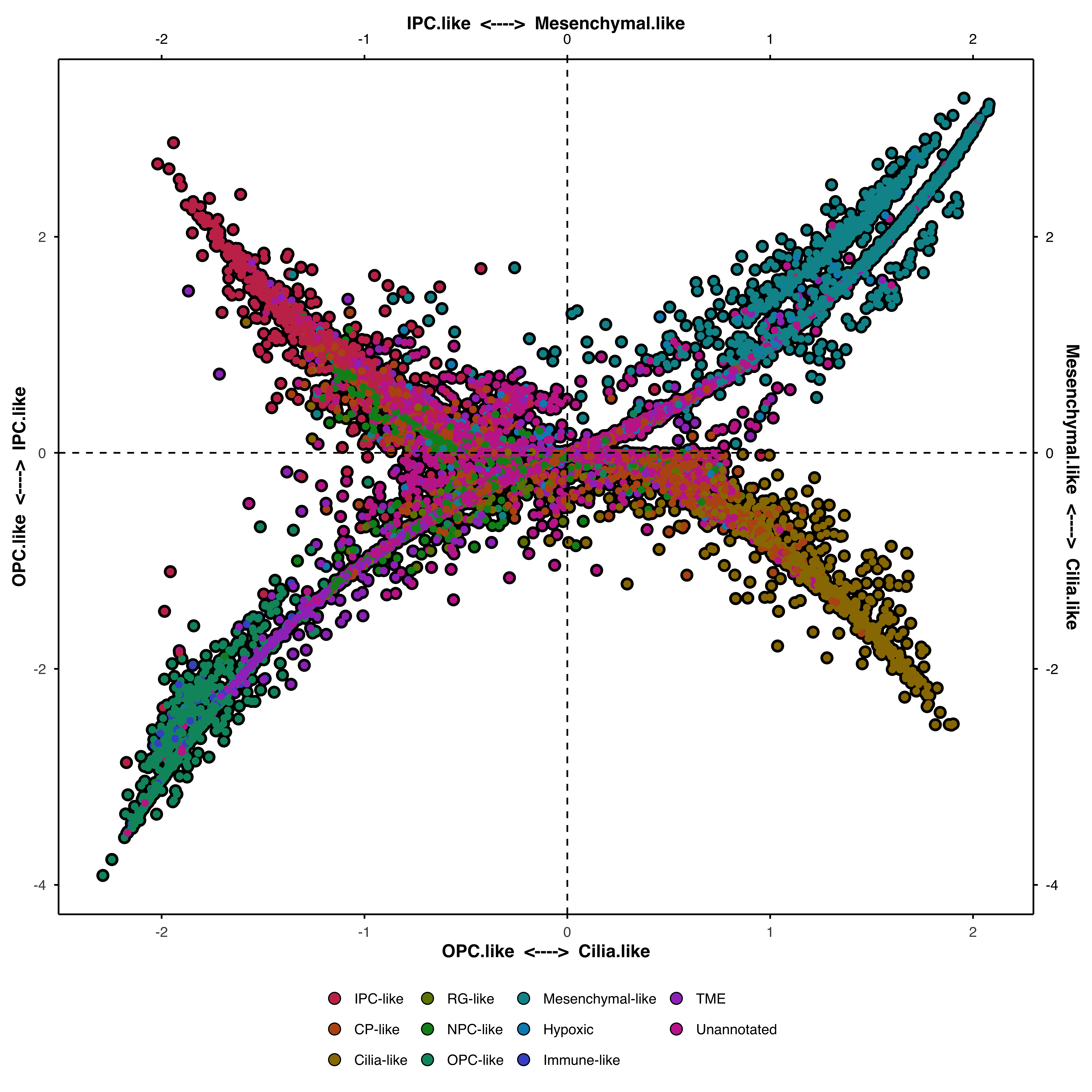
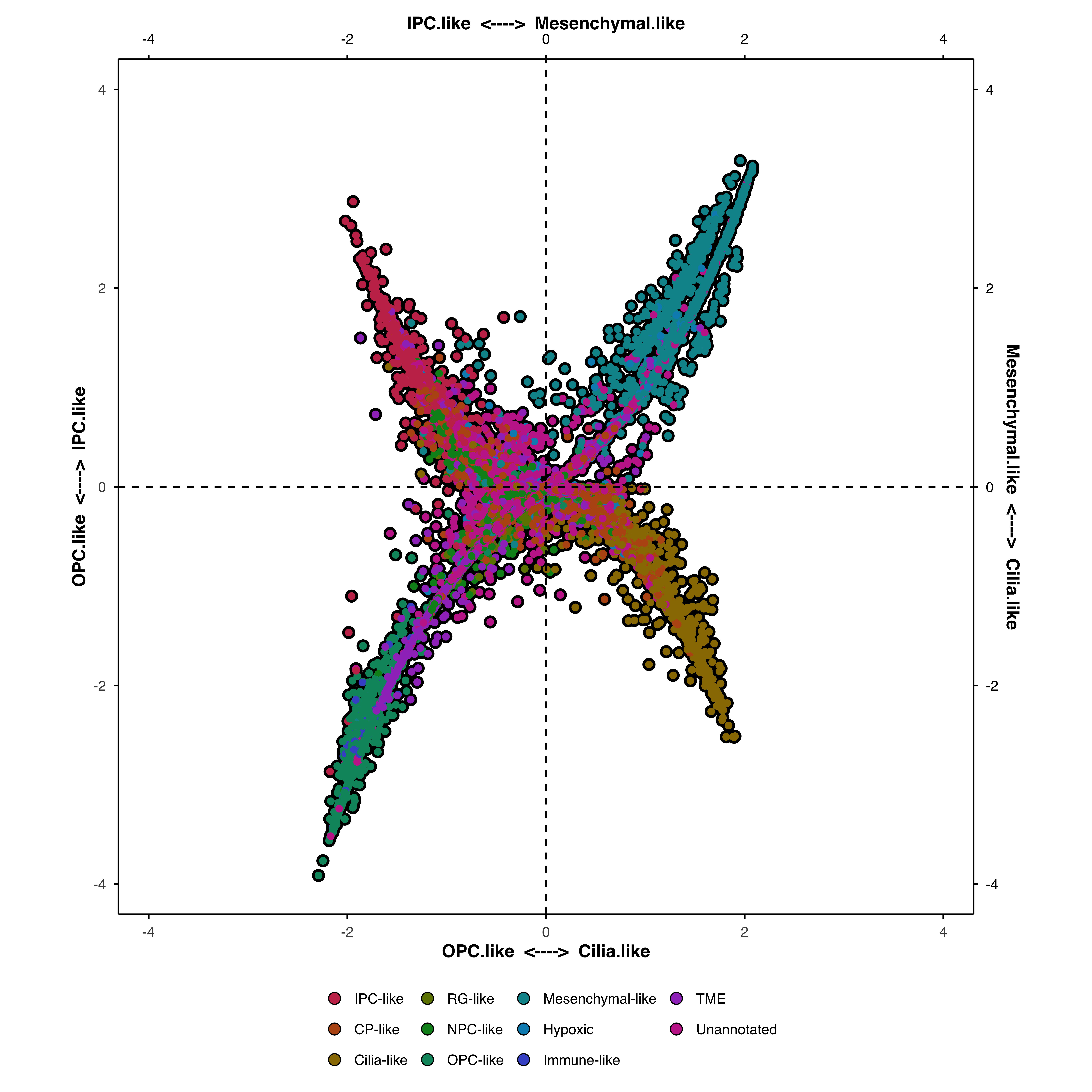
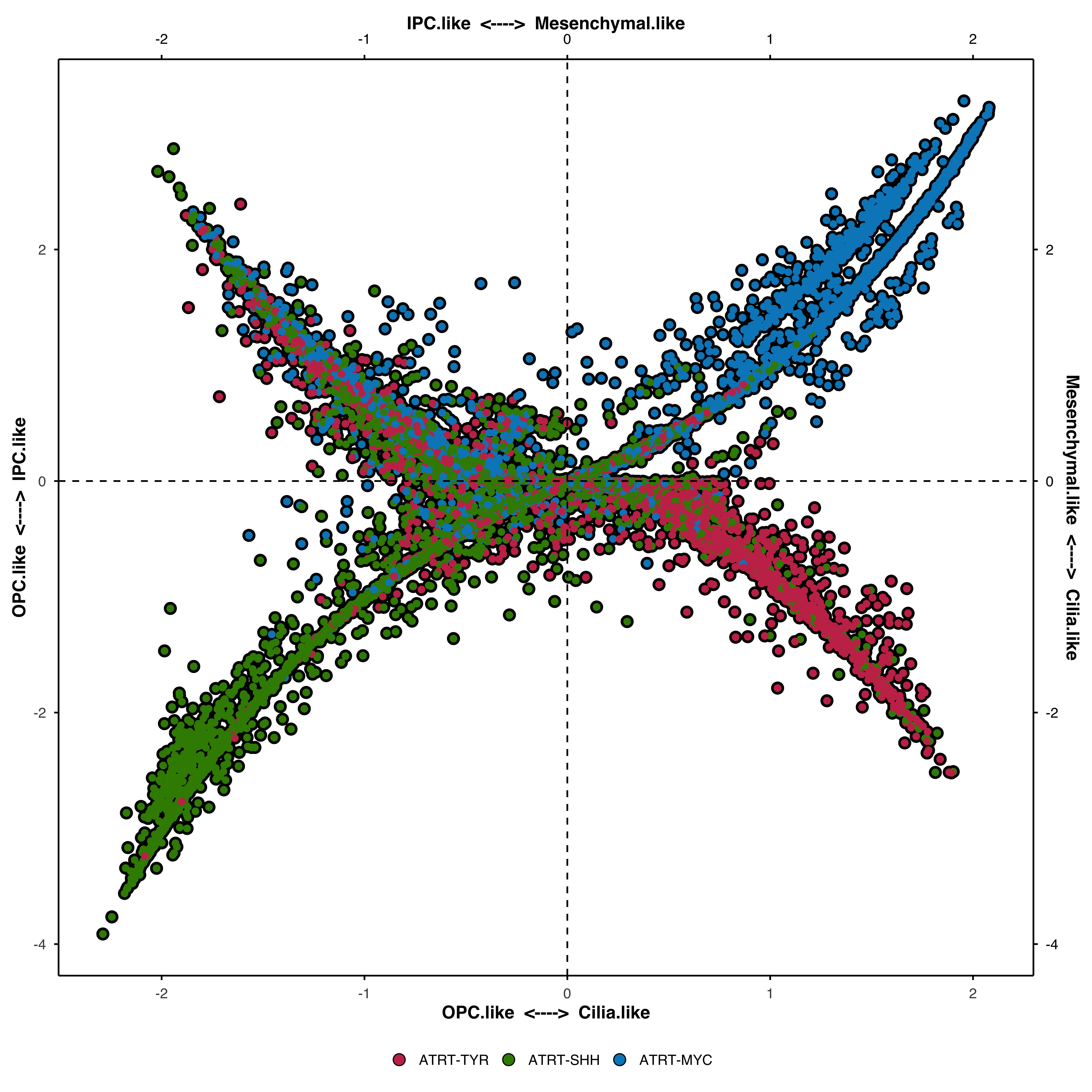
Four-variable plot (quadrant plot)
With four signatures, each corner represents one cellular state:
Top-right → x1
Top-left → x2
Bottom-right → y1
Bottom-left → y2
Cells cluster toward corners they’re enriched in, or fall between corners if enriched in multiple states.
gene_lists <- list ( "IPC.like" = c ( "CDC25C" , "KIF18B" , "KIF14" , "CENPE" ) ,
"Cilia.like" = c ( "DNAAF1" , "ADGB" , "CFAP61" , "CFAP157" ) ,
"OPC.like" = c ( "KCNQ5" , "MEOX2" , "DNER3" , "SNTG1" ) ,
"Mesenchymal.like" = c ( "S100A1" , "MGP" , "TNNT1" , "H2AFJ" )
) p <- SCpubr :: do_CellularStatesPlot ( sample = sample ,
input_gene_list = gene_lists ,
x1 = "IPC.like" ,
x2 = "Mesenchymal.like" ,
y1 = "OPC.like" ,
y2 = "Cilia.like"
) p
Enforce symmetry
Force the plot to be symmetrical around zero:
gene_lists <- list ( "IPC.like" = c ( "CDC25C" , "KIF18B" , "KIF14" , "CENPE" ) ,
"Cilia.like" = c ( "DNAAF1" , "ADGB" , "CFAP61" , "CFAP157" ) ,
"OPC.like" = c ( "KCNQ5" , "MEOX2" , "DNER3" , "SNTG1" ) ,
"Mesenchymal.like" = c ( "S100A1" , "MGP" , "TNNT1" , "H2AFJ" )
) p <- SCpubr :: do_CellularStatesPlot ( sample = sample ,
input_gene_list = gene_lists ,
x1 = "IPC.like" ,
x2 = "Mesenchymal.like" ,
y1 = "OPC.like" ,
y2 = "Cilia.like" ,
enforce_symmetry = TRUE
) p
For 3-variable plots, this centers the X-axis at 0. For 4-variable plots, this creates a square plot with equal ranges on both axes.
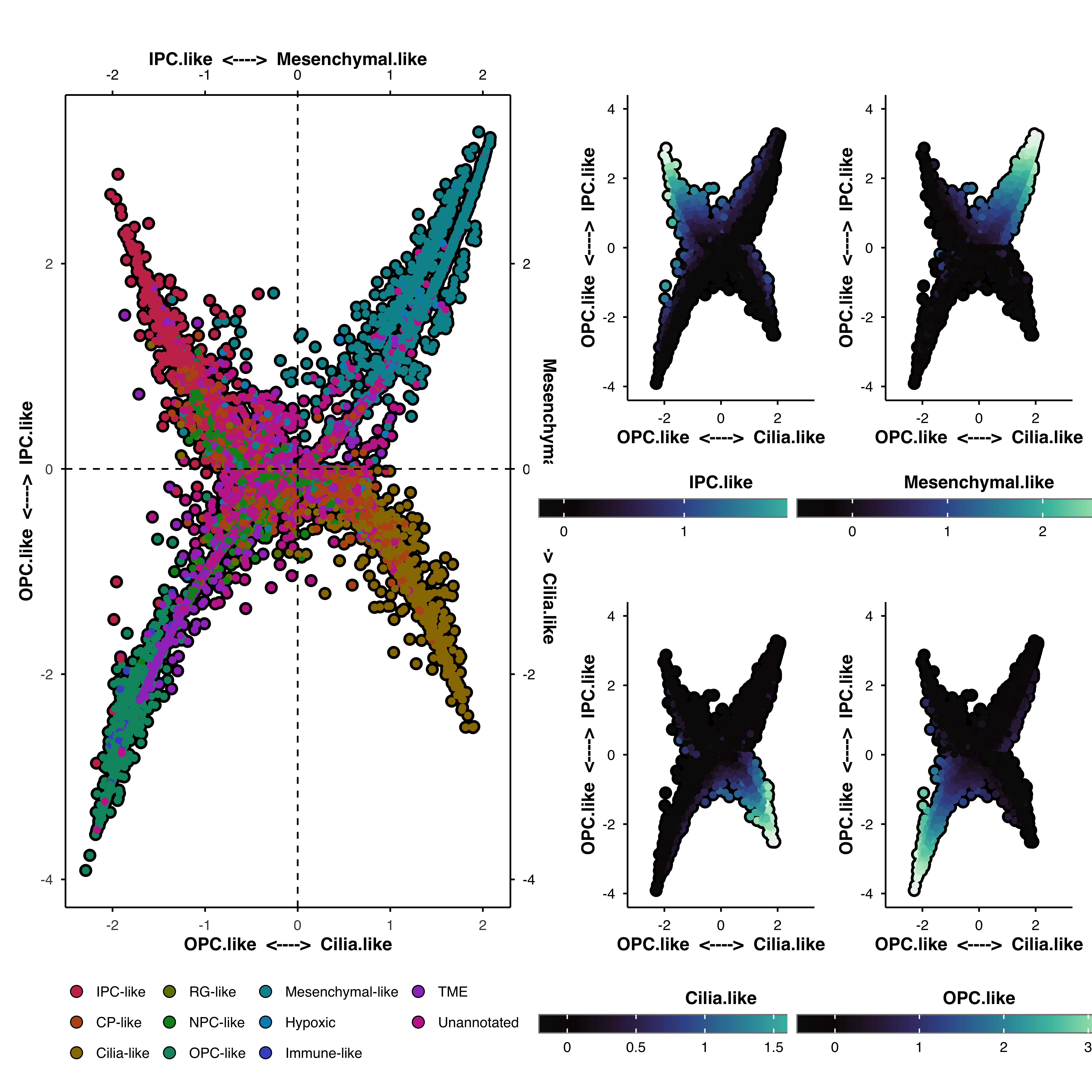
Plot enrichment scores
Visualize the individual enrichment scores as additional feature plots:
gene_lists <- list ( "IPC.like" = c ( "CDC25C" , "KIF18B" , "KIF14" , "CENPE" ) ,
"Cilia.like" = c ( "DNAAF1" , "ADGB" , "CFAP61" , "CFAP157" ) ,
"OPC.like" = c ( "KCNQ5" , "MEOX2" , "DNER3" , "SNTG1" ) ,
"Mesenchymal.like" = c ( "S100A1" , "MGP" , "TNNT1" , "H2AFJ" )
) p <- SCpubr :: do_CellularStatesPlot ( sample = sample ,
input_gene_list = gene_lists ,
x1 = "IPC.like" ,
x2 = "Mesenchymal.like" ,
y1 = "OPC.like" ,
y2 = "Cilia.like" ,
plot_enrichment_scores = TRUE
) p $ main | ( ( p $ IPC.like | p $ Mesenchymal.like ) / ( p $ Cilia.like | p $ OPC.like ) )
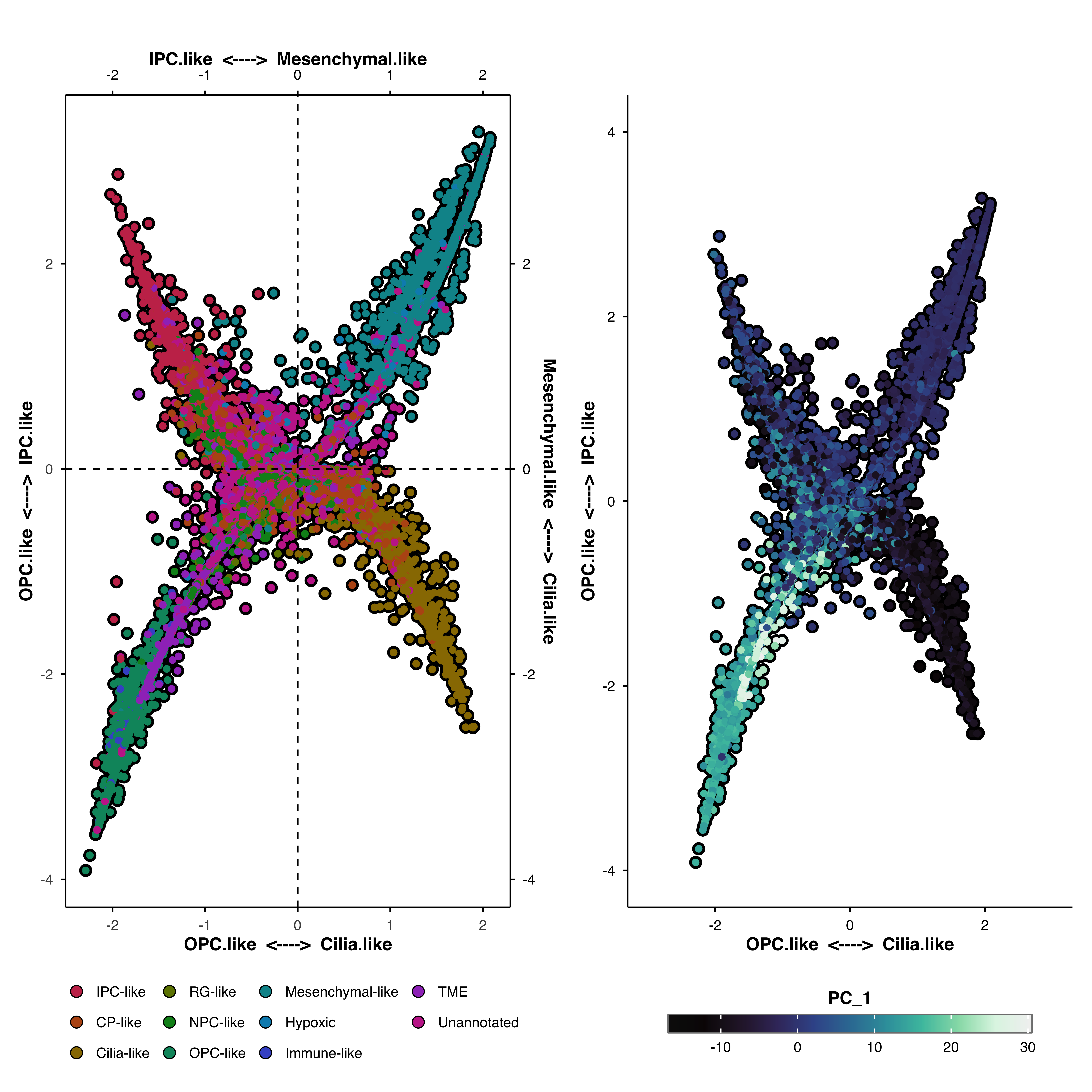
Overlay additional features
Plot any feature (genes, metadata) onto the cellular states coordinates:
gene_lists <- list ( "IPC.like" = c ( "CDC25C" , "KIF18B" , "KIF14" , "CENPE" ) ,
"Cilia.like" = c ( "DNAAF1" , "ADGB" , "CFAP61" , "CFAP157" ) ,
"OPC.like" = c ( "KCNQ5" , "MEOX2" , "DNER3" , "SNTG1" ) ,
"Mesenchymal.like" = c ( "S100A1" , "MGP" , "TNNT1" , "H2AFJ" )
) p <- SCpubr :: do_CellularStatesPlot ( sample = sample ,
input_gene_list = gene_lists ,
x1 = "IPC.like" ,
x2 = "Mesenchymal.like" ,
y1 = "OPC.like" ,
y2 = "Cilia.like" ,
plot_features = TRUE ,
features = c ( "PC_1" ) ,
) p $ main | p $ PC_1
Parameter reference
For parameters shared across many functions (color palettes, typography, legend styling, titles, cell borders, marginal distributions, rendering), see Shared features .
Core parameters
input_gene_listNamed list of gene signatures
—
x1First X-axis signature name
—
y1Y-axis signature name (or bottom-right quadrant)
—
x2Second X-axis signature (enables 3-variable mode)
NULL
y2Second Y-axis signature (enables 4-variable mode)
NULL
Enrichment computation
nbinNumber of bins for enrichment scoring
24
ctrlNumber of control genes per bin
100
Plot modes
enforce_symmetryForce symmetrical axis ranges
FALSE
plot_enrichment_scoresReturn enrichment score plots
FALSE
plot_featuresReturn additional feature plots
FALSE
featuresFeatures to plot (when plot_features = TRUE)
NULL
Appearance
axis.ticksShow axis ticks
TRUE
axis.textShow axis text
TRUE
colorblindUse colorblind-safe palette
FALSE