25 Pathway Activity inference analysis
This section is highly similar to TF Activity inference analysis as it makes use of the same source package and visualizations.
Another very important analysis that can be carried out, once we have our cells defined into groups (i.e: cell clusters), is Pathway Activity inference analysis. Out of the different tools out there to perform this task, the one we will use is called decoupleR (P.Badia-i-Mompel et al. 2022). This tool allows the inference of biological activities out of Omics data. For this, it requires a dataset to act as prior knowledge. For Pathway Activity inference, progeny is used. This allows for the computation of activity scores on a cell basis depicting how much (or little) each cell is enriched in each of the cancer Pathways stored in the database.
In order to visualize the enrichment of our cells in the pathways, the results need to be computed:
# Define your sample and assay.
sample <- your_seurat_object
assay <- "your_normalized_data_assay"

# Retrieve prior knowledge network.
network <- decoupleR::get_progeny(organism = "human")

# Run weighted means algorithm.
activities <- decoupleR::run_wmean(mat = as.matrix(sample@assays[[assay]]@data),
                                   network = network,
                                   .source = "source",
                                   .targe = "target",
                                   .mor = "weight",
                                   times = 100,
                                   minsize = 5)
With this, we can proceed to plot our results with SCpubr::do_PathwayActivityPlot().
25.1 Heatmap of averaged scores
The most informative and, perhaps, straightforward approach is to visualize the resulting scores averaged by the groups we have defined, as a heatmap. This is the default output of SCpubr::do_PathwayActivityPlot().
# General heatmap.
out <- SCpubr::do_PathwayActivityPlot(sample = sample,
                                      activities = activities)
p <- out$heatmaps$average_scores
p
25.2 Set the scale limits.
We can set the limits of the color scale by using min.cutoff and/or max.cutoff:
# General heatmap.
out <- SCpubr::do_PathwayActivityPlot(sample = sample,
                                      activities = activities,
                                      min.cutoff = -1,
                                      max.cutoff = 1)
p <- out$heatmaps$average_scores
p
However, be mindful that if enforce_symmetry = TRUE, this will override these settings, to achieve a symmetrical color scale:
# Effect of enforce symmetry on the scale limits.
out <- SCpubr::do_PathwayActivityPlot(sample = sample,
                                      activities = activities,
                                      min.cutoff = -1.25,
                                      max.cutoff = 1,
                                      enforce_symmetry = TRUE)
p <- out$heatmaps$average_scores
p
Be mindful when using min.cutoff and max.cutoff, as this behavior might be overriden by enforce_symmetry = TRUE. Consider setting it to FALSE.
25.3 Feature plots of the scores
Perhaps we are interested into visualizing the scores as a Feature plot. This way we can observe trends of enrichment in the activities. This can be achieved by providing plot_FeaturePlots = TRUE.
# Retrieve feature plots.
out <- SCpubr::do_PathwayActivityPlot(sample = sample,
                                      activities = activities,
                                      plot_FeaturePlots = TRUE)
p1 <- SCpubr::do_DimPlot(sample)
p2 <- out$feature_plots$EGFR
p <- p1 | p2
p
This effect will also be seen if only min.cutoff or max.cutoff is set and the other end of the color scale has a higher absolute value.
25.4 Geyser plots of the scores
In the same fashion as with the feature plots, we can also visualize the scores as Geyser plots, to get a sense of the distribution of the scores alongside the groups. This can be achieved by providing plot_GeyserPlots = TRUE.
# Retrieve Geyser plots.
out <- SCpubr::do_PathwayActivityPlot(sample = sample,
                                      activities = activities,
                                      plot_GeyserPlots = TRUE)
p1 <- SCpubr::do_DimPlot(sample)
p2 <- out$geyser_plots$EGFR
p <- p1 | p2
p
25.5 Use non-symmetrical color scales
If one wants to just plot a continuous color scale for the Feature plots and the Geyser plots, this can be achieved by using enforce_symmetry = FALSE.
# Use non-symmetrical color scale.
out <- SCpubr::do_PathwayActivityPlot(sample = sample,
                                      activities = activities,
                                      plot_GeyserPlots = TRUE,
                                      plot_FeaturePlots = TRUE,
                                      enforce_symmetry = FALSE)
p1 <- out$feature_plots$EGFR
p2 <- out$geyser_plots$EGFR

out <- SCpubr::do_PathwayActivityPlot(sample = sample,
                                      activities = activities,
                                      plot_GeyserPlots = TRUE,
                                      plot_FeaturePlots = TRUE,
                                      enforce_symmetry = TRUE)
p3 <- out$feature_plots$EGFR
p4 <- out$geyser_plots$EGFR

p <- (p1 | p2) / (p3 | p4)
p
25.6 Order geysers by the mean
We can also decide not to order the Geyser plots by the mean of the values. We can do that by providing geyser_order_by_mean = FALSE.
# Not order Geyser plot by mean values.
out <- SCpubr::do_PathwayActivityPlot(sample = sample,
                                      activities = activities,
                                      plot_GeyserPlots = TRUE,
                                      enforce_symmetry = TRUE,
                                      geyser_order_by_mean = FALSE)
p1 <- out$geyser_plots$EGFR

out <- SCpubr::do_PathwayActivityPlot(sample = sample,
                                      activities = activities,
                                      plot_GeyserPlots = TRUE,
                                      enforce_symmetry = TRUE,
                                      geyser_order_by_mean = TRUE)
p2 <- out$geyser_plots$EGFR

p <- p1 | p2
p
25.7 Split the heatmap into different groups
We can also further divide the heatmap into groups. This can be achieved using split.by parameter.
# Split the heatmap by another variable.
sample$split.me <- ifelse(sample$seurat_clusters %in% c("0", "3", "7"), "Group A","Group B")

out <- SCpubr::do_PathwayActivityPlot(sample = sample,
                                      activities = activities,
                                      split.by = "split.me")
p <- out$heatmaps$average_scores
p
25.8 Control the color scale
Again, we can control the color scale using min.cutoff and max.cutoff. This will apply to all plot types:
# Control the color scale
out <- SCpubr::do_PathwayActivityPlot(sample = sample,
                                      activities = activities,
                                      split.by = "split.me",
                                      min.cutoff = 0.1,
                                      max.cutoff = 0.7,
                                      plot_FeaturePlots = TRUE,
                                      plot_GeyserPlots = TRUE)
p <- out$heatmaps$average_scores
p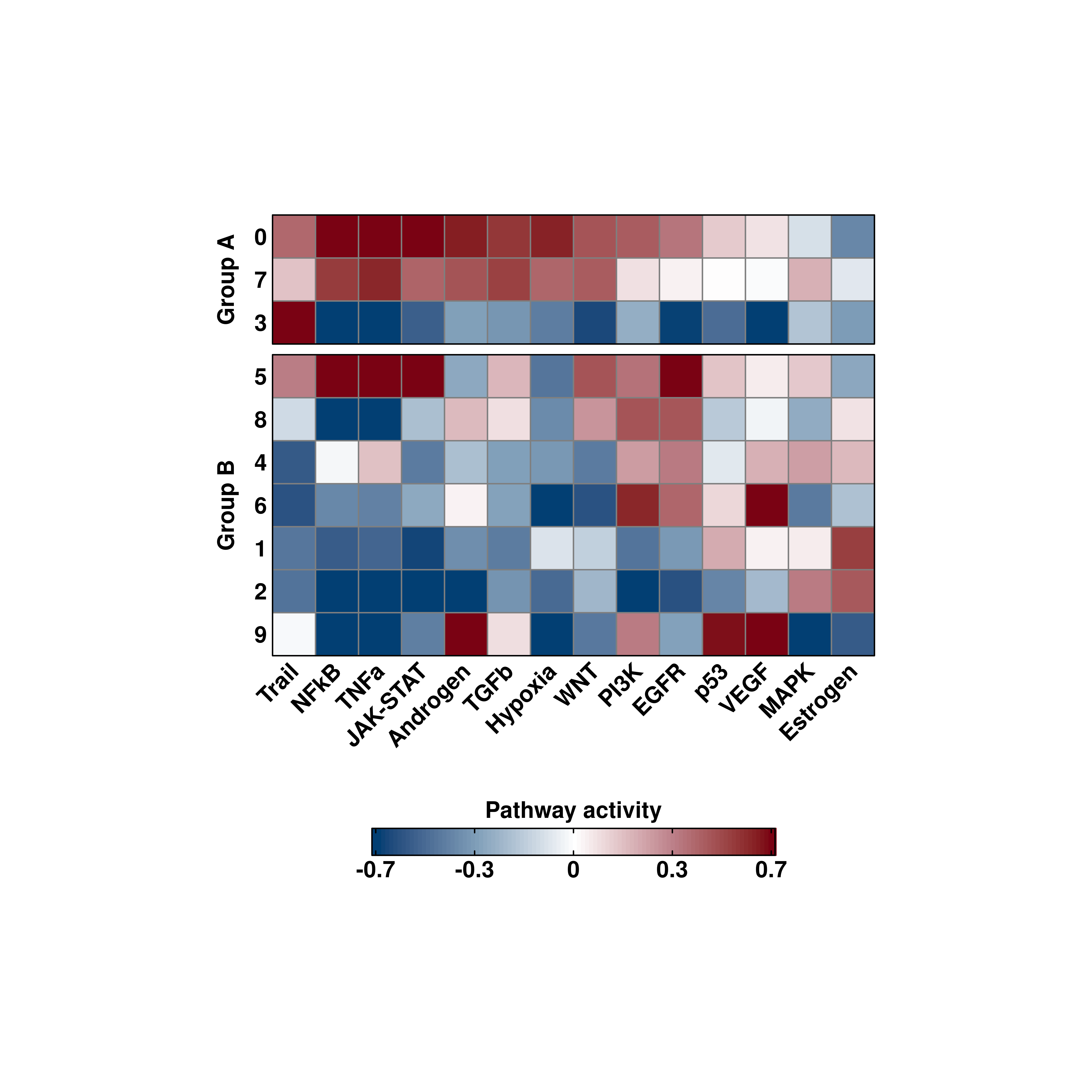
p1 <- out$feature_plots$PI3K
p2 <- out$geyser_plots$PI3K
p <- p1 | p2
p