11 Alluvial plots
Alluvial plots are a set of visualizations that help depicting how the cells “flow” from a given group to another. This can be particular interesting, let’s say, when we have a merged dataset that has samples from different subtypes and we want to see how the cells from each subtype distribute along the different clusters in our sample. Or, similarly, how the cells from each cluster distribute across the different individual datasets. ## Basic usage
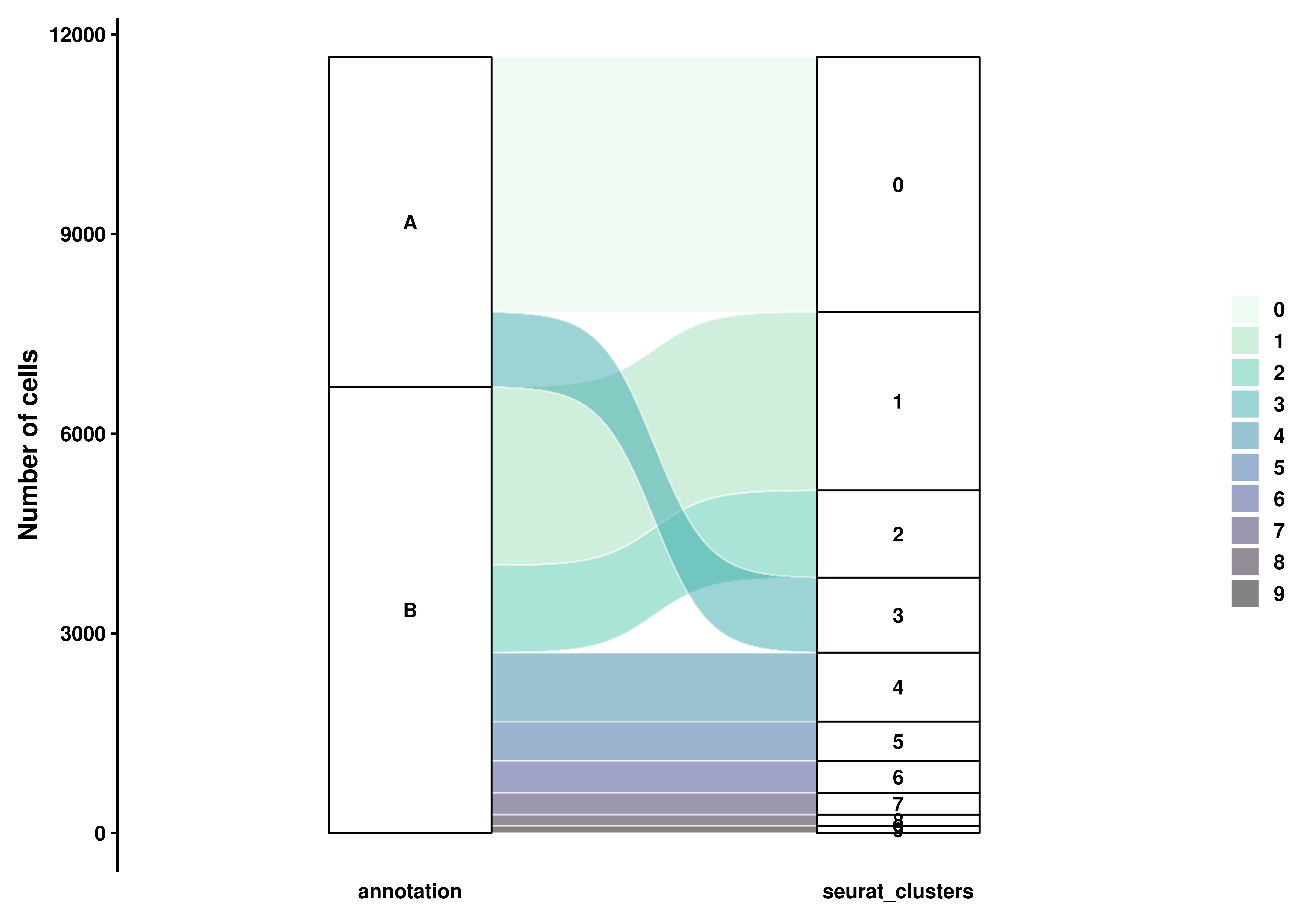
The most basic Alluvial plot can be achieved by using:
# Generate a more fine-grained clustering.
sample$annotation <- ifelse(sample$seurat_clusters %in% c("0", "3"), "A", "B")

# Compute basic sankey plot.
p <- SCpubr::do_AlluvialPlot(sample = sample,
                            first_group = "annotation",
                            last_group = "seurat_clusters")

p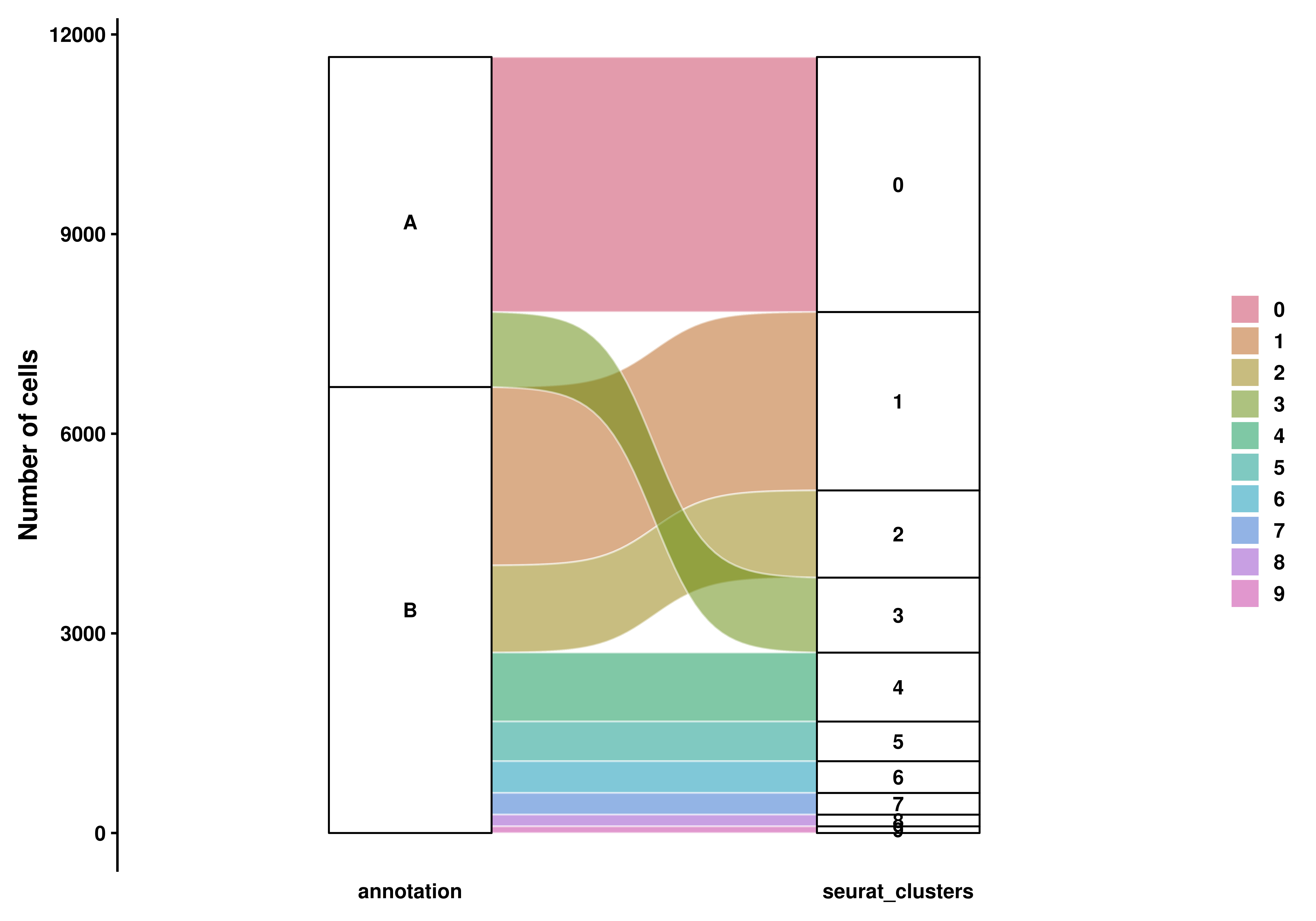
As can be observed, the Y axis reflects the total amount of cells and the X axis shows the different categorical variables. Overlapping of the names for the low-represented groups is unavoidable. The plot can be flipped using flip = TRUE:
# Compute basic sankey plot.
p <- SCpubr::do_AlluvialPlot(sample = sample,
                            first_group = "annotation",
                            last_group = "seurat_clusters",
                            flip = TRUE)

p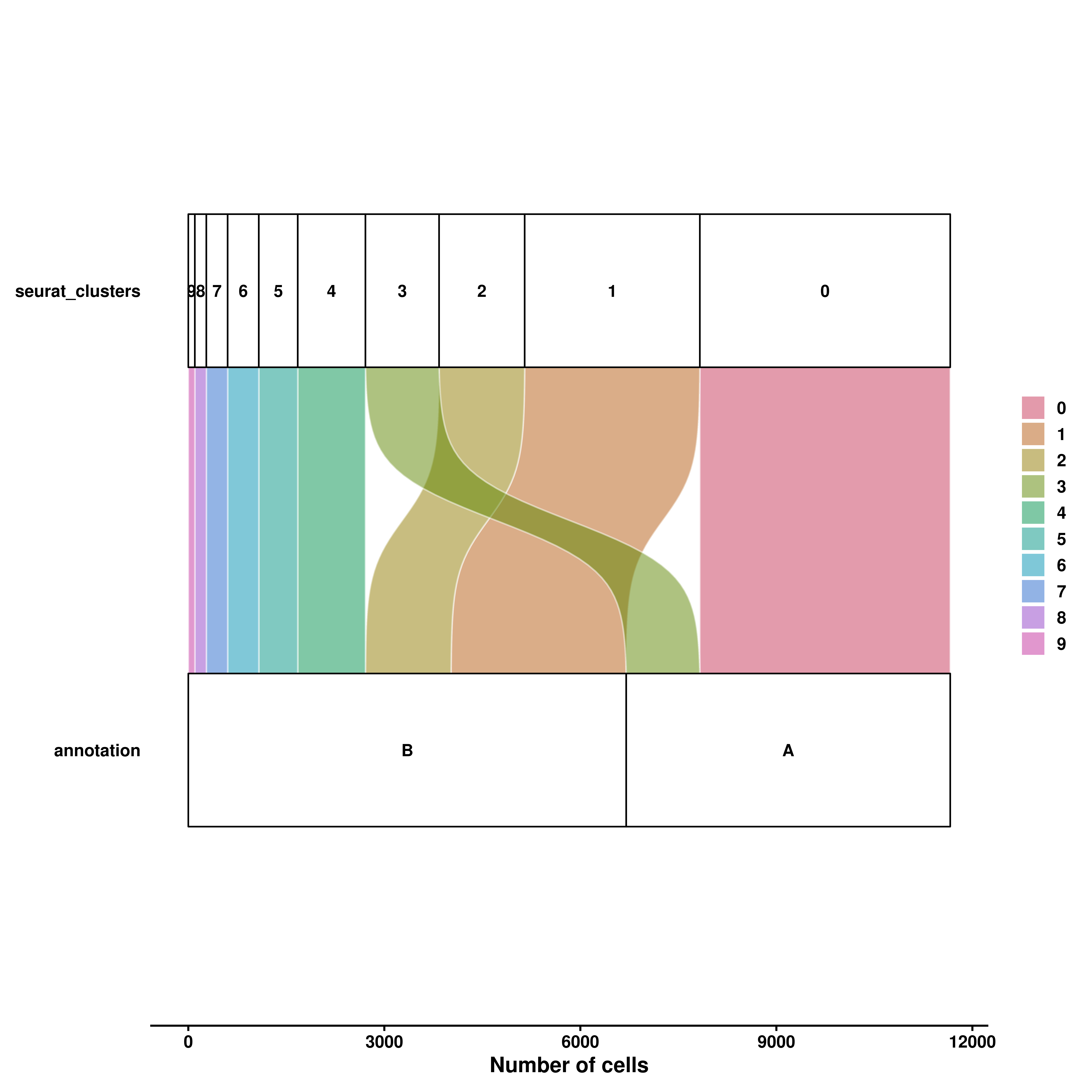
11.1 Addd more groups
Further groups can be added with the middle_groups parameter:
# Generate a more fine-grained clustering.
sample$extra_annotation <- ifelse(sample$seurat_clusters %in% c("1", "4"), "C", "D")

# Compute basic sankey plot.
p <- SCpubr::do_AlluvialPlot(sample = sample,
                            first_group = "annotation",
                            middle_groups = "extra_annotation",
                            last_group = "seurat_clusters")

p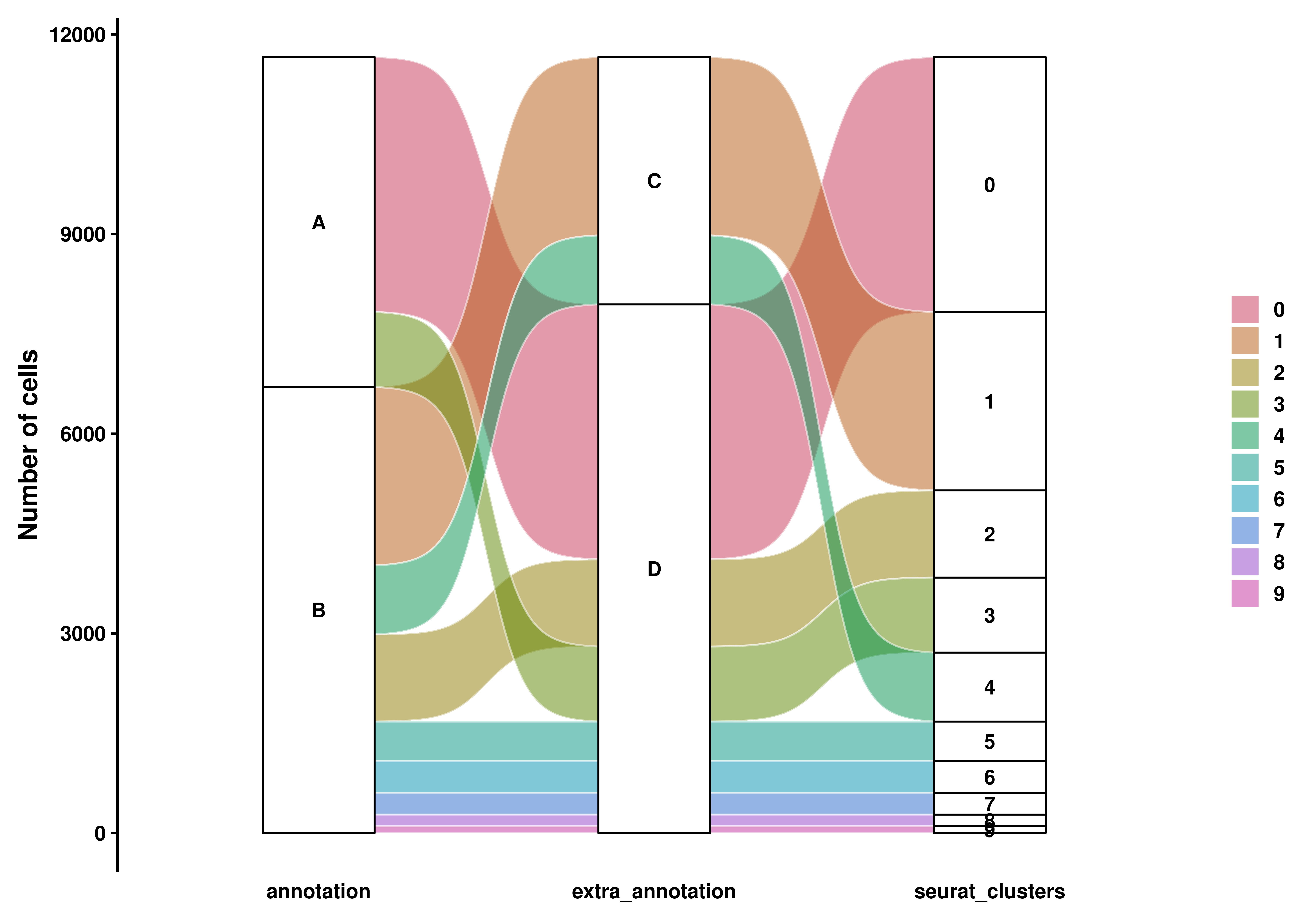
11.2 Change the label type
To better control the overplotting of the labels, the user can choose the geom to use for them with use_labels = TRUE/FALSE and whether to repel the labels using repel = TRUE/FALSE.
# Control overplotting.
p1 <- SCpubr::do_AlluvialPlot(sample = sample,
                              first_group = "annotation",
                              last_group = "seurat_clusters",
                              use_labels = FALSE)

p2 <- SCpubr::do_AlluvialPlot(sample = sample,
                              first_group = "annotation",
                              last_group = "seurat_clusters",
                              use_labels = TRUE)

p3 <- SCpubr::do_AlluvialPlot(sample = sample,
                              first_group = "annotation",
                              last_group = "seurat_clusters",
                              use_labels = FALSE,
                              repel = TRUE)

p4 <- SCpubr::do_AlluvialPlot(sample = sample,
                              first_group = "annotation",
                              last_group = "seurat_clusters",
                              use_labels = TRUE,
                              repel = TRUE)

p <- (p1 | p2) / (p3 | p4)
p
11.3 Customisation
As can be noted, the color of the connection between the nodes is determined by the variable provided to last_group. This is a limitation of the plot type only one column can be passed for the coloring. This can be customized by using fill.by.
# Color by another column.
p <- SCpubr::do_AlluvialPlot(sample = sample,
                            first_group = "annotation",
                            middle_groups = "extra_annotation",
                            last_group = "seurat_clusters",
                            fill.by = "annotation")

p
Also, one can provide its own custom colors to the plot, as always, using color.by:
# Use custom colors.
p <- SCpubr::do_AlluvialPlot(sample = sample,
                            first_group = "annotation",
                            middle_groups = "extra_annotation",
                            last_group = "seurat_clusters",
                            fill.by = "extra_annotation",
                            colors.use = c("C" = "#684C41",
                                           "D" = "#FDAE38"))

p
We can modify the colors of the border of the connections (alluvium) and the nodes (stratum) with stratum.color and alluvium.color.
# Use custom colors for borders.
p <- SCpubr::do_AlluvialPlot(sample = sample,
                            first_group = "annotation",
                            last_group = "seurat_clusters",
                            stratum.color = "white",
                            alluvium.color = "black")

p
We can also control the filling of both stratum by using alluvium.fill.
# Use custom colors for fill
p <- SCpubr::do_AlluvialPlot(sample = sample,
                            first_group = "annotation",
                            last_group = "seurat_clusters",
                            stratum.fill = "grey75")

p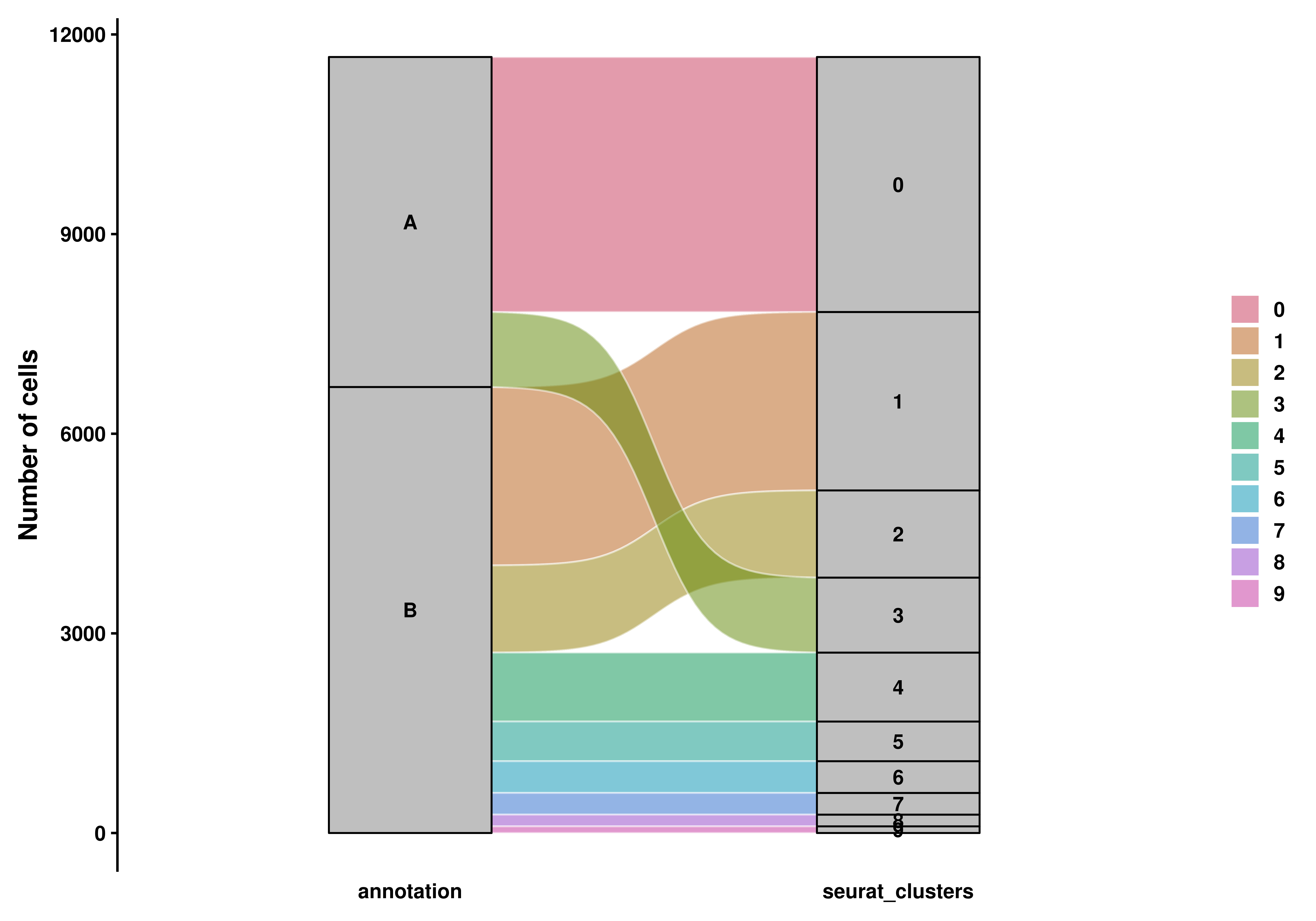
Also, one can apply viridis scales, if wanted, by using use_viridis and viridis_color_map parameters:
# Use viridis scales.
p <- SCpubr::do_AlluvialPlot(sample = sample,
                            first_group = "annotation",
                            last_group = "seurat_clusters",
                            use_viridis = TRUE,
                            viridis_color_map = "G")

p