genes.use <- c("CCR7", "CD14", "LYZ",
           "S100A4", "MS4A1",
           "MS4A7", "GNLY", "NKG7", "FCER1A",
           "CST3", "PPBP")

# Compute the grouped GO terms.
out <- SCpubr::do_FunctionalAnnotationPlot(genes = genes.use,
org.db = org.Hs.eg.db)17 Functional Annotation Analysis plots
A major analysis in Single-Cell transcriptomics, and subsequential to the previous chapter, is Functional Annotation Analysis. This allows to get more insights in a list of genes that we might have at hand, and retrieve a set of statistically enriched terms (GO terms, KEGG terms) shared amongst the genes in the gene signature. For this purpose, SCpubr makes use of clusterProfiler and enrichplot packages together with some own plots to provide a set of comprehensive data visualization to understand the output of functional enrichment analyses using clusterProfiler. This can be accessed using SCpubr::do_FunctionalAnnotationPlot().
17.1 Basic output
The basic output of SCpubr::do_FunctionalAnnotationPlot()contains a list with several plots, and can be computed by providing the function with a list of genes and a database object, such as the one provided by the org.Hs.eg.db package:
This reports a list containing four complementary plots. The first, is a heatmap that contains the overlap between the genes and the term, the gene count and their corresponding adjusted p-value:
# Retrieve the heatmap.
out$Heatmap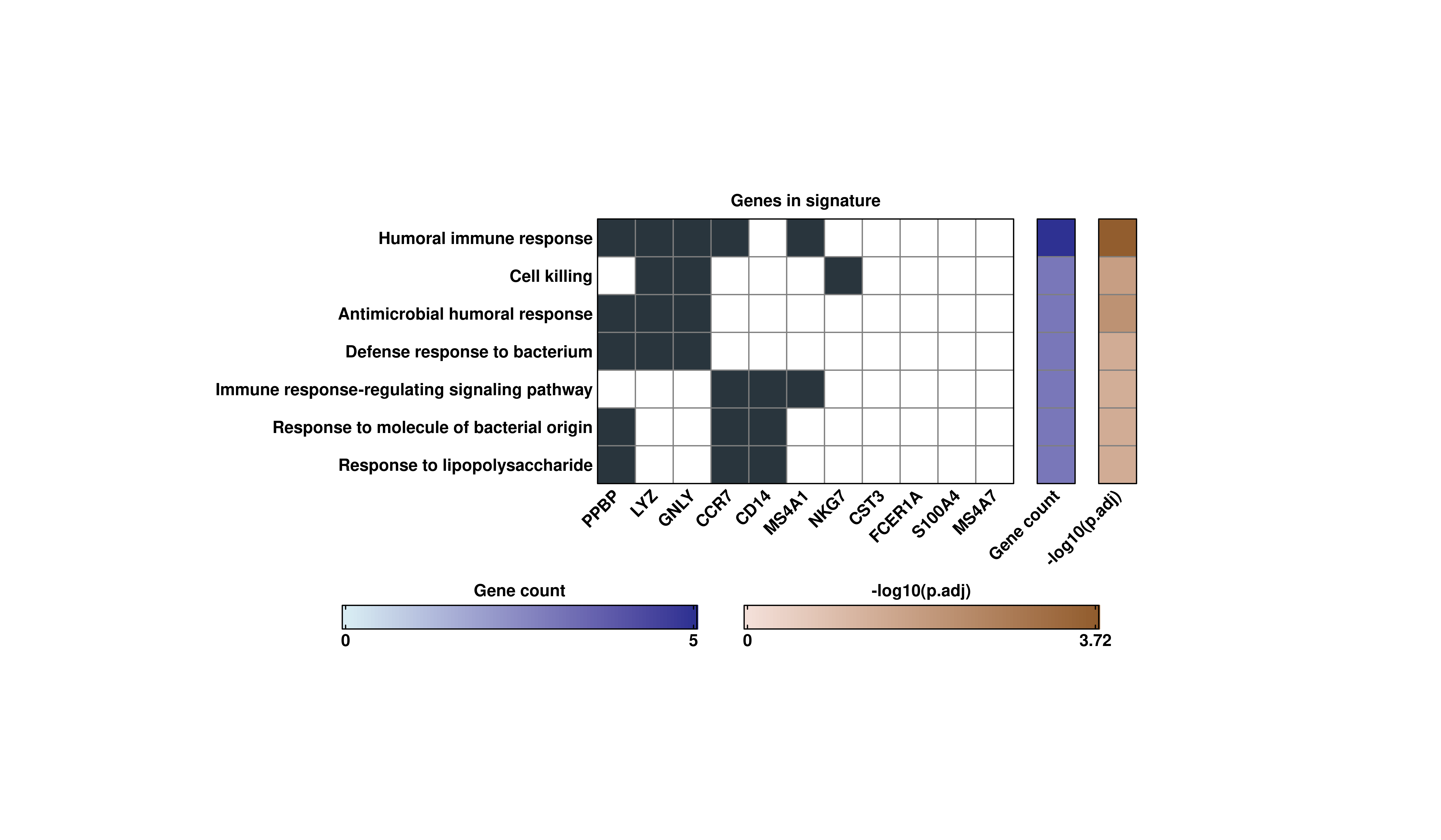
Second, is a bar plot showing the enriched terms with the height of the bars corresponding to the gene count per term, and the color or the bars corresponding to the adjusted p-value associated to the terms:
# Retrieve the Bar plot.
out$BarPlot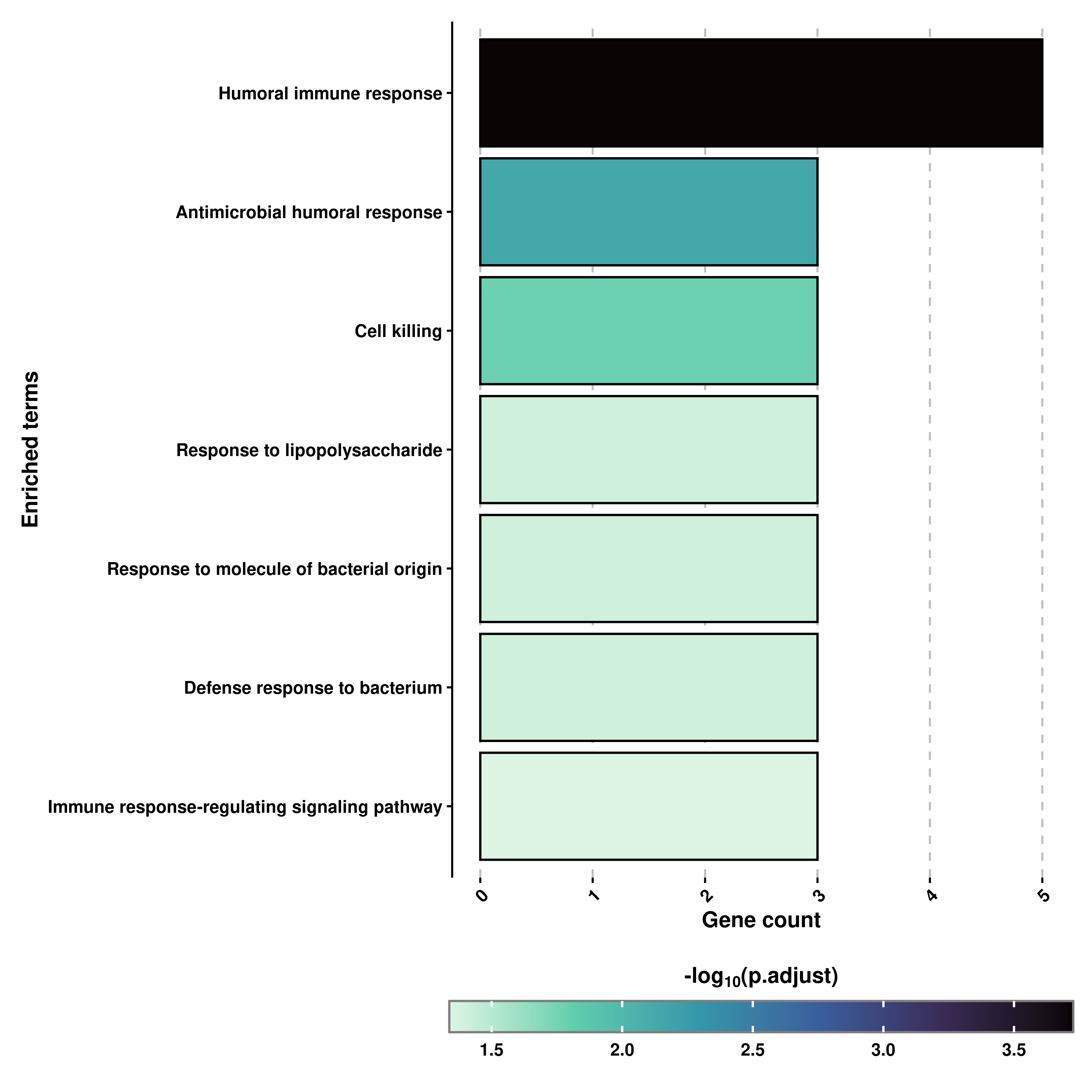
Almost identical, we can also retrieve a Dot plot in which the size of the dots correspond to the number of genes supporting the term and the color to the adjusted p-value:
# Retrieve the Dot plot.
out$DotPlot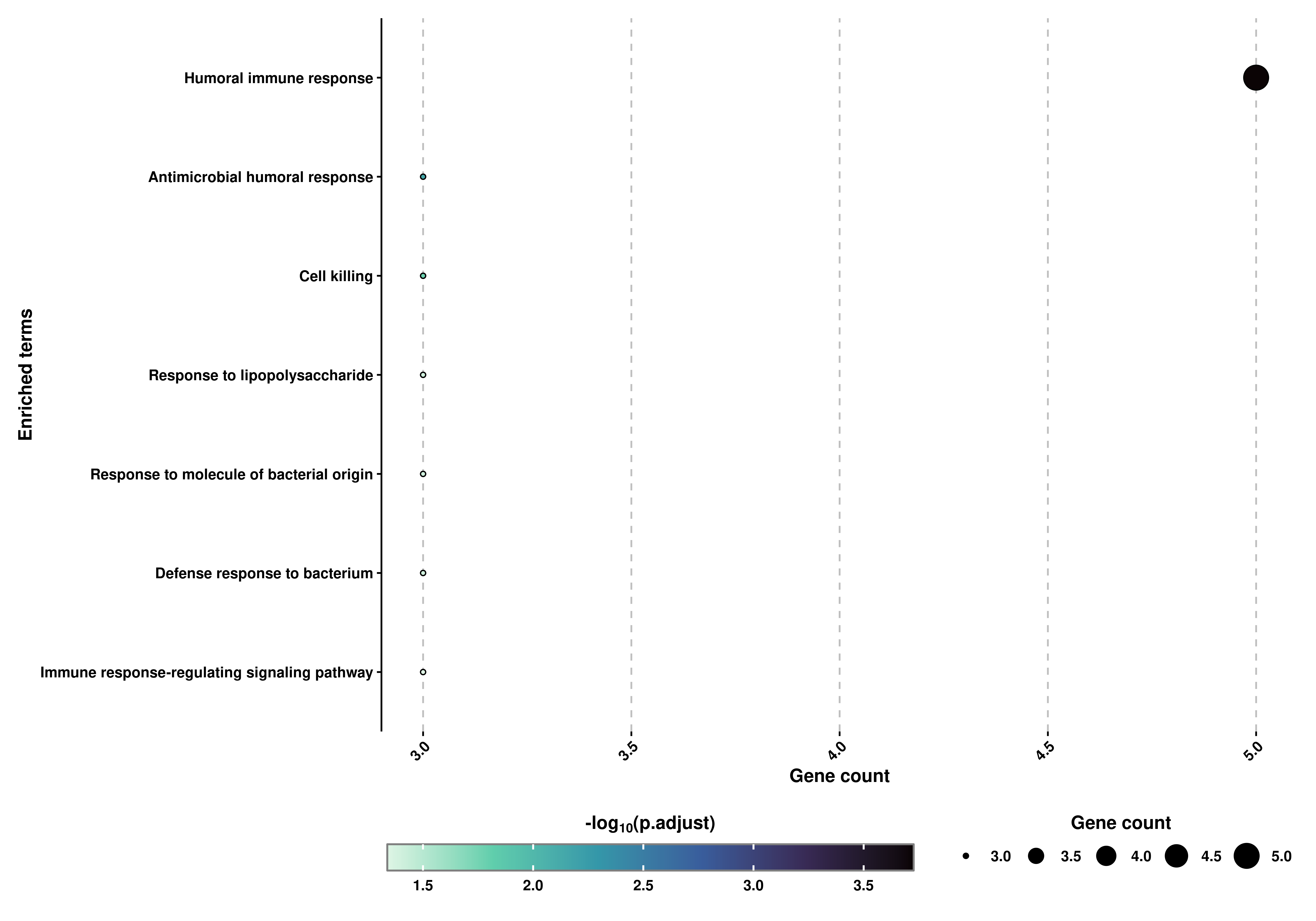
Finally, and thanks to enrichplot package, we can also obtain a customized hierarchical visualization of the enriched terms called Tree plot:
# Retrieve the Tree plot.
out$TreePlot
We can control the number of clusters and the number of high-frequency words with nClusters and nWords parameters. Similarly, the total number of terms to display (if available), can be controlled using showCategory parameter.
Please note:
The right-most labels refer to high frequency words, not to the GO terms on a level above. For more information please consult the official documentation for enrichplot package
It can also be the case that the high frequency words and the clusters behave a bit wonky. This has been observed already but is also related entirely to enrichplot package and the number of clusters selected by nClusters. If you are experiencing problems with this, consider reducing the number of nClusters.
17.2 Limit the number of terms reported
Similar to the previous chapter, we can decide whether we want more or less overlap between the genes for the reported terms using min.overlap:
# Compute the grouped GO terms.
out <- SCpubr::do_FunctionalAnnotationPlot(genes = genes.use,
                                           org.db = org.Hs.eg.db,
                                           min.overlap = 2)
# Retrieve the heatmap.
out$Heatmap
# Retrieve the Bar and Dot plot.
out$BarPlot | out$DotPlot
# Retrieve the Tree plot.
out$TreePlot
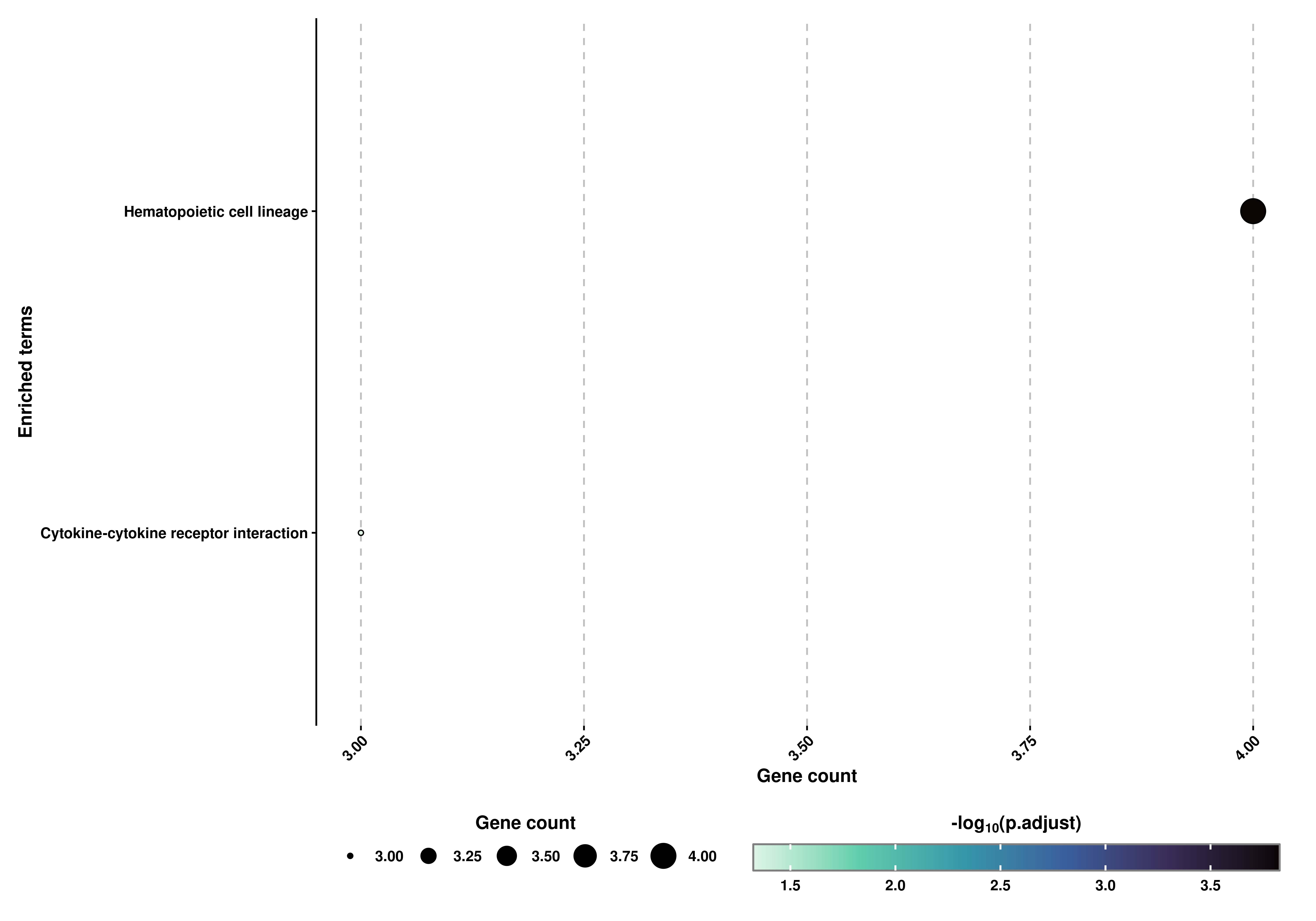
17.3 Compute the results for different databases
We can also query other database apart from GO. KEGG and MKEGG are also available, and can be selected using database parameter:
genes.use <- c("IL7R", "CCR7", "CD14", "LYZ",
           "S100A4", "MS4A1", "CD8A", "FCGR3A",
           "MS4A7", "GNLY", "NKG7", "FCER1A",
           "CST3", "PPBP")

# Compute the grouped KEGG terms.
out1 <- SCpubr::do_FunctionalAnnotationPlot(genes = genes.use,
                                            org.db = org.Hs.eg.db,
                                            database = "KEGG")
# Retrieve the Bar and Dot plot.
out1$DotPlot