12 Sankey plots
SCpubr::do_SankeyPlot() is discontinued and will be removed from SCpubr in the following version. Please consider using SCpubr::do_AlluvialPlot() instead.
Due to CRAN policies, this function could not make it to the official release and is only available in the development release of SCpubr. Find how to install it here.
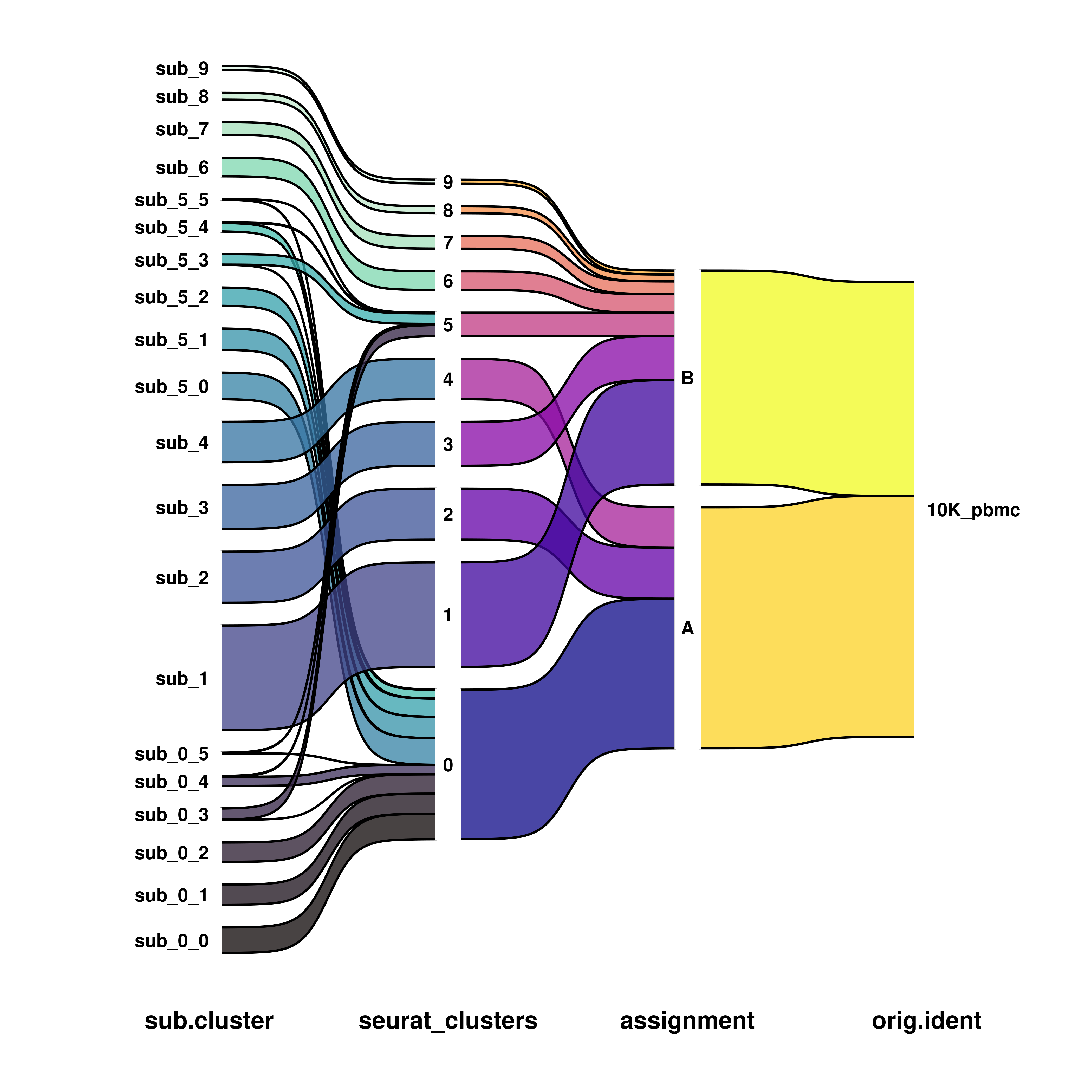
Sankey and alluvial plots are a set of visualizations that help depicting how the cells “flow” from a given group to another. This can be particular interesting, let’s say, when we have a merged dataset that has samples from different subtypes and we want to see how the cells from each subtype distribute along the different clusters in our sample. Or, similarly, how the cells from each cluster distribute across the different individual datasets.
12.1 Basic usage
Due to an internal bug in ggsankey, the package dplyr has to be loaded with library(dplyr) before running this function.
This is how we can achieve basic Sankey or alluvial plots (using package):
# Generate a more fine-grained clustering.
sample <- Seurat::FindSubCluster(sample, cluster = c("0", "5"), graph.name = "SCT_snn")
#> Modularity Optimizer version 1.3.0 by Ludo Waltman and Nees Jan van Eck
#>
#> Number of nodes: 4428
#> Number of edges: 146366
#>
#> Running Louvain algorithm...
#> Maximum modularity in 10 random starts: 0.7966
#> Number of communities: 6
#> Elapsed time: 0 seconds
sample$sub.cluster <- paste0("sub_", sample$sub.cluster)

# Compute basic sankey plot.
p1 <- SCpubr::do_SankeyPlot(sample = sample,
                            first_group = "sub.cluster",
                            last_group = "seurat_clusters",
                            type = "sankey")

# Compute basic alluvial plot.
p2 <- SCpubr::do_SankeyPlot(sample = sample,
                            first_group = "sub.cluster",
                            last_group = "seurat_clusters",
                            type = "alluvial")

p <- p1 / p2
p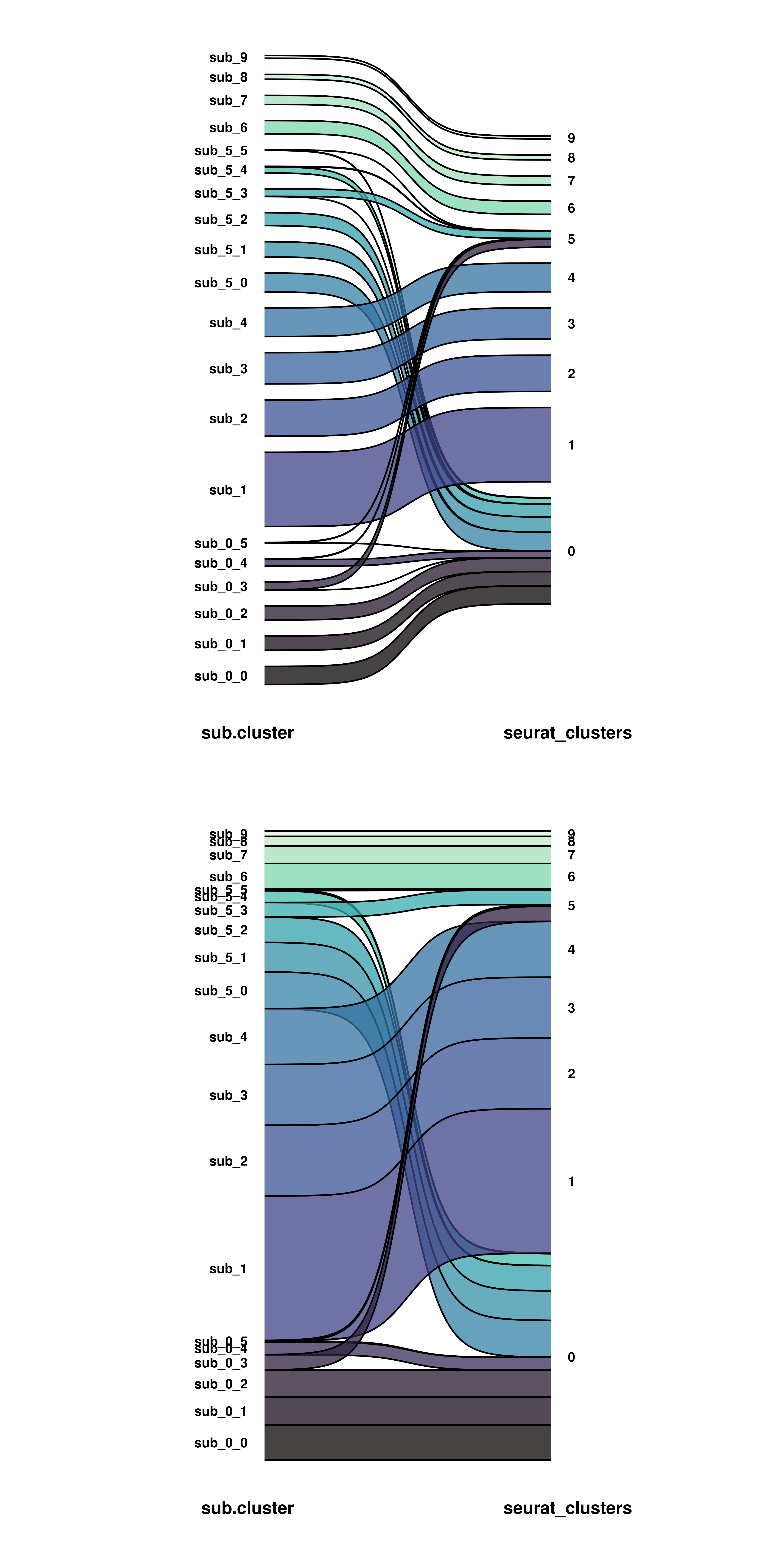
The key aspects of this figure is that one has to provide the starting and end groups to first_group and last_group parameters, and the type of plot to type, making it either alluvial or sankey. The major difference between both is simply that the alluvial plot has not space between the groups. This allows for a more compact visualization, although it can get quite messy depending on the colors. We can keep adding as many groups as we want in between by using middle_groups parameter.
sample$assignment <- ifelse(sample$seurat_clusters %in% c("0", "2", "4"), "A", "B")

# Add more groups.
p1 <- SCpubr::do_SankeyPlot(sample = sample,
                            first_group = "sub.cluster",
                            middle_groups = c("seurat_clusters", "assignment"),
                            last_group = "orig.ident",
                            type = "sankey")

p2 <- SCpubr::do_SankeyPlot(sample = sample,
                            first_group = "sub.cluster",
                            middle_groups = c("seurat_clusters", "assignment"),
                            last_group = "orig.ident",
                            type = "alluvial")

p <- p1 / p2
p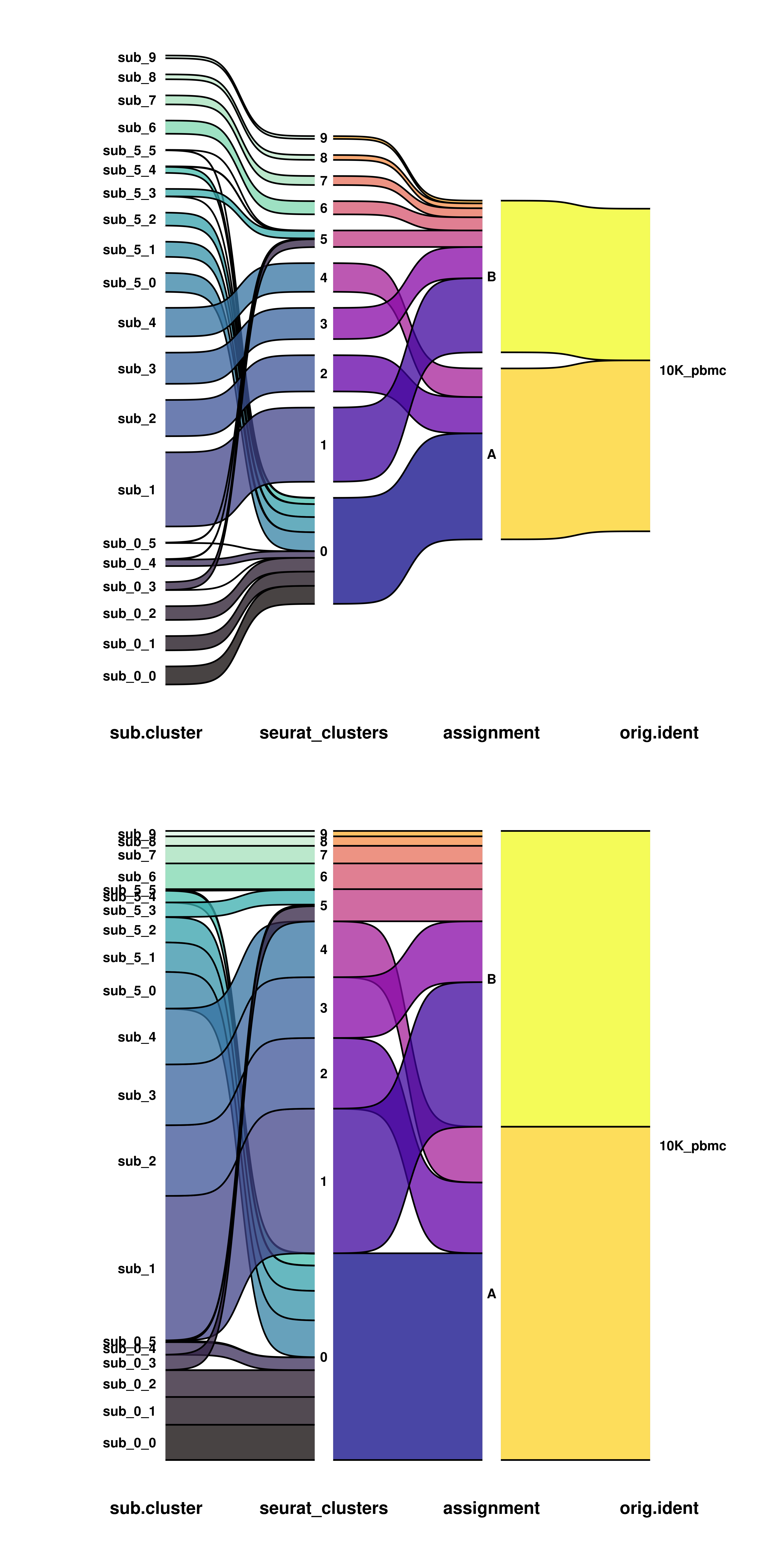
12.2 Modify node aesthetics
By default, the color of the nodes and the fill is white, so that they can not be seen. One Can modify this by using node.fill and node.color.
# Control the color and fill of the nodes.
p1 <- SCpubr::do_SankeyPlot(sample = sample,
                            first_group = "sub.cluster",
                            middle_groups = c("seurat_clusters", "assignment"),
                            last_group = "orig.ident",
                            type = "sankey",
                            node.fill = "grey95",
                            node.color = "black")

p2 <- SCpubr::do_SankeyPlot(sample = sample,
                            first_group = "sub.cluster",
                            middle_groups = c("seurat_clusters", "assignment"),
                            last_group = "orig.ident",
                            type = "alluvial",
                            node.fill = "grey95",
                            node.color = "black")

p <- p1 / p2
p
As can be seen, the text labels, then, overlap the limits of the nodes. We can fix that using the width parameter:
# Control the width of the nodes.
p1 <- SCpubr::do_SankeyPlot(sample = sample,
                            first_group = "sub.cluster",
                            middle_groups = c("seurat_clusters", "assignment"),
                            last_group = "orig.ident",
                            type = "sankey",
                            node.fill = "grey95",
                            node.color = "black")

p2 <- SCpubr::do_SankeyPlot(sample = sample,
                            first_group = "sub.cluster",
                            middle_groups = c("seurat_clusters", "assignment"),
                            last_group = "orig.ident",
                            type = "sankey",
                            node.fill = "grey95",
                            node.color = "black",
                            width = 0.5)

p <- p1 / p2
p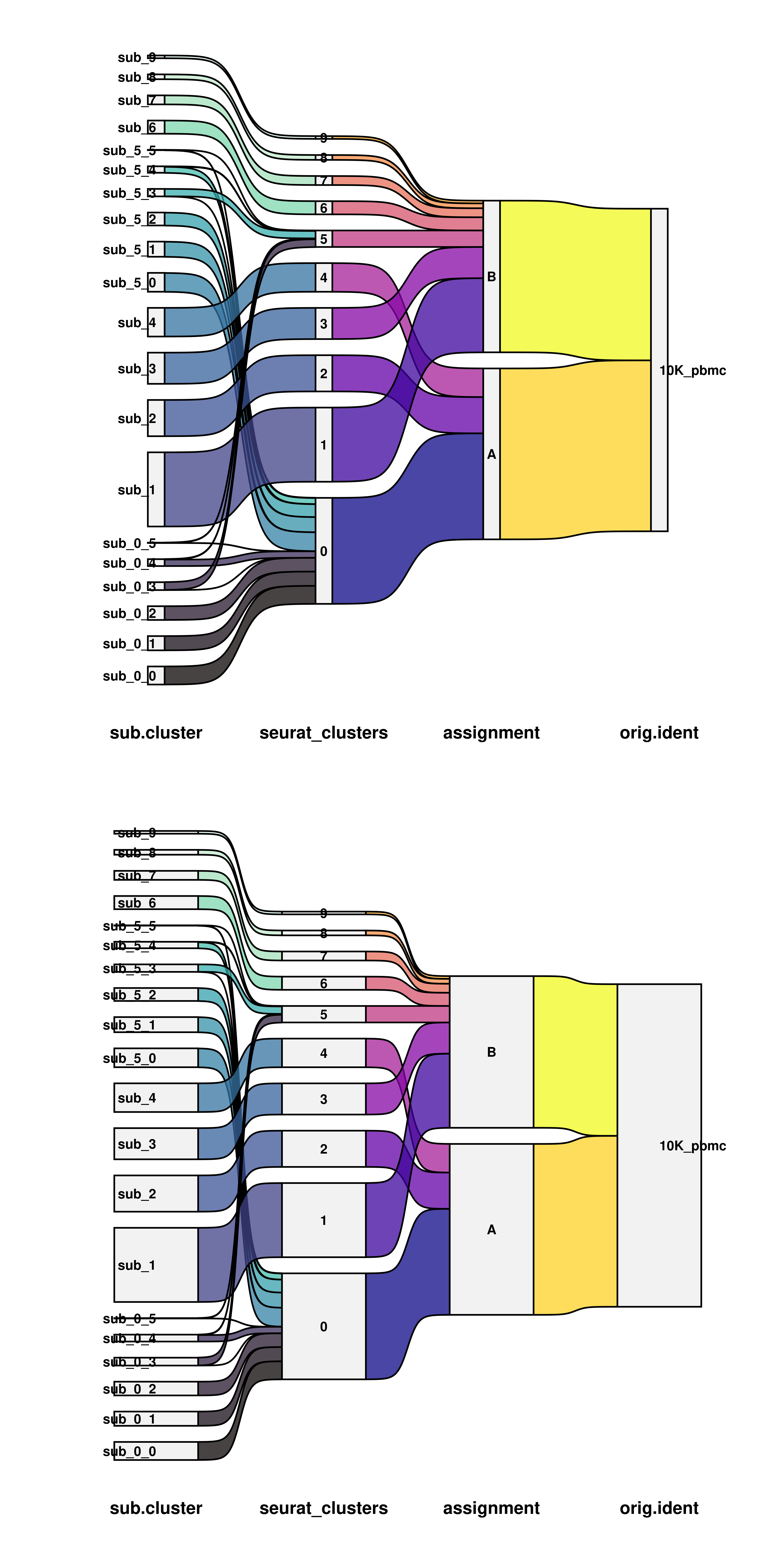
12.3 Control alignment of the labels
We can also control the alignment of the labels (goes different by the different groups by default) using the hjust parameter. This will modify it for all the nodes.
# Control the alignment of the labels.
p1 <- SCpubr::do_SankeyPlot(sample = sample,
                            first_group = "sub.cluster",
                            middle_groups = c("seurat_clusters", "assignment"),
                            last_group = "orig.ident",
                            type = "sankey",
                            node.fill = "grey95",
                            node.color = "black",
                            width = 0.5)

p2 <- SCpubr::do_SankeyPlot(sample = sample,
                            first_group = "sub.cluster",
                            middle_groups = c("seurat_clusters", "assignment"),
                            last_group = "orig.ident",
                            type = "sankey",
                            node.fill = "grey95",
                            node.color = "black",
                            width = 0.5,
                            hjust = 0.5)

p <- p1 / p2
p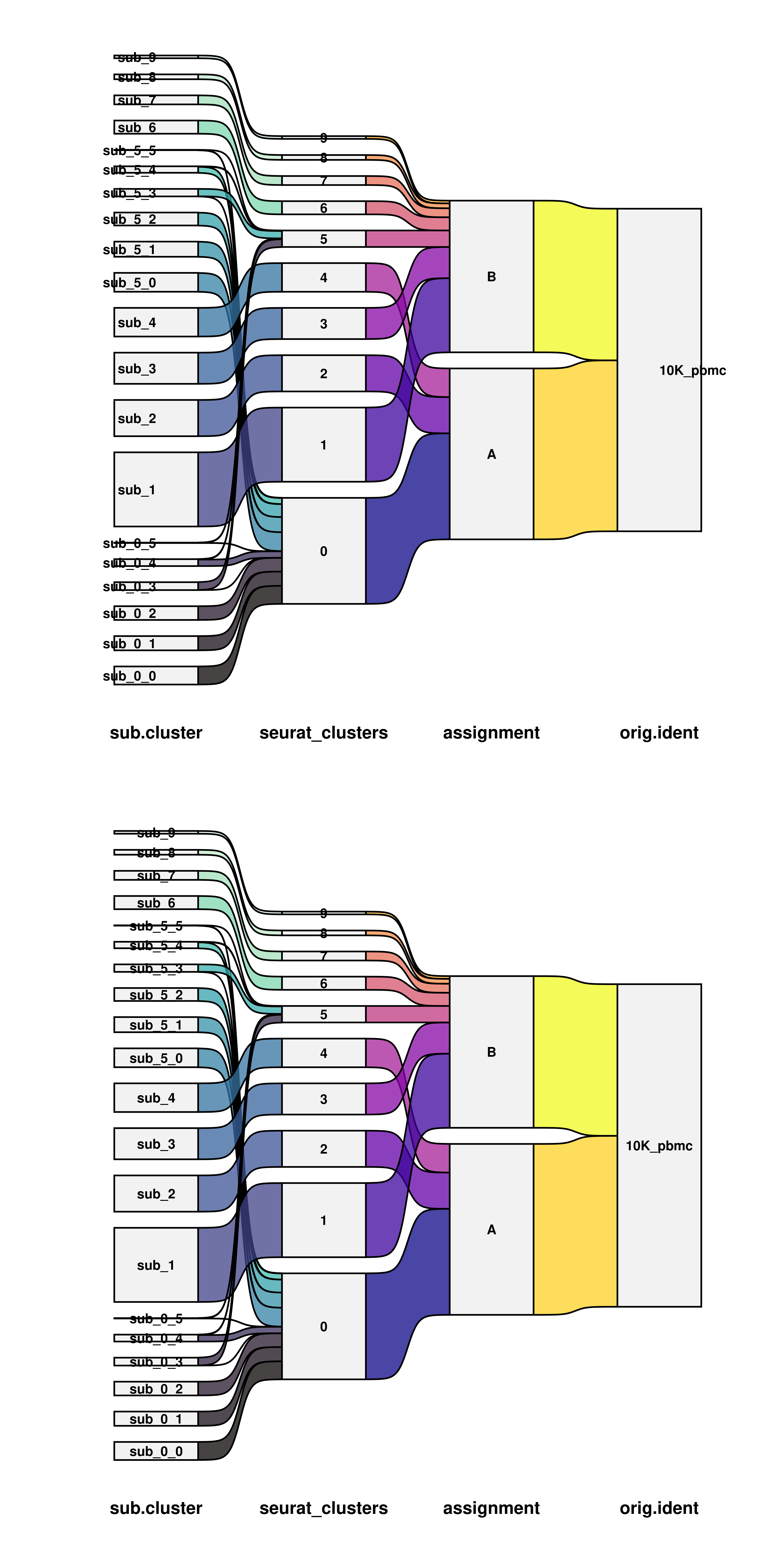
We can also turn the text into labels, which will then be colored based on the end nodes. We can toggle it by using use_labels = TRUE.
# Use text or labels for the nodes.
p1 <- SCpubr::do_SankeyPlot(sample = sample,
                            first_group = "sub.cluster",
                            middle_groups = c("seurat_clusters", "assignment"),
                            last_group = "orig.ident",
                            type = "sankey")

p2 <- SCpubr::do_SankeyPlot(sample = sample,
                            first_group = "sub.cluster",
                            middle_groups = c("seurat_clusters", "assignment"),
                            last_group = "orig.ident",
                            type = "sankey",
                            use_labels = TRUE,
                            text_color = "white")

p <- p1 / p2
p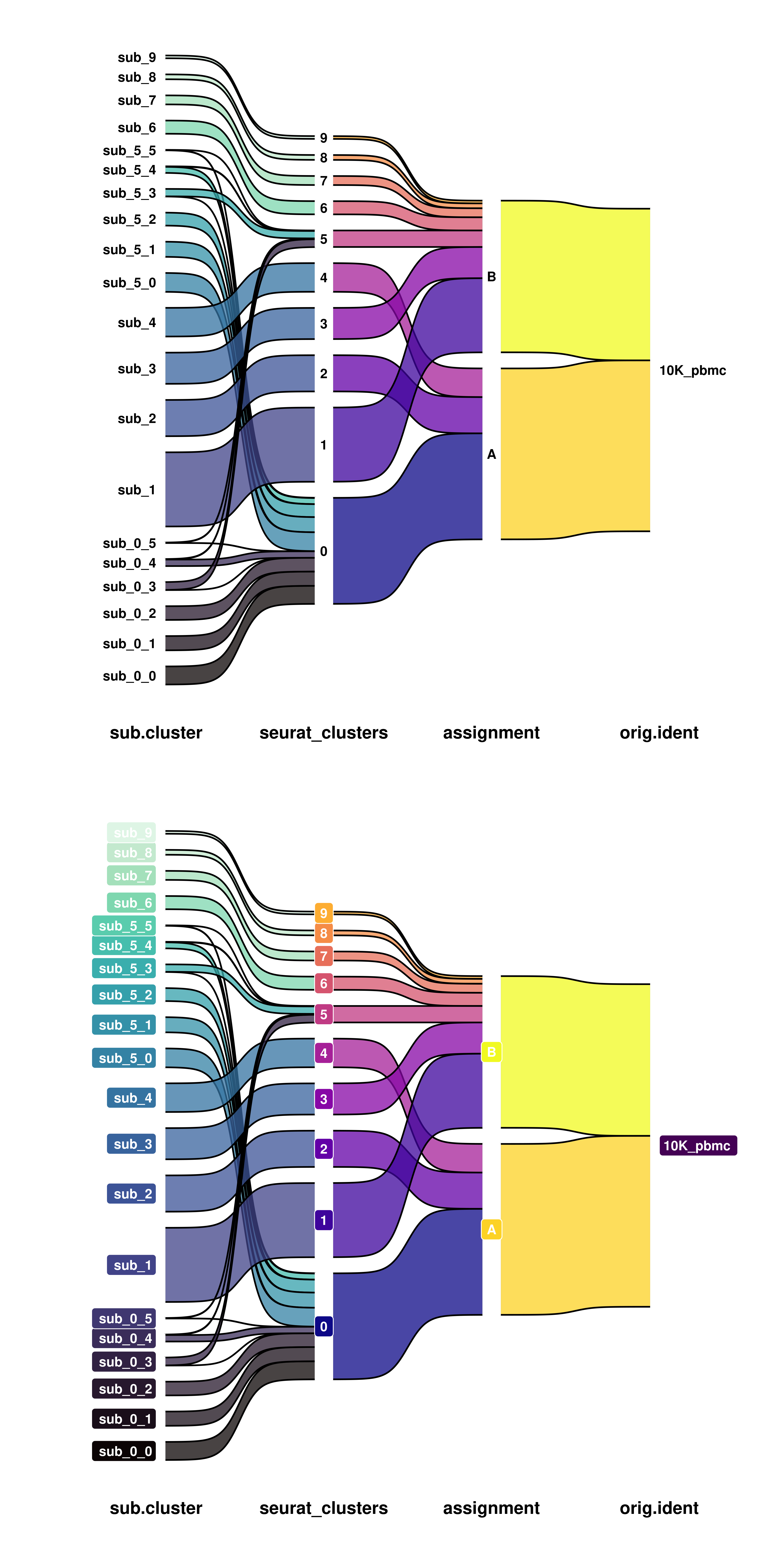
12.4 Increase the gap between the nodes
One can also increase the gaps between the nodes. This is done by providing a number to space. This number would act as “invisible” cells in between the nodes. So one needs to think in terms of how many cells do we have in our dataset. The bigger the dataset, the higher the number we need to notice a difference. It is set by default to 5% of the total number of cells in the dataset.
# Modify the space between nodes.
p1 <- SCpubr::do_SankeyPlot(sample = sample,
                            first_group = "sub.cluster",
                            middle_groups = c("seurat_clusters", "assignment"),
                            last_group = "orig.ident",
                            type = "sankey",
                            space =  1000)

p2 <- SCpubr::do_SankeyPlot(sample = sample,
                            first_group = "sub.cluster",
                            middle_groups = c("seurat_clusters", "assignment"),
                            last_group = "orig.ident",
                            type = "sankey",
                            space = 5000)

p <- p1 / p2
p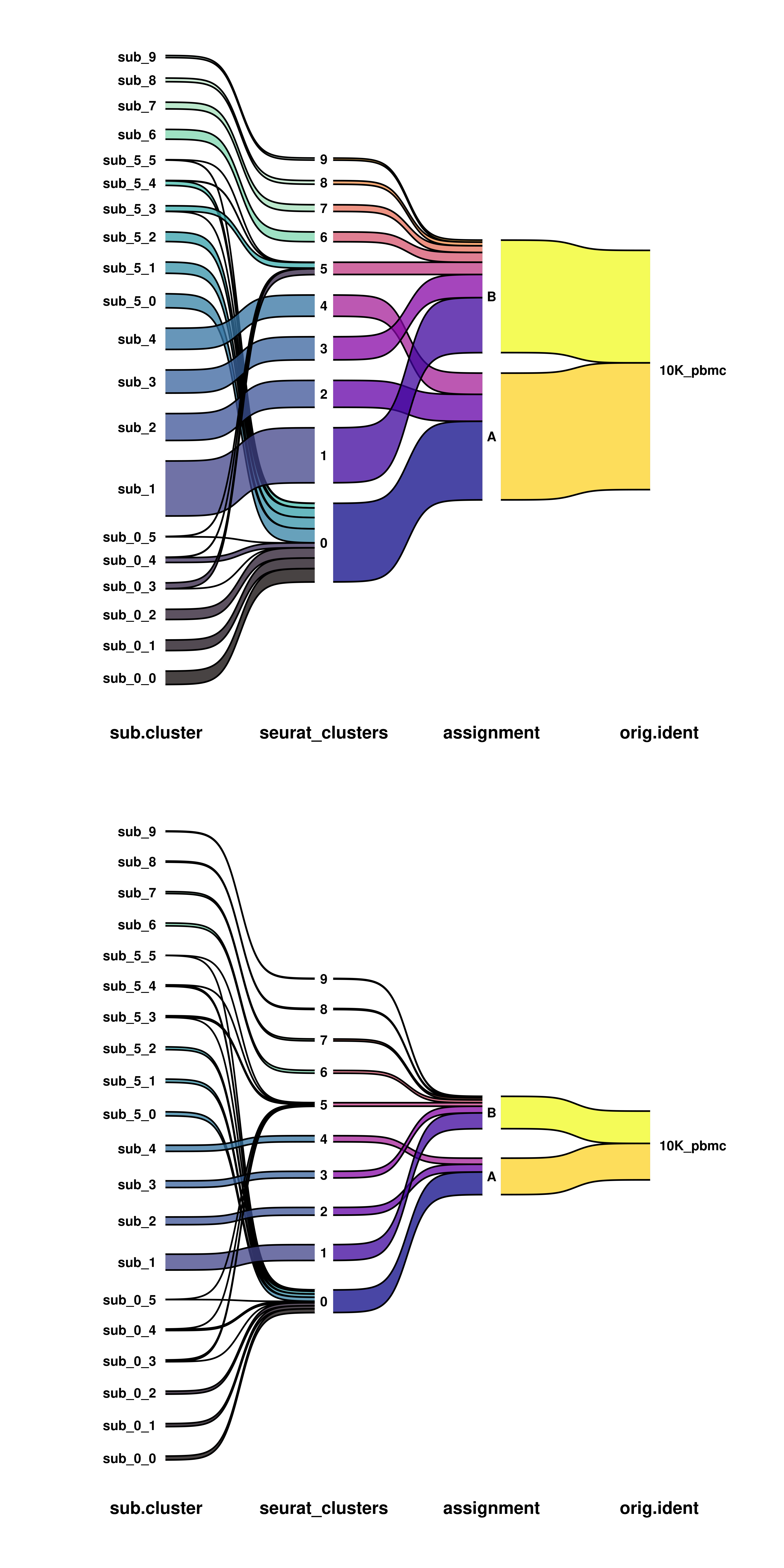
12.5 Modify default colors
Finally, we can modify the default colors by providing our own to colors.first, colors.middle and colors.last. It has to be a named vector with
# Modify default colors.
colors.first <- SCpubr::do_ColorPalette(colors.use = "steelblue",
                                        n = length(unique(sample$sub.cluster)))
names(colors.first) <- unique(sample$sub.cluster)

p <- SCpubr::do_SankeyPlot(sample = sample,
                           first_group = "sub.cluster",
                           middle_groups = c("seurat_clusters", "assignment"),
                           last_group = "orig.ident",
                           type = "sankey",
                           colors.first = )
p