2 Feature plots
Another flagship function in Seurat is Seurat::FeaturePlot(). It is basically the counterpart of Seurat::DimPlot() which, instead of coloring the cells based on a categorical color scale, it uses a continuous scale instead, according to a variable provided by the user. This can range from gene expression, to metadata variables such as the number of genes, or even values such as a principal component.
2.1 Basic usage
This is SCpubr’s take on Seurat::FeaturePlot():
# Seurat's Feature Plot.
p1 <- Seurat::FeaturePlot(sample,
                          features = "PC_1")

# SCpubr's Feature Plot.
p2 <- SCpubr::do_FeaturePlot(sample = sample,
                             features = "PC_1")

p <- p1 | p2
p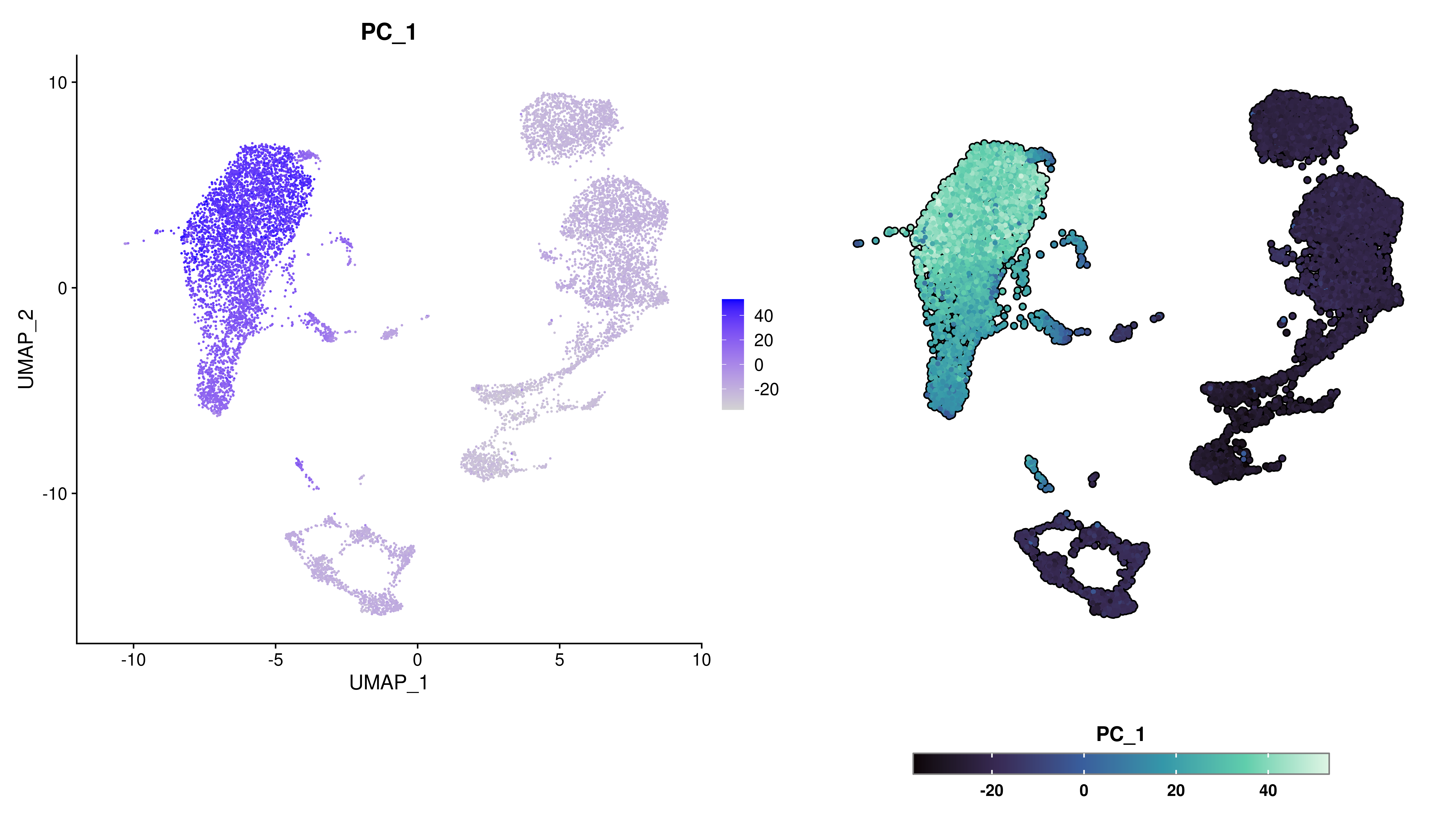
By default, SCpubr::do_FeaturePlot() enlarges the dots a bit and modifies the legend, to better stand out. Even though axes are removed from UMAP reductions, the title for the axes is kept for any other reduction used. The same is applied for UMAP if the default dimension order is altered.
# Use case with PCA embedding.
p1 <- SCpubr::do_FeaturePlot(sample = sample,
                             features = "CD14",
                             plot.title = "Plotting PCA coordinates",
                             reduction = "pca")

# Use case with non-canonical dimensions.
p2 <- SCpubr::do_FeaturePlot(sample = sample,
                             features = "CD14",
                             plot.title = "Plotting UMAP coordinates in a different order",
                             dims = c(2, 1))

p <- p1 | p2
p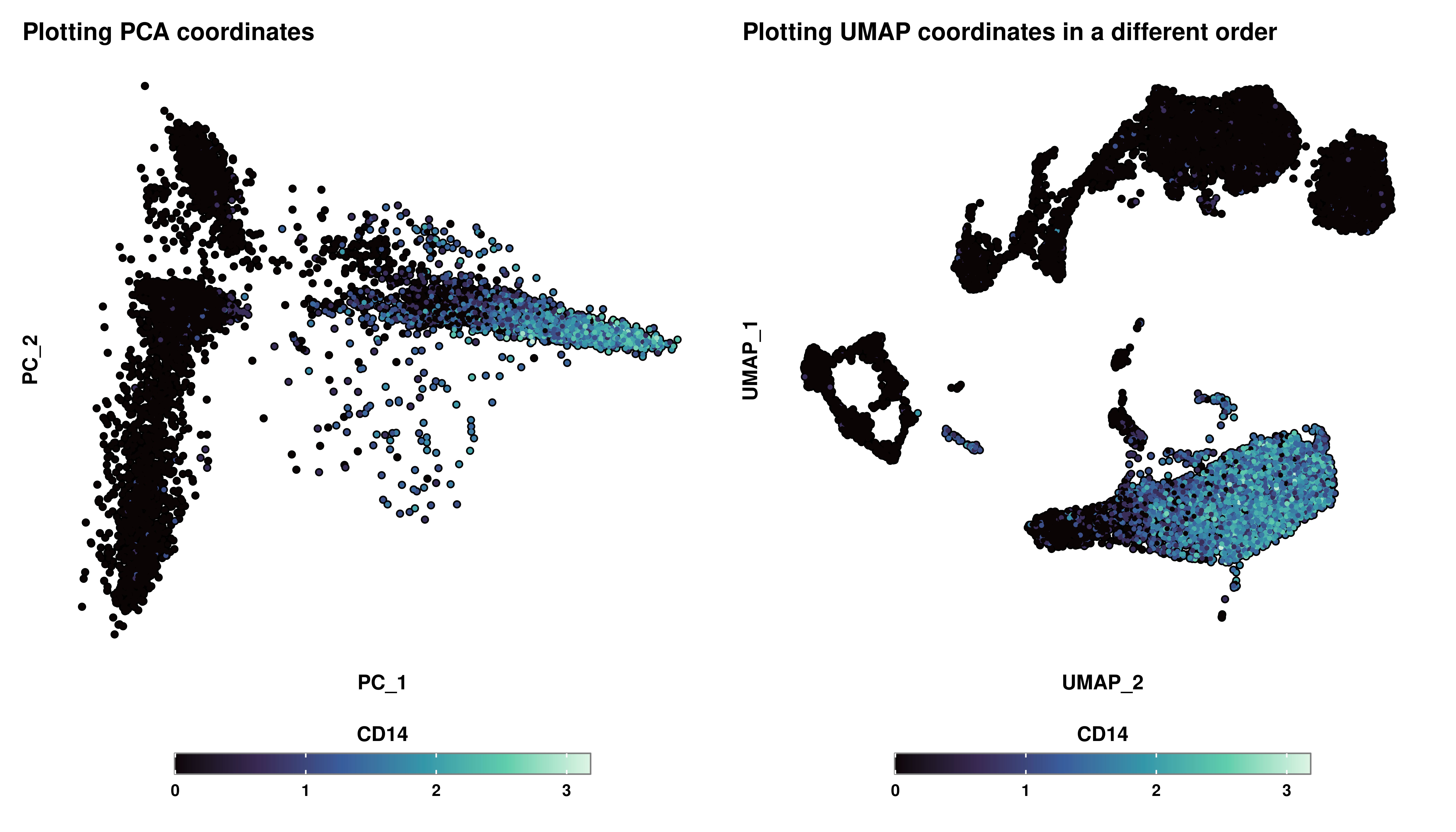
2.2 Multiple features
SCpubr::do_FeaturePlot() can tackle multiple queries at the same time. Plots can be rearranged as desired with ncol parameter:
p <- SCpubr::do_FeaturePlot(sample, features = c("nCount_RNA",
                                                 "nFeature_RNA",
                                                 "percent.mt",
                                                 "CD14"),
                            plot.title = "A collection of features",
                            ncol = 2)

p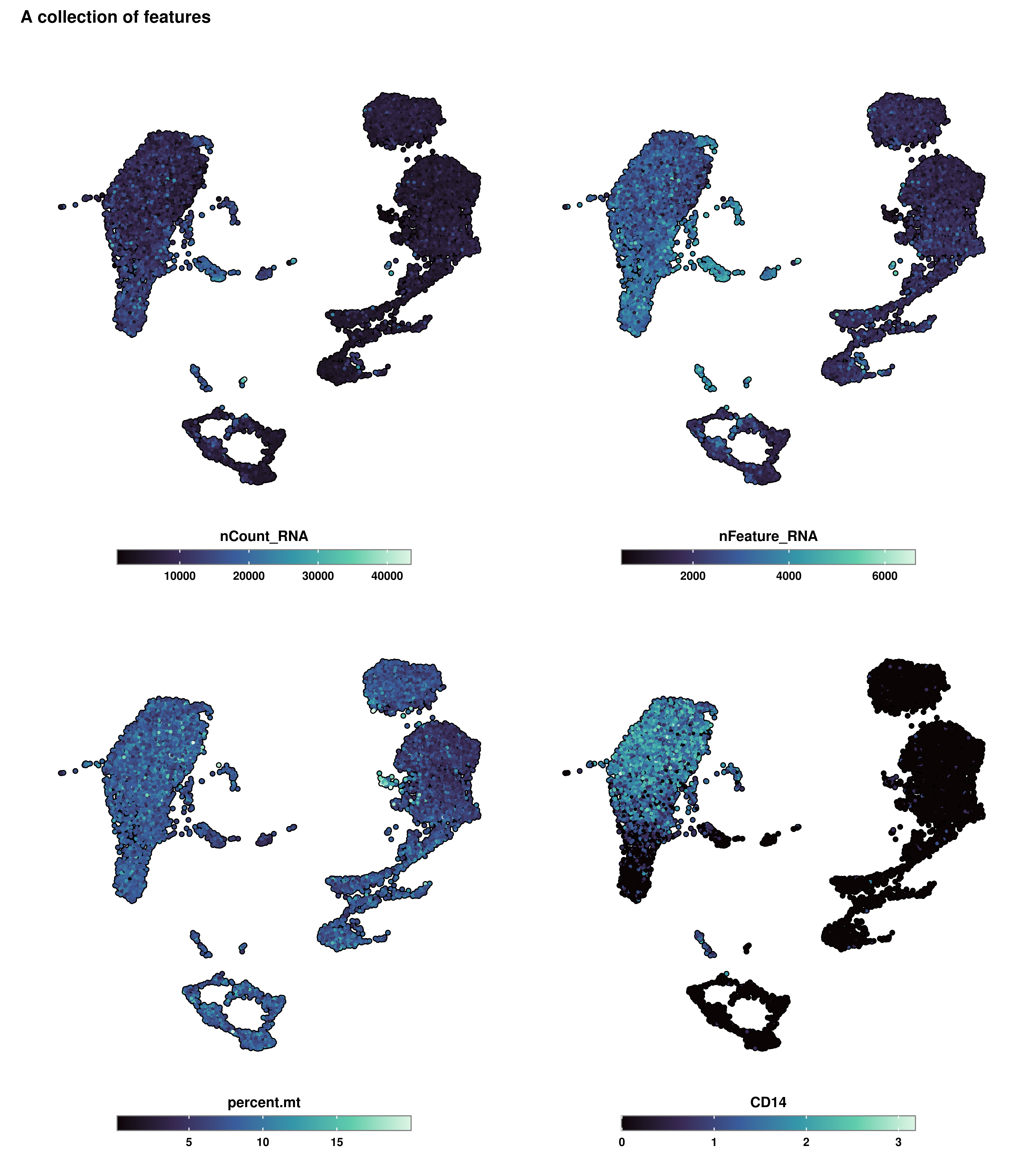
2.3 Limit the color scale to a max and min values
Similar to what Seurat does with the min.cutoff and max.cutoff parameter, this feature will be availble in a future update. In the meantime, please refer to this hotfix.
2.4 Working with subsets of cells
One of the things that can be misleading is that it could be the case that a very specific subset of cells are driving the ends of the color scales. Let’s say that we have identified that clusters 2, 5, and 8 are responsible for this behavior. We would like to plot the values without taking those cells into consideration. The very first thing that comes to mind is, indeed, removing the cells completely, resulting in the following:
cells.plot <- colnames(sample[, !(sample$seurat_clusters %in% c("2", "5", "8"))])

p <- SCpubr::do_FeaturePlot(sample[, cells.plot],
                            features = c("CD14"))

p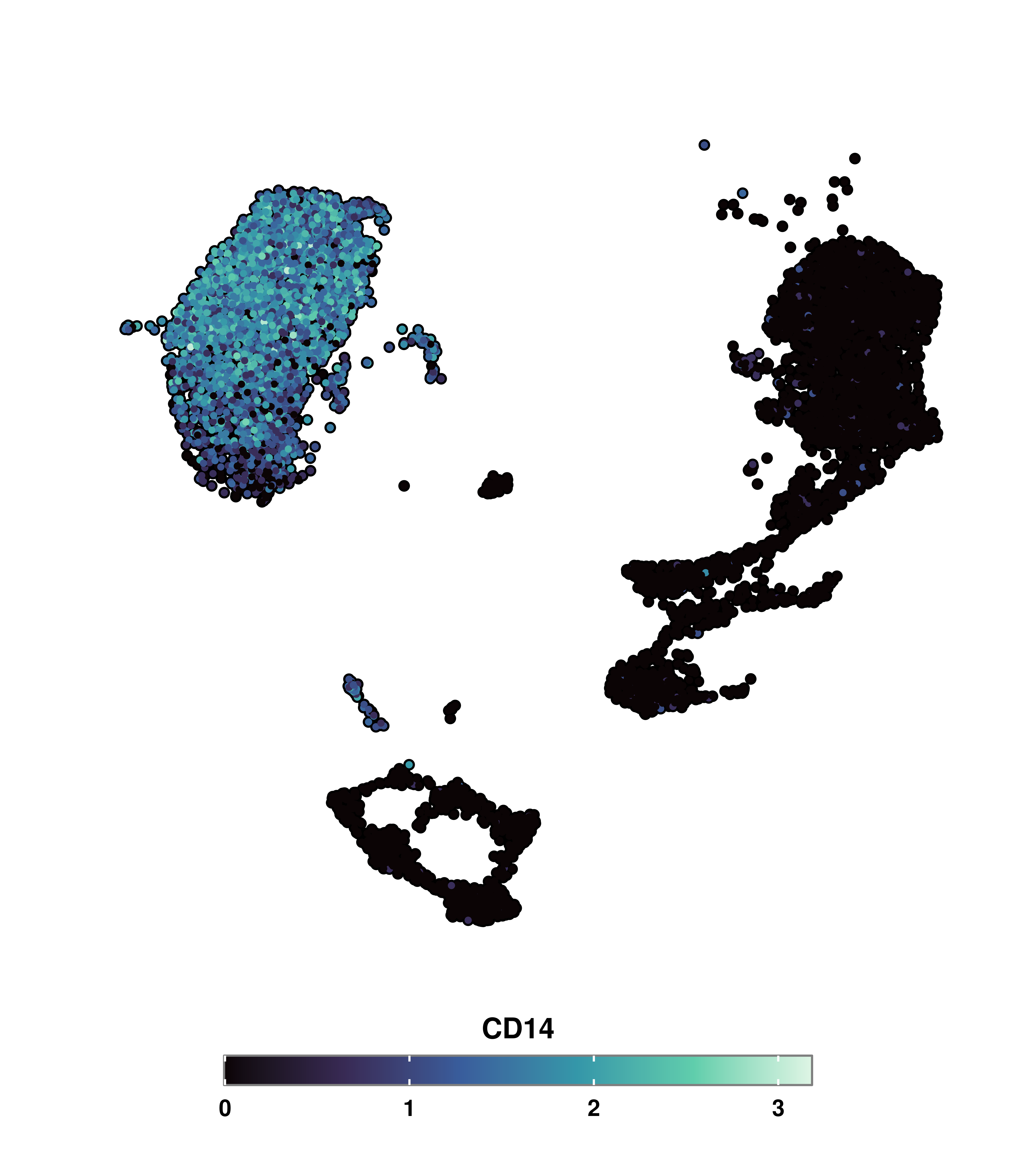
However, this falls back to the same problem as with Seurat::DimPlot with the split.by parameter. We lose the overall context of where the cells are, as we lost the original UMAP silhouette. This can be fixed by using the cells.highlight parameter:
# Using cells.highlight parameter to select the cells we want to include in the plot.
p <- SCpubr::do_FeaturePlot(sample = sample,
                            cells.highlight = cells.plot,
                            features = c("CD14"))

p
This way, by adding the cells back and modifying the legend, we accomplish the desired effect. Furthermore, SCpubr::do_FeaturePlot() also accepts a vector of the identities to plot, as long as they are part of levels(seurat_object). This can be achieved by using the idents.highlight instead.
2.5 Splitting the FeaturePlot by a variable
In some cases, we want to visualize a given feature, let’s say, the expression of LYN across another variable, for instance seurat_clusters. This can be achieved easily in Seurat by using the split.by parameter. For the sake of representation, let’s reduce the number of clusters.
# Group clusters into three values for visualization purposes.
sample$new_clusters <- as.character(sample$seurat_clusters)
sample$new_clusters[sample$new_clusters %in% c("0", "1", "2", "3")] <- "Cluster 1"
sample$new_clusters[sample$new_clusters %in% c("4", "5", "6")] <- "Cluster 2"
sample$new_clusters[sample$new_clusters %in% c("7", "8", "9")] <- "Cluster 3"

# Seurat Feature Plot using split.by.
p <- Seurat::FeaturePlot(sample,
                         features = "LYN",
                         split.by = "new_clusters")
p
Apart from the general aesthetic discrepancies mentioned before, there are two main aspects missing. First, is the loss of the UMAP silhouette. Secondly, knowing that, by default, the color scale is shared across all the plots, we would like to know the range of values this color scale is displaying. In this two aspects is where SCpubr::do_FeaturePlot() delves into:
# SCpubr Feature Plot using split.by
p <- SCpubr::do_FeaturePlot(sample = sample,
                            features = "LYN",
                            split.by = "new_clusters")

p
We can even subset the previous plot to any set of identities in split.by we are particularly interested in. The color scale also limits itself to contain only the values in the selected identities. This can be achieved by provided a vector with the identities to split.by.idents parameter.
# Using split.by.idents parameter alongside split.by.
p <- SCpubr::do_FeaturePlot(sample,
                            features = c("LYN"),
                            split.by = "seurat_clusters",
                            split.by.idents = c("2", "5"))

p
2.6 Subset the color scale to a minimum and maximum
The color scale can be restricted to minimum and maximum values using min.cutoff and max.cutoff:
# Use min.cutoff and max.cutoff.
p1 <- SCpubr::do_FeaturePlot(sample,
                             features = c("LYN"))

p2 <- SCpubr::do_FeaturePlot(sample,
                             features = c("LYN"),
                             min.cutoff = 1,
                             max.cutoff = 2)
p <- p1 | p2
p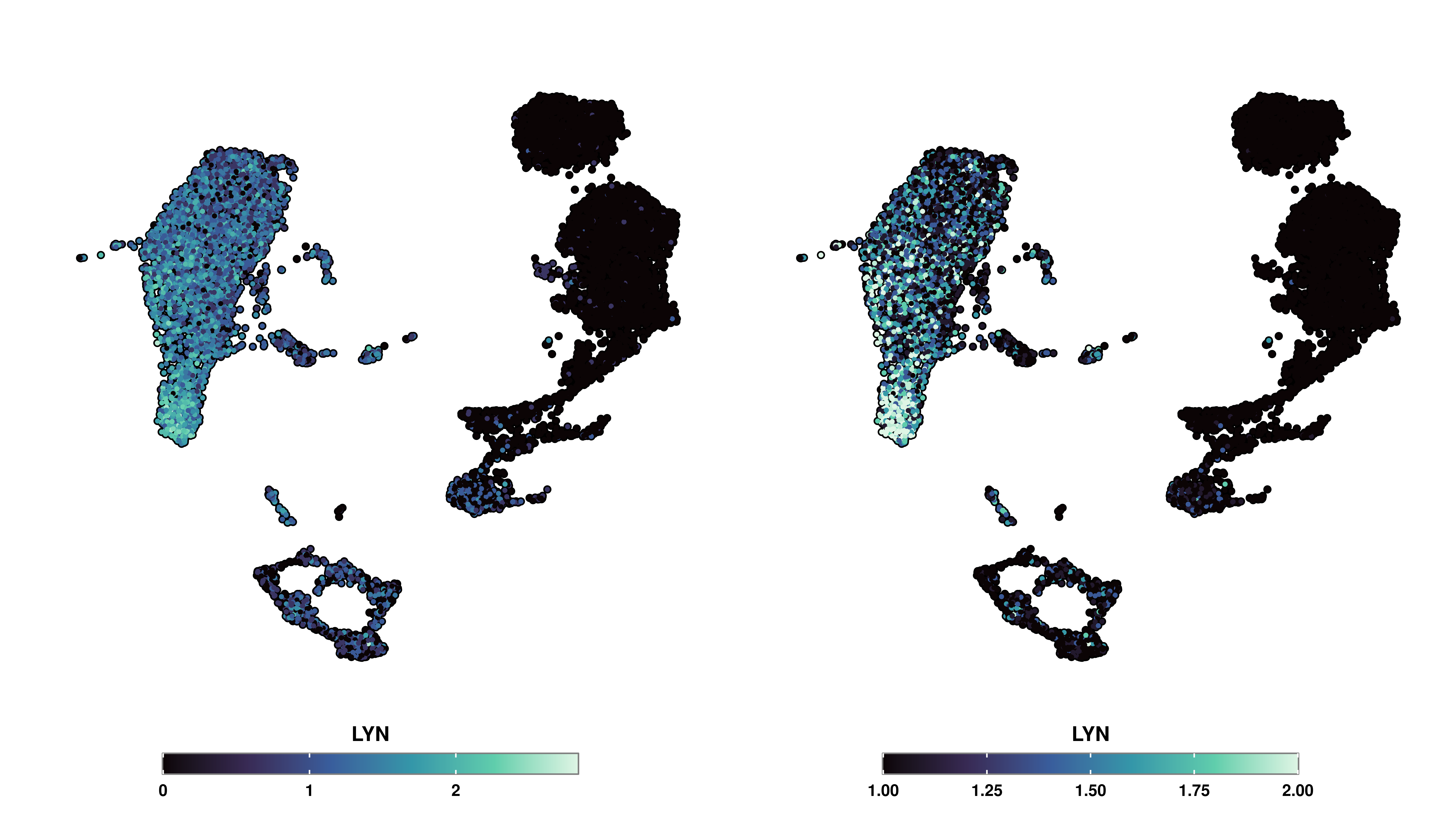
However, it is important to note that cells outside the range of min.cutoff and max.cutoff have their values modified to either min.cutoff or max.cutoff. Therefore, it is important to take this into account when using this functionality, that the end colors of the continuous scale represent cells outside the desired range, and not the actual values. This is specially important for the values below min.cutoff, as it may seem that the cells are not expressed when they truly might be.
2.7 Apply symmetrical color scales
There are times in which we want to color the Feature plot using a two-end continuous color scale. We can achieve this by using enforce_symmetry = TRUE:
# Enforce two-end symmetrical color scale.
p1 <- SCpubr::do_FeaturePlot(sample,
                             features = "PC_1",
                             enforce_symmetry = FALSE)

p2 <- SCpubr::do_FeaturePlot(sample,
                             features = "PC_1",
                             enforce_symmetry = TRUE)

p <- p1 | p2
p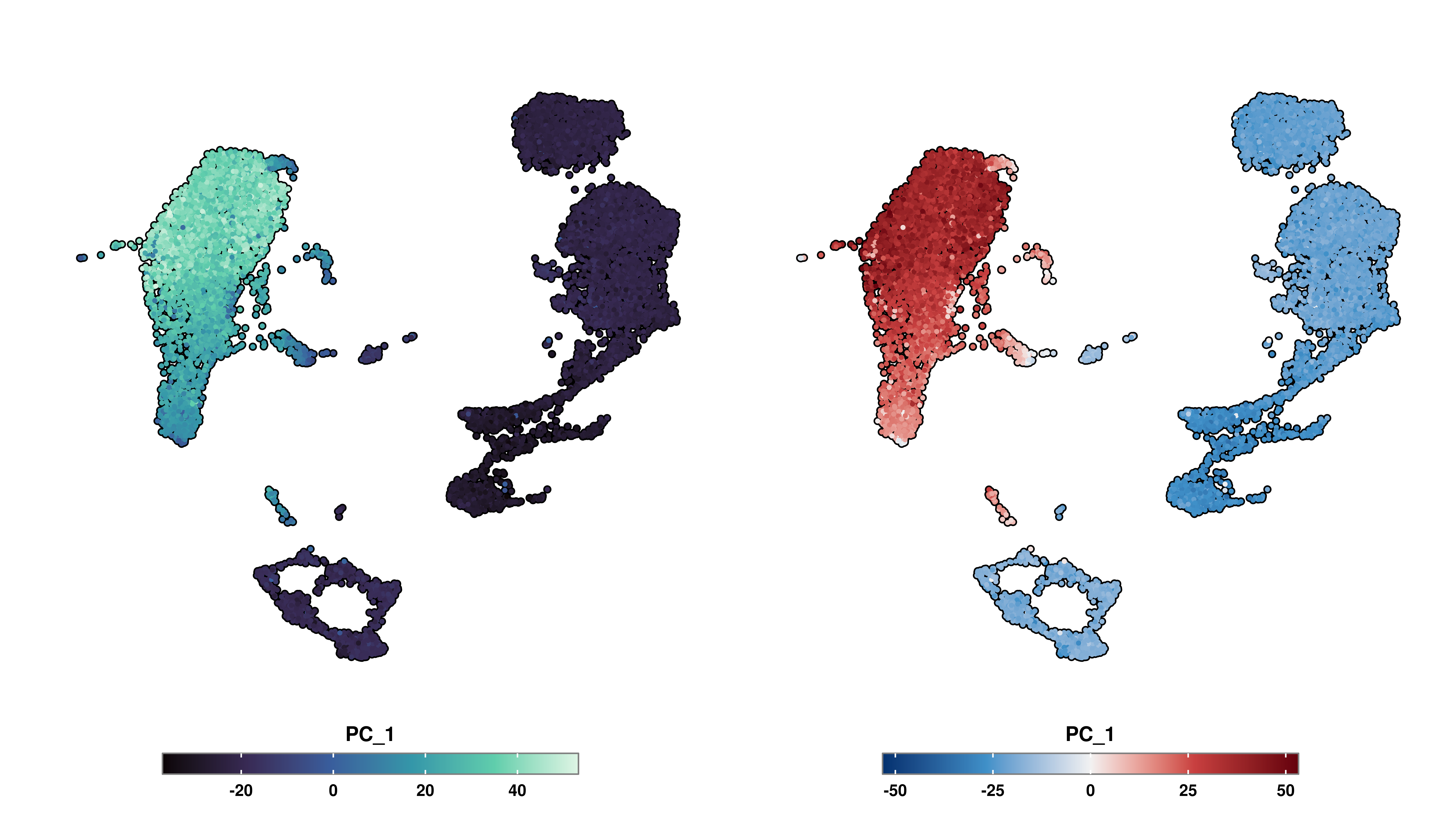
As one can observe, this parameters sets a scale centered around 0, with the two ends being of the same value. This allows for direct comparison between the colors.
