22 Cellular State Plots
These plots are, on their bare basis, scatter plots. As of today, I am not completely sure if this is the correct name for the plot, but I will follow the name provided to such plot in Neftel, et al, 2019. The core concept of the function computing these plots, SCpubr::do_CellularStatesPlot() is that you only need a Seurat object and a named list of gene signatures. With this, the function will compute enrichment scores using Seurat::AddModuleScore() and store them as metadata in the object, that will be use for the plotting later on. That is why, alongside the list of gene signatures, the user needs to provide the names of the lists to be plotted as arguments.
gene_set <- list("A" = Seurat::VariableFeatures(sample)[1:10],
                 "B" = Seurat::VariableFeatures(sample)[11:20],
                 "C" = Seurat::VariableFeatures(sample)[21:30],
                 "D" = Seurat::VariableFeatures(sample)[31:40])
22.1 Two variable plots
This is the easiest case. For this, the user needs to provide the name of two gene signatures present in the list of genes provided to input_gene_list parameter: - x1: The enrichment scores computed for this list will be displayed on the X axis. - y1: The enrichment scores computed for this list will be displayed on the Y axis.
# 2 Variables
p <- SCpubr::do_CellularStatesPlot(sample = sample,
                                   input_gene_list = gene_set,
                                   x1 = "A",
                                   y1 = "B")
p
This way, we can see how much effect gene set A has with regards to gene set B. One can further enforce some symmetry in the plot with enforce_symmetry = TRUE.
p <- SCpubr::do_CellularStatesPlot(sample = sample,
                                   input_gene_list = gene_set,
                                   x1 = "A",
                                   y1 = "B",
                                   enforce_symmetry = TRUE)
p
22.2 Three variable plots
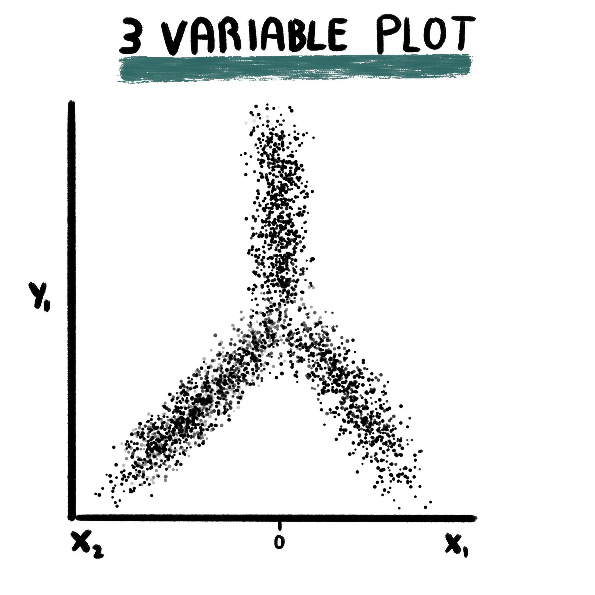
This plot is retrieved from Tirosh, et al, 2016 and plot requires the user to provide three gene sets, for which enrichment scores are computed using Seurat::AddModuleScore. For the X axis, two gene sets are assigned to it. Cells will be placed towards the right if they are enriched in x1 and towards the left if they are enriched in x2. This is decided by, first, retrieving the enrichment scores for both lists and keeping the highest out of the two. The score will turn positive or negative depending on the gene list for which the highest enrichment score belonged to: positive for x1 and negative for x2. For the Y axis. one gene set is provided. The value for the Y axis is computed by subtracting to the enrichment scores for y1 the value for the X axis.
This plot makes a lot of sense, as showcased by Tirosh, et al, 2016, when the Y axis shows a differentiation trajectory. This is, it contains enrichment scores for stemness genes. Therefore, the lower on the Y axis, the less stem a given cell is. On the X axis, cells will order depending on whether they are enriched more in x1 or x2. the more extreme the value on the X axis, the more differentiated towards the given list of genes the cell will be.
p <- SCpubr::do_CellularStatesPlot(sample = sample,
                                   input_gene_list = gene_set,
                                   x1 = "A",
                                   y1 = "B",
                                   x2 = "C")
p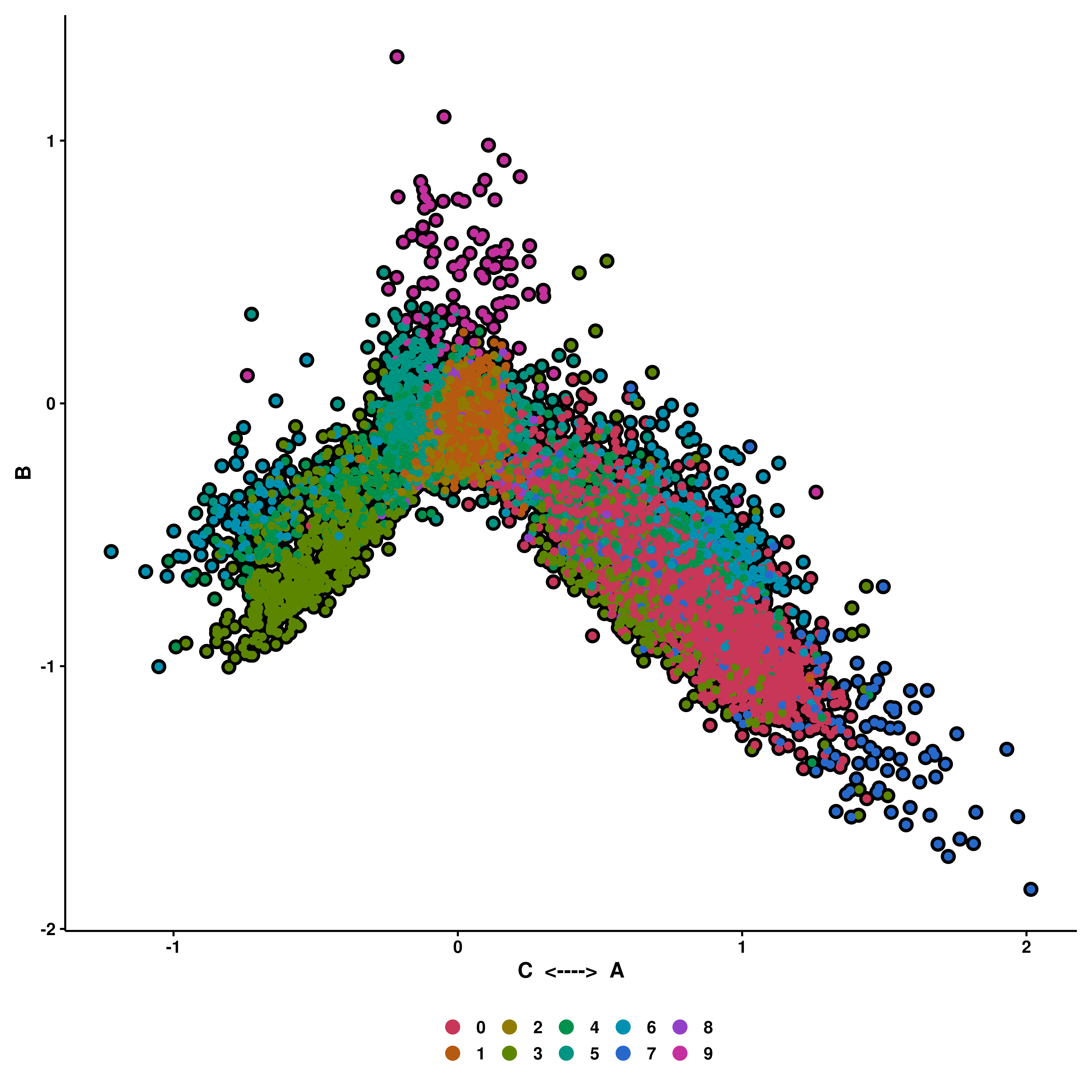
If enforce_symmetry is set to true, the X axis will have 0 as middle point.
p <- SCpubr::do_CellularStatesPlot(sample = sample,
                                   input_gene_list = gene_set,
                                   x1 = "A",
                                   y1 = "B",
                                   x2 = "C",
                                   enforce_symmetry = TRUE)
p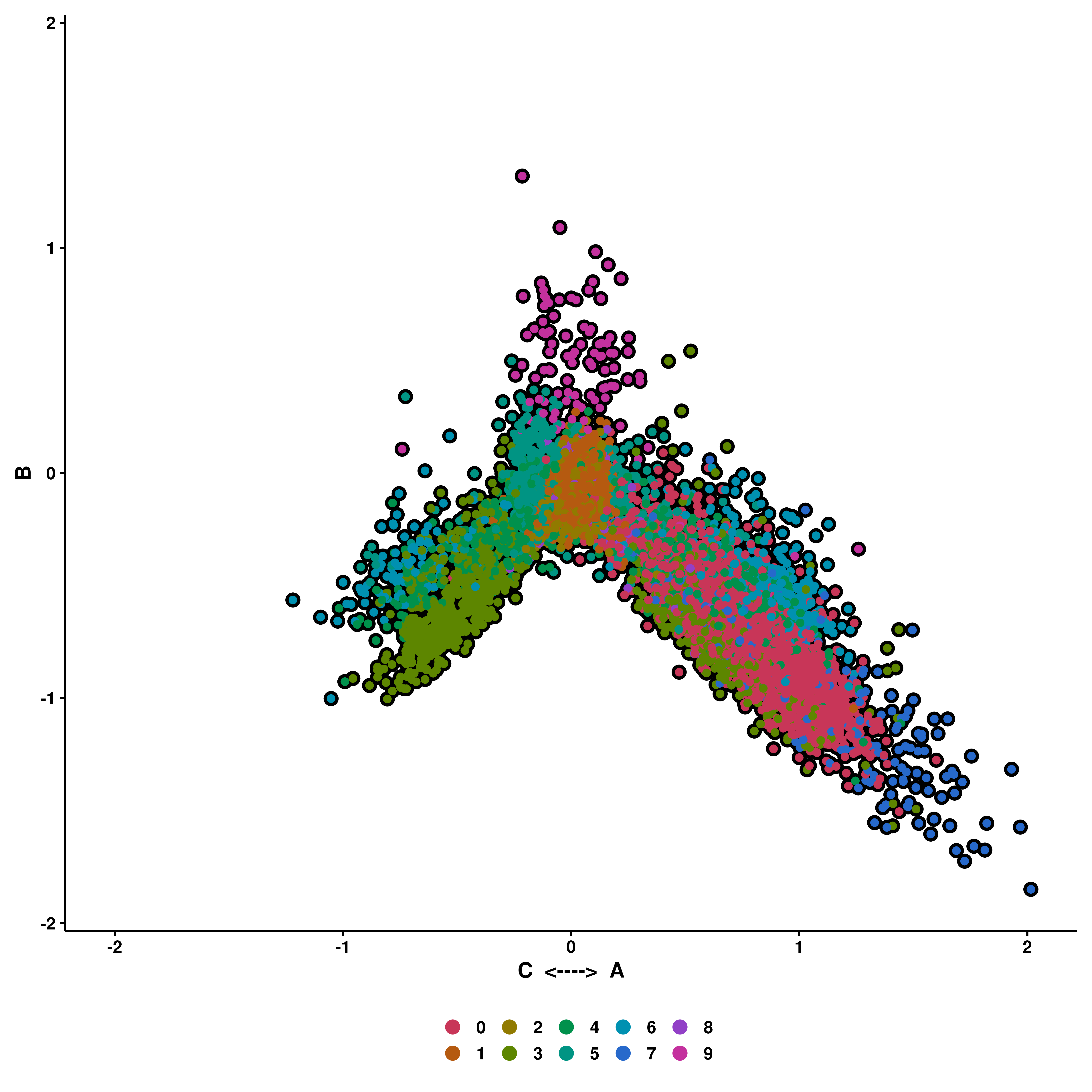
22.3 Four variable plots
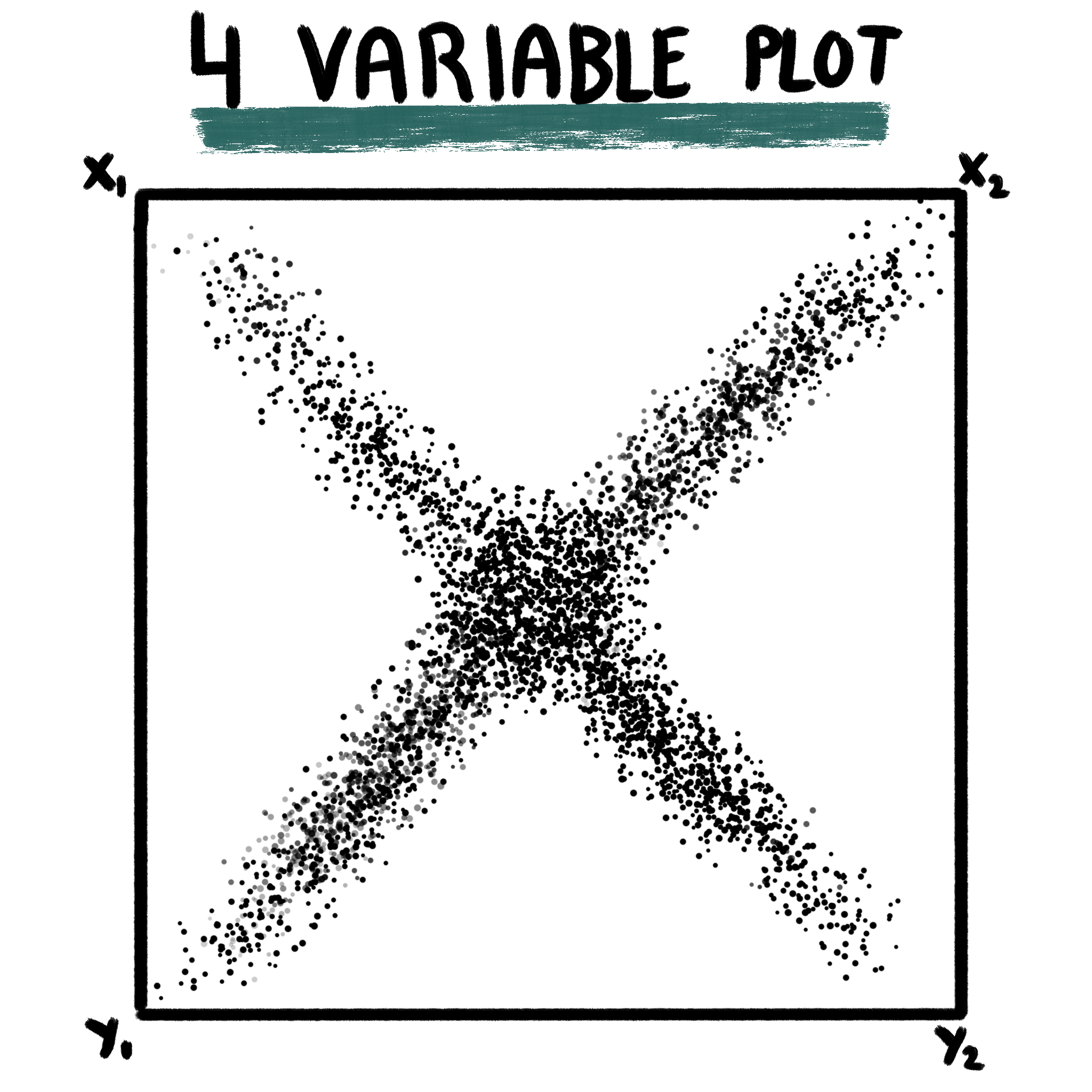
This the most complicated variant of the plot, retrieved from Neftel, et al, 2019. This makes use of four gene sets: x1, x2, y1 and y2. As a general, brief description, enrichment scores are computed for all 4 gene sets and the cells will locate in the resulting figure according to the list they are most enriched on, towards a given corner, following the scheme shown above.
This is achieved by assuming: - x1 and x2 are connected, so are y1 and y2. The first step will be to decide which the highest score out of x1-x2 and y1-y2, which will locate the cells either on the upper or lower half (Y axis). - Then, for the X axis, and depending on whether the score for the Y axis is positive or negative, the values will be computed as the log2 logarithm of the absolute of the difference in enrichment scores plus 1: log2(abs((x1 or y1) - (x2 or y2)) + 1). The resulting value will be positive or negative depending on whether the score for x1 or y1 is higher or lower than the score for x2 or y2.
p <- SCpubr::do_CellularStatesPlot(sample = sample,
                                   input_gene_list = gene_set,
                                   x1 = "A",
                                   y1 = "C",
                                   x2 = "B",
                                   y2 = "D")
p
If enforce_symmetry is set to true, then the plot is completely squared.
p <- SCpubr::do_CellularStatesPlot(sample = sample,
                                   input_gene_list = gene_set,
                                   x1 = "A",
                                   y1 = "C",
                                   x2 = "B",
                                   y2 = "D",
                                   enforce_symmetry = TRUE)
p
22.4 Continuous features
In addition to all the above, one can also further query the resulting plot for any other feature that would be accepted in a regular SCpubr::do_FeaturePlot(). The plots are returned alongside the original one. This behavior is achieved by using plot_features = TRUE and providing the desired features to features parameter.
# Plot continuous features.
out <- SCpubr::do_CellularStatesPlot(sample = sample,
                                     input_gene_list = gene_set,
                                     x1 = "A",
                                     y1 = "C",
                                     x2 = "B",
                                     y2 = "D",
                                     plot_cell_borders = TRUE,
                                     enforce_symmetry = TRUE,
                                     plot_features = TRUE,
                                     features = c("PC_1", "nFeature_RNA"))
p <- out$main | out$PC_1 | out$nFeature_RNA
p
Furthermore, the original list of genes queried can be also plotted as enrichment scores. This can be achieved by plot_enrichment_scores = TRUE:
# Plot enrichment scores for the input gene lists.
out <- SCpubr::do_CellularStatesPlot(sample = sample,
                                     input_gene_list = gene_set,
                                     x1 = "A",
                                     y1 = "C",
                                     x2 = "B",
                                     y2 = "D",
                                     plot_cell_borders = TRUE,
                                     enforce_symmetry = TRUE,
                                     plot_enrichment_scores = TRUE)
layout <- "AABC
           AADE"
p <- patchwork::wrap_plots(A = out$main,
                           B = out$A,
                           C = out$B,
                           D = out$C,
                           E = out$D,
                           design = layout)
p