p <- SCpubr::do_FeaturePlot(sample = sample,
                            features = "PC_1")
p
Directly opposed to categorical Dimensional Reduction plot, we can also map a continuous variable to the cells, resulting what we commonly refer as Feature plots. This is, because we are mapping a feature onto the cells. This can be anything: from gene expression, to metadata variables such as the number of genes, or even values such as a principal component. All this, can be computed using SCpubr::do_FeaturePlot().
p <- SCpubr::do_FeaturePlot(sample = sample,
features = "PC_1")
p
More than one features can be used at the same time.
p <- SCpubr::do_FeaturePlot(sample = sample,
                            features = c("PC_1", "PC_2"))
p
More often than not, we encounter that very few cells are driving the color axis. Very few cells with very high values will inevitably comprise the cells in a very limited color range due to their values. For this, we can manually set up the limits by using min.cutoff and max.cutoff.
p1 <- SCpubr::do_FeaturePlot(sample = sample,
                             features = "PC_1",
                             min.cutoff = 0)

p2 <- SCpubr::do_FeaturePlot(sample = sample,
                             features = "PC_1",
                             max.cutoff = 0)
p <- p1 | p2
p
We can also restrict which cells are taken into account for the plot and grey out the rest. This is specially important if we want to inspect population-wise patterns of expression, for instance.
# Use a vector of cells
p1 <- SCpubr::do_FeaturePlot(sample = sample,
                             features = c("PC_1"),
                             cells.highlight = sample(colnames(sample), 500))

# Select identities.
p2 <- SCpubr::do_FeaturePlot(sample = sample,
                             features = c("PC_1"),
                             idents.highlight = c("0", "2", "5"))
p <- p1 | p2
p
A combination of cells.highlight and idents.highlight is also possible!
We can also plot the cells split by a metadata variable using split.by:
# Use a vector of cells
p <- SCpubr::do_FeaturePlot(sample = sample,
                            features = c("PC_1"),
                            split.by = "seurat_clusters",
                            ncol = 5)
p
And we can restrict which identities are shown when using split.by with idents.keep.
# Use a vector of cells
p <- SCpubr::do_FeaturePlot(sample = sample,
                            features = c("PC_1"),
                            split.by = "seurat_clusters",
                            idents.keep = c("0", "5", "7"),
                            ncol = 3)
p
Sometimes we still want to have a rough estimate of categorical groups of cells present in the data. For this, using group.by allows to plot a circle where the different groups are located.
p <- SCpubr::do_FeaturePlot(sample = sample,
                            features = "PC_1",
                            group.by = "seurat_clusters")
p
Size of the dots can be modified using group.by.dot.size.
p <- SCpubr::do_FeaturePlot(sample = sample,
                            features = "PC_1",
                            group.by = "seurat_clusters",
                            group.by.dot.size = 12)
p
One can also plot a shadow around the cells to also depict the assignment to the groups in group.by. This can be done using group.by.cell_borders = TRUE and the alpha of the shadow is controlled using group.by.cell_borders.alpha parameter.
p <- SCpubr::do_FeaturePlot(sample = sample,
                            features = "PC_1",
                            group.by = "seurat_clusters",
                            group.by.cell_borders = TRUE,
                            group.by.cell_borders.alpha = 0.1)
p
And we can remove the dots but keep the shadow by using group.by.show.dots = FALSE.
p <- SCpubr::do_FeaturePlot(sample = sample,
                            features = "PC_1",
                            group.by = "seurat_clusters",
                            group.by.cell_borders = TRUE,
                            group.by.cell_borders.alpha = 0.1,
                            group.by.show.dots = FALSE)
p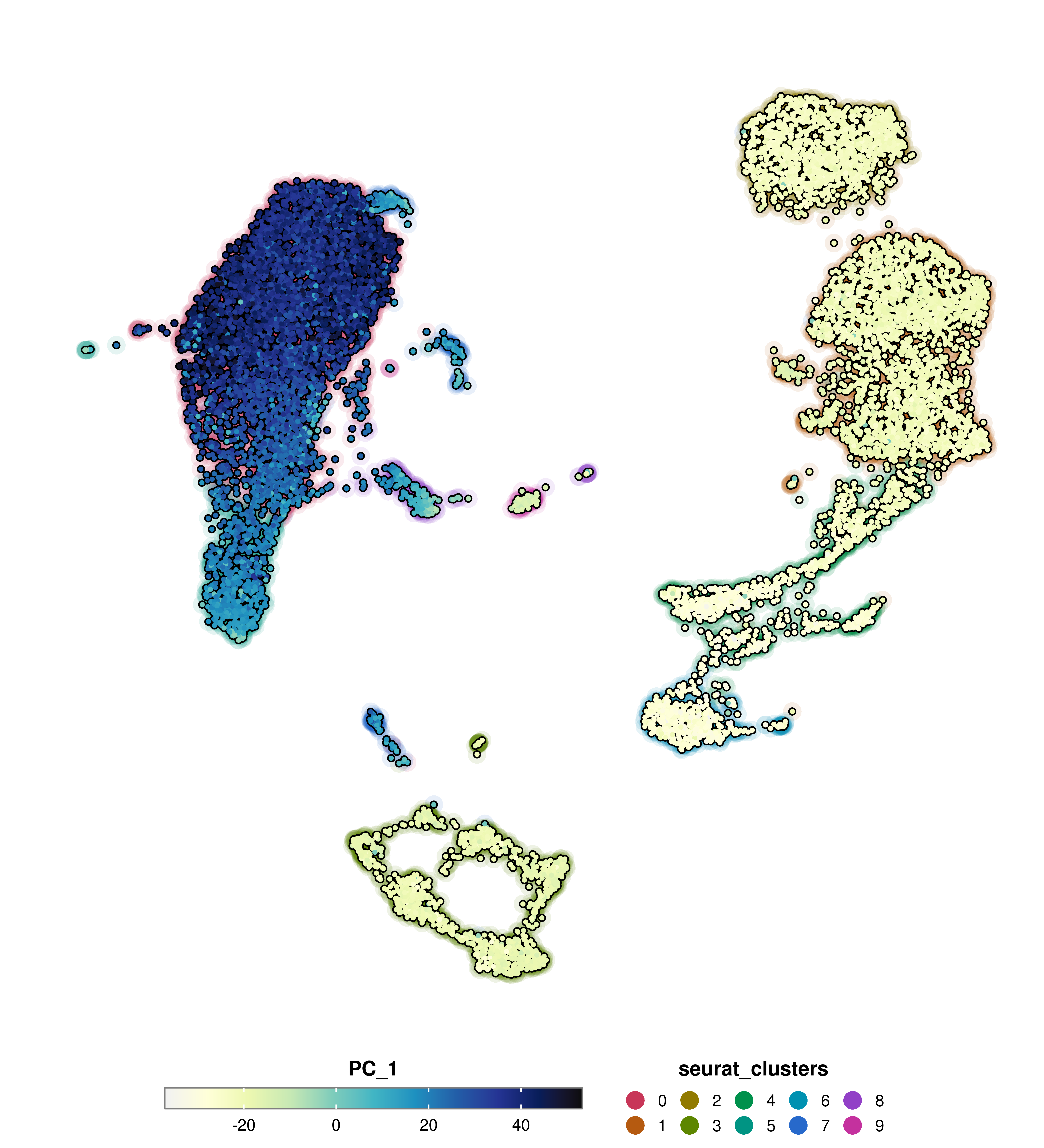
Finally, we can control the legend title using group.by.legend and the colors used in group.by with group.by.colors.use.
p <- SCpubr::do_FeaturePlot(sample = sample,
                            features = "PC_1",
                            group.by = "seurat_clusters",
                            group.by.cell_borders = TRUE,
                            group.by.cell_borders.alpha = 0.1,
                            group.by.show.dots = TRUE,
                            group.by.legend = "My Clusters",
                            group.by.colors.use = c("0" = "#001219",
                                                    "1" = "#005f73",
                                                    "2" = "#0a9396",
                                                    "3" = "#94d2bd",
                                                    "4" = "#e9d8a6",
                                                    "5" = "#ee9b00",
                                                    "6" = "#ca6702",
                                                    "7" = "#bb3e03",
                                                    "8" = "#ae2012",
                                                    "9" = "#9b2226"))
p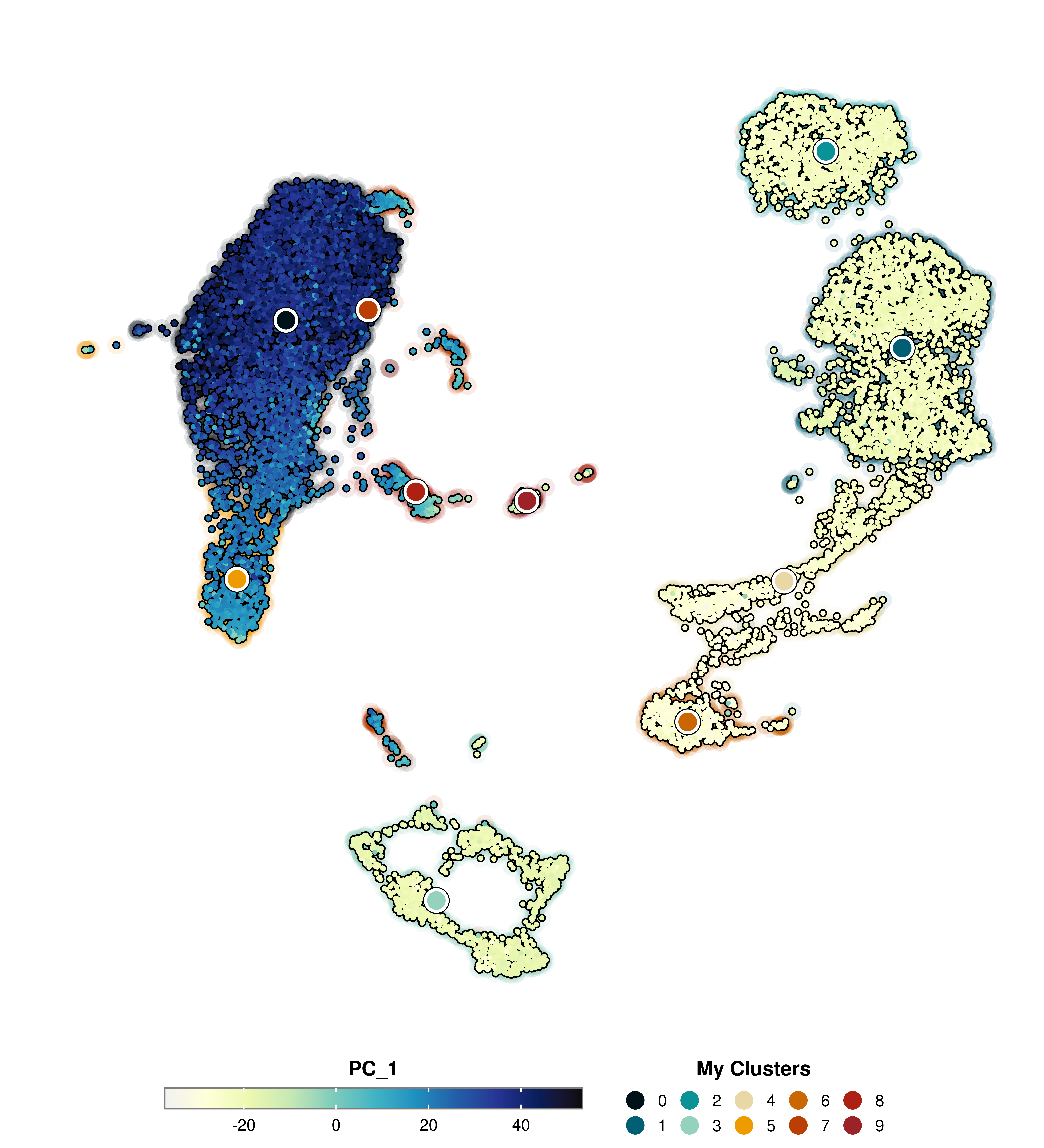
Finally, we can also achieve a similar effect by using a combination of label = TRUE, label.color and label.size parameters, which will plot labels where the current groups defined by Seurat::Idents(sample) are located.
p <- SCpubr::do_FeaturePlot(sample = sample,
                            features = "PC_1",
                            label = TRUE,
                            label.color = "#ca6702",
                            label.size = 8)
p
There are many synergies across functions. Have a look at the section Shared features across functions!