In this package, there are a lot of shared featuresacross functions. Here is a quick summary of them!
Basic parameters
There are a handful of parameters needed to run mostly any function in SCpubr:
sample: Seurat object to use for plotting.
group.by: Metadata variable to group the values to plot by.
split.by: Metadata variable to split the values to plot by.
features: Genes, metadata columns, dimensional reduction column names to use for plotting.
input_gene_list: Named list with different gene sets to use for plotting.
assay: Assay name to pull the data from.
slot: Slot in assay to pull the data from.
reduction: Which dimensional reduction to use for plotting.
dims: A vector with numbers representing which dimensions of the dimensional reduction embedding to use.
na.value: Color used for NA values.
raster: Whether to rasterize (TRUE) an image or not (FALSE).
raster.dpi: Resolution of the rasterization.
Change colors | categorical
SCpubr has a built-in custom color palette for categorical variables. However, it is very often the case that we do want our own color system in the plots. This is always achieved by using the colors.use parameter. The input to this parameter can vary on a per function basis, but it is always one for the following:
A vector of named values. The names correspond to each of the unique values that the categorical variable to plot has, and the values are the colors corresponding to each of those values.
A named list of vectors of named values. In more complex scenarios, we have different categorical variables to plot. For this, the names of the list will correspond to the names of the categorical variables stored in the metadata of the Seurat object, and the values will be the vectors of named values (like in the example above). Each vector should contain as many values as unique occurrences in the metadata variable.
For continuous variables, we do have a more complex system. First of all, SCpubr has implemented both RColorBrewer palettes and Viridis palettes palettes, and use them interchangeably depending on the function. This behavior can accessed and customized with the following parameters:
use_viridis: Whether to use a viridis palette (TRUE) or not (FALSE).
viridis.palette: Which viridis palette to use. Can be either the long name or the shortened version.
sequential.palette: Which RColorBrewercontinuous palette to use.
viridis.direction: Whether to map the darkest colors to the lowest values (1) or not (-1).
sequential.direction: Whether to map the darkest colors to the lowest values (-1) or not (1).
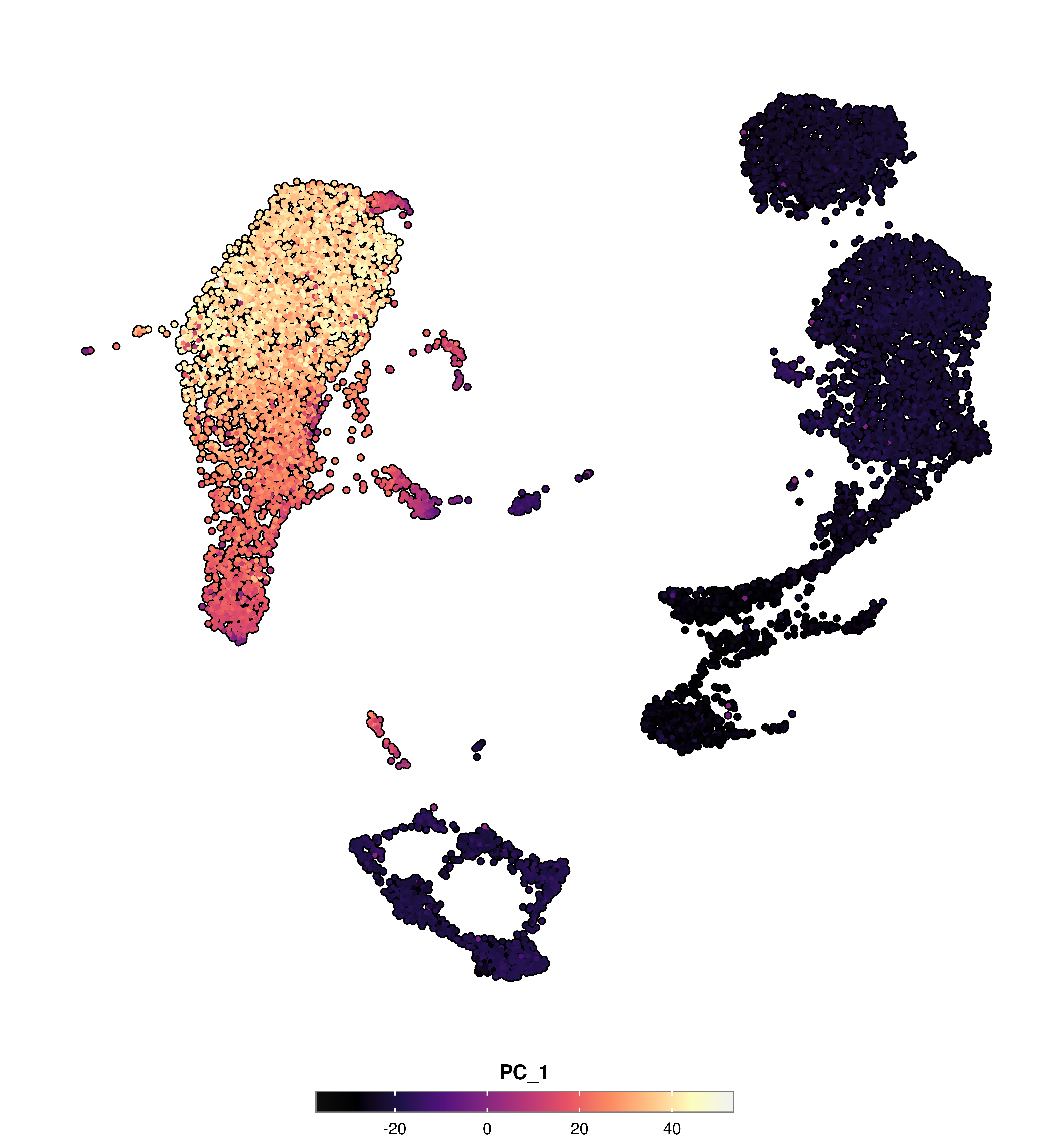
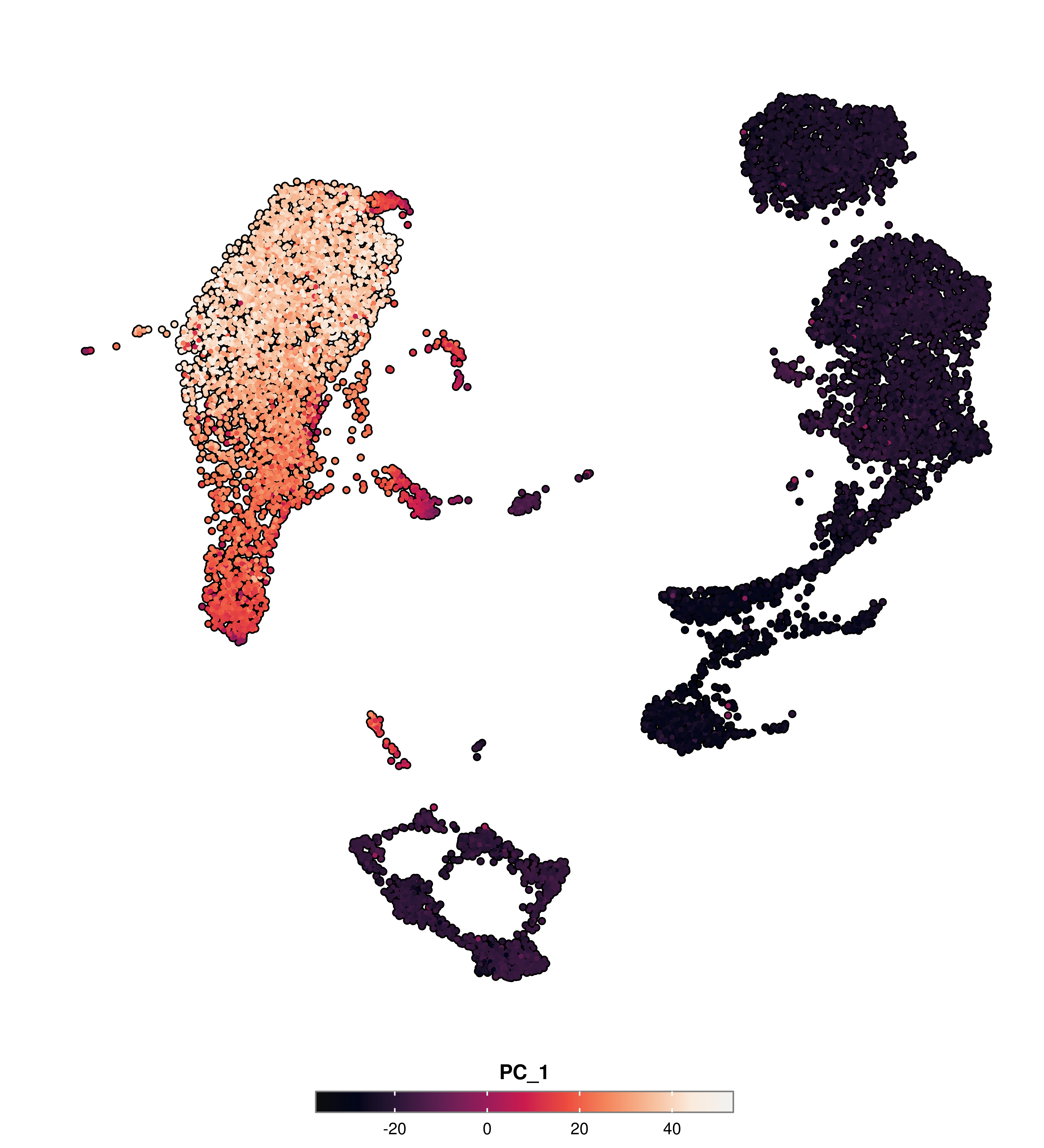
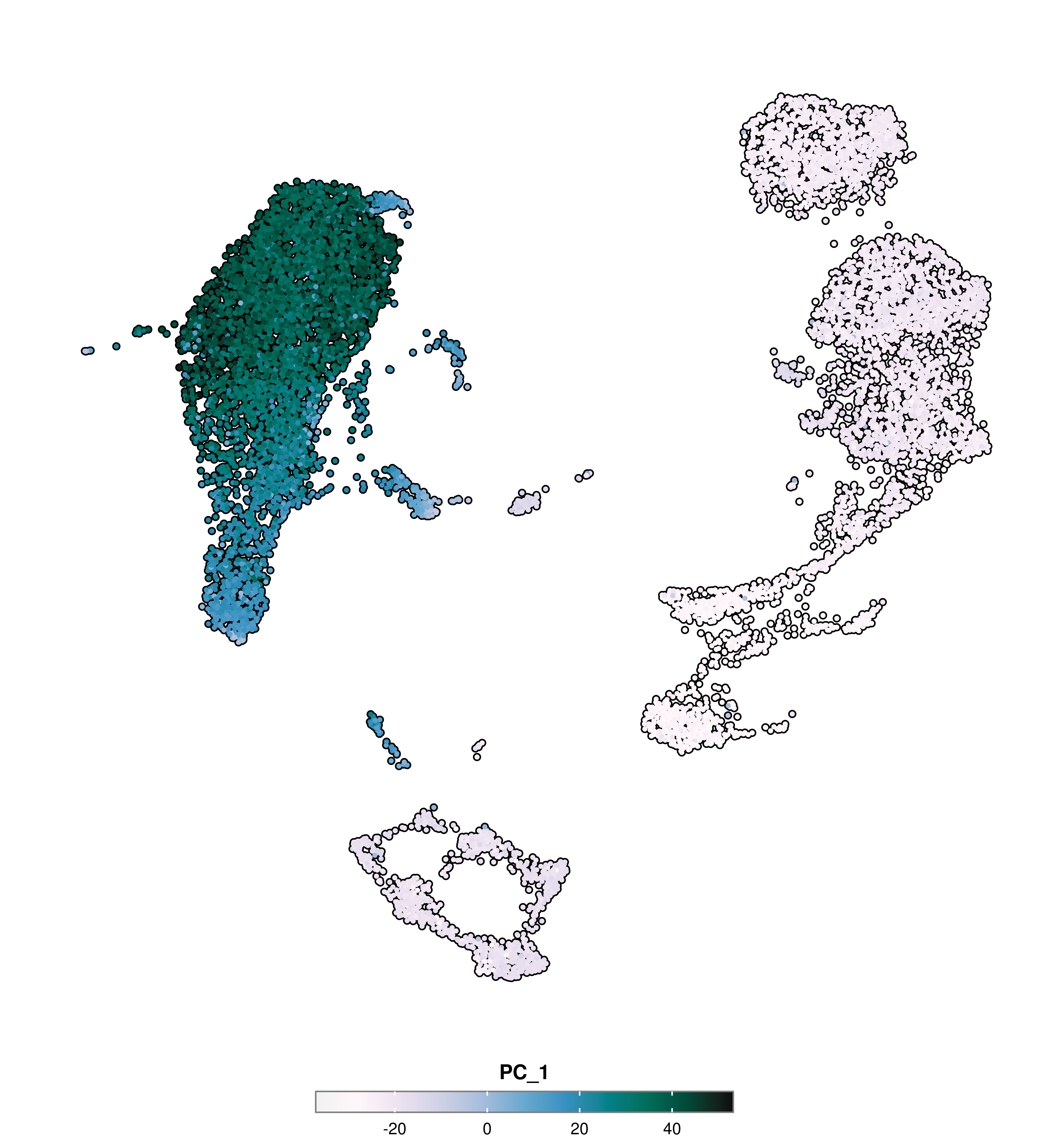
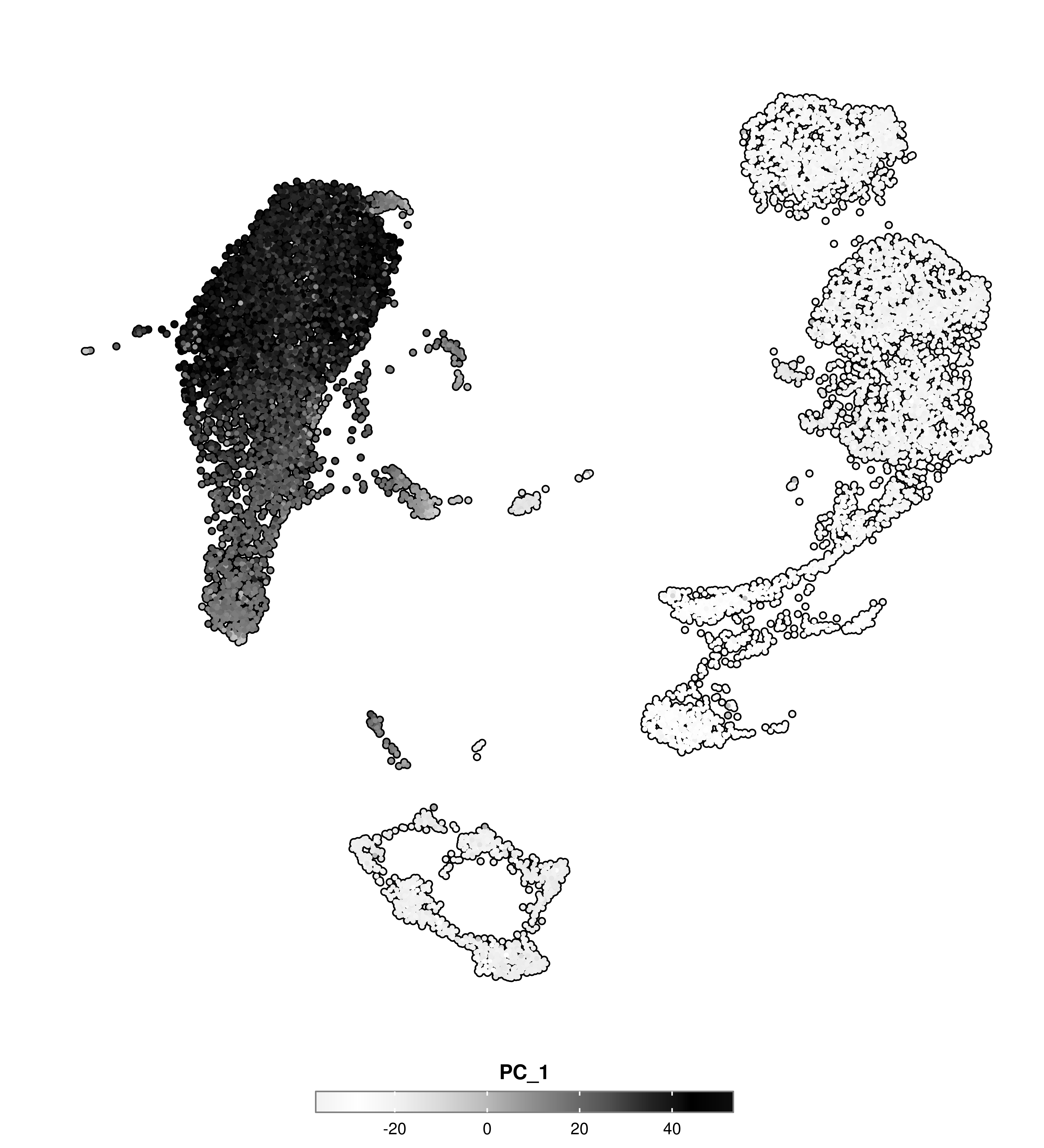
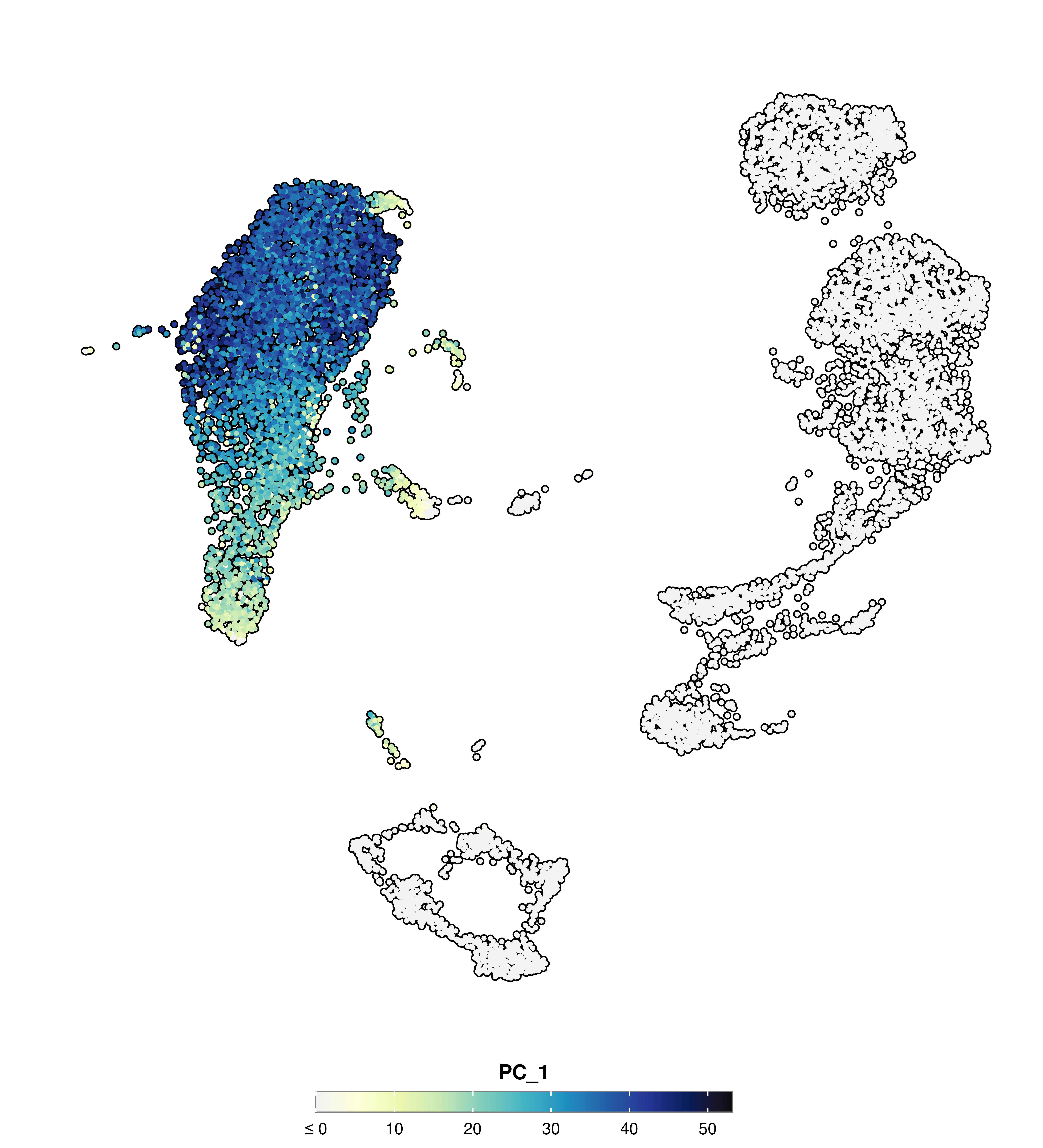
SCpubr::do_FeaturePlot(sample, features ="PC_1", use_viridis =TRUE, viridis.direction =1)
Code
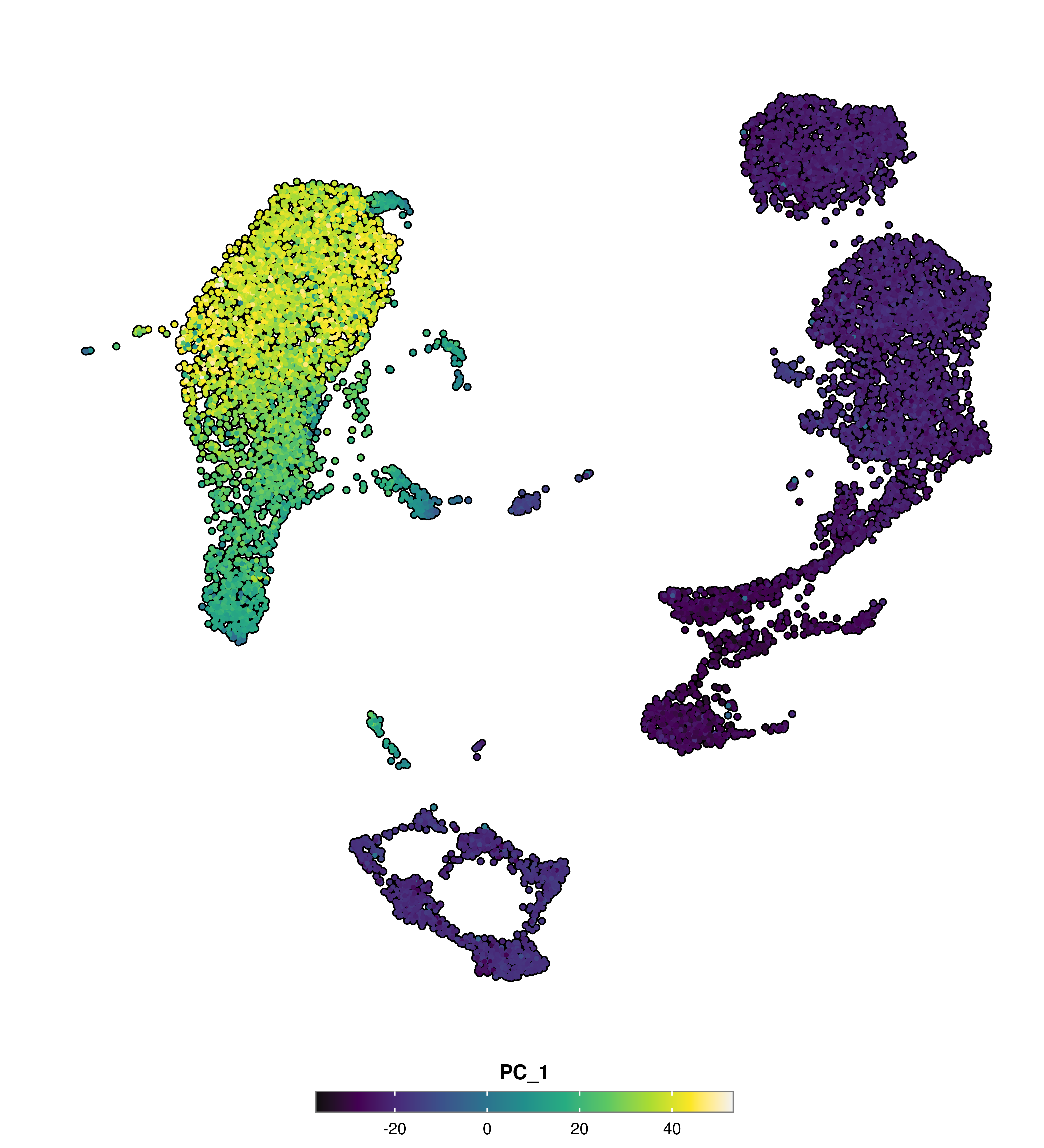
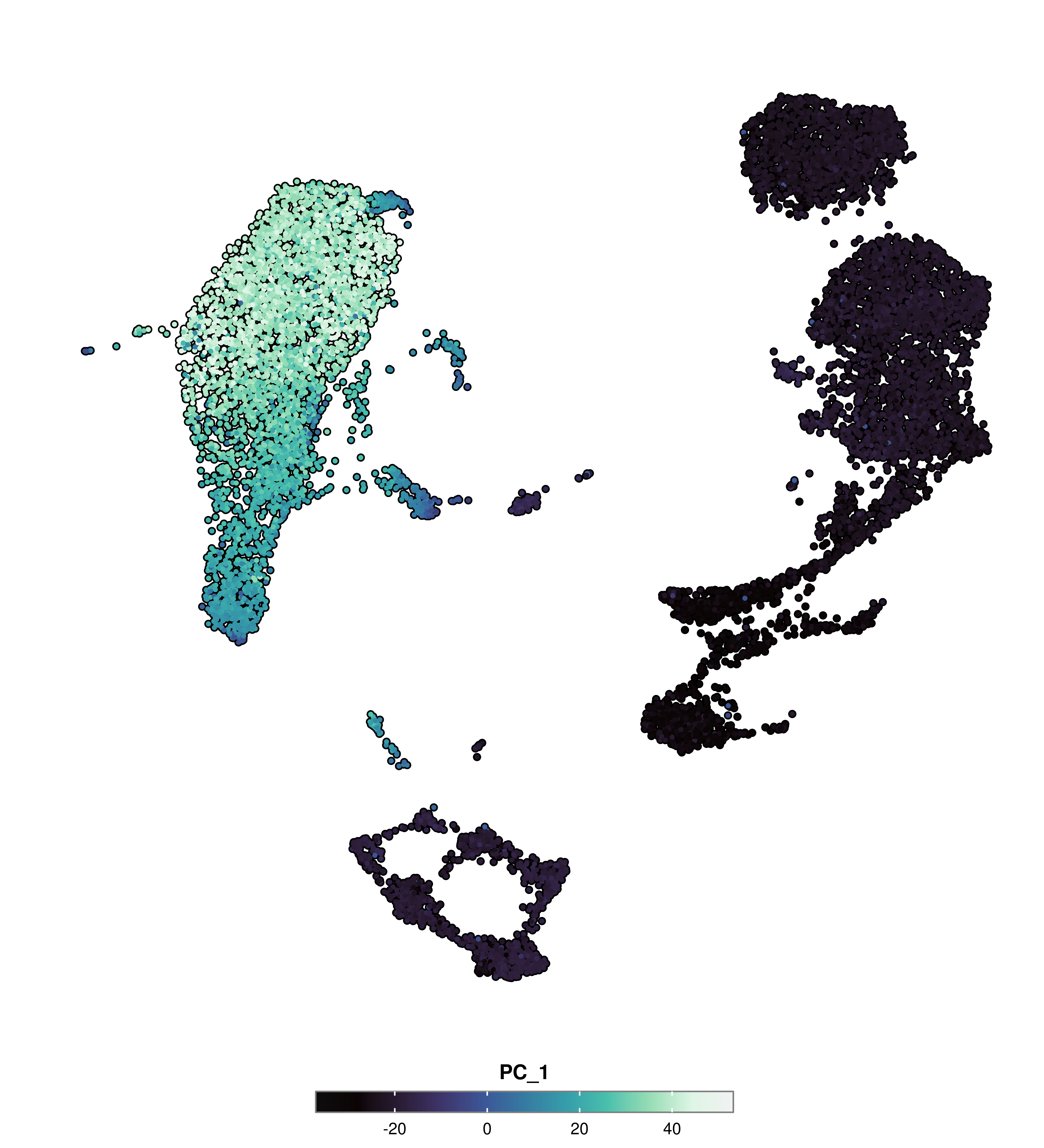
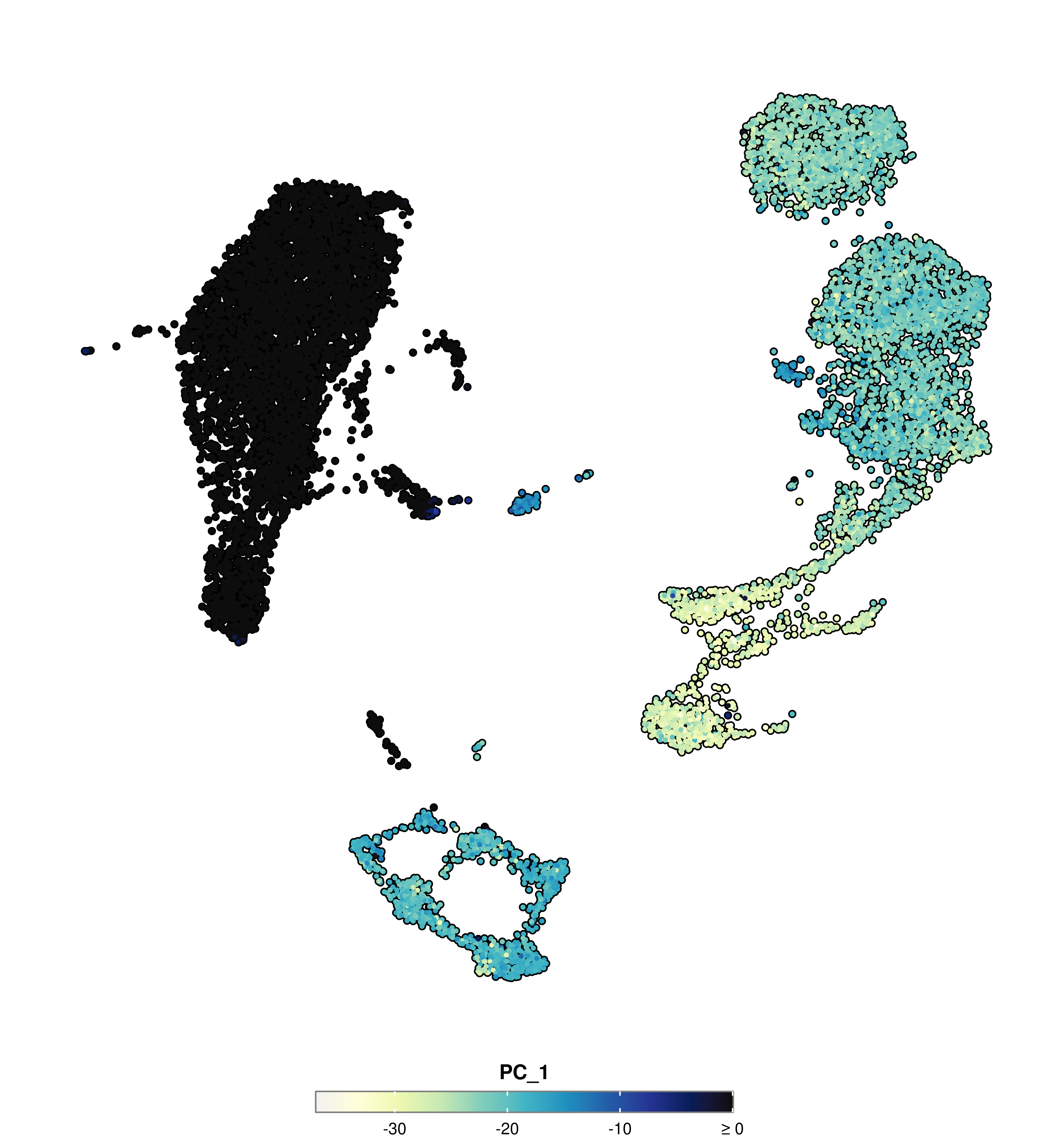
SCpubr::do_FeaturePlot(sample, features ="PC_1", use_viridis =TRUE, viridis.direction =-1)
Code
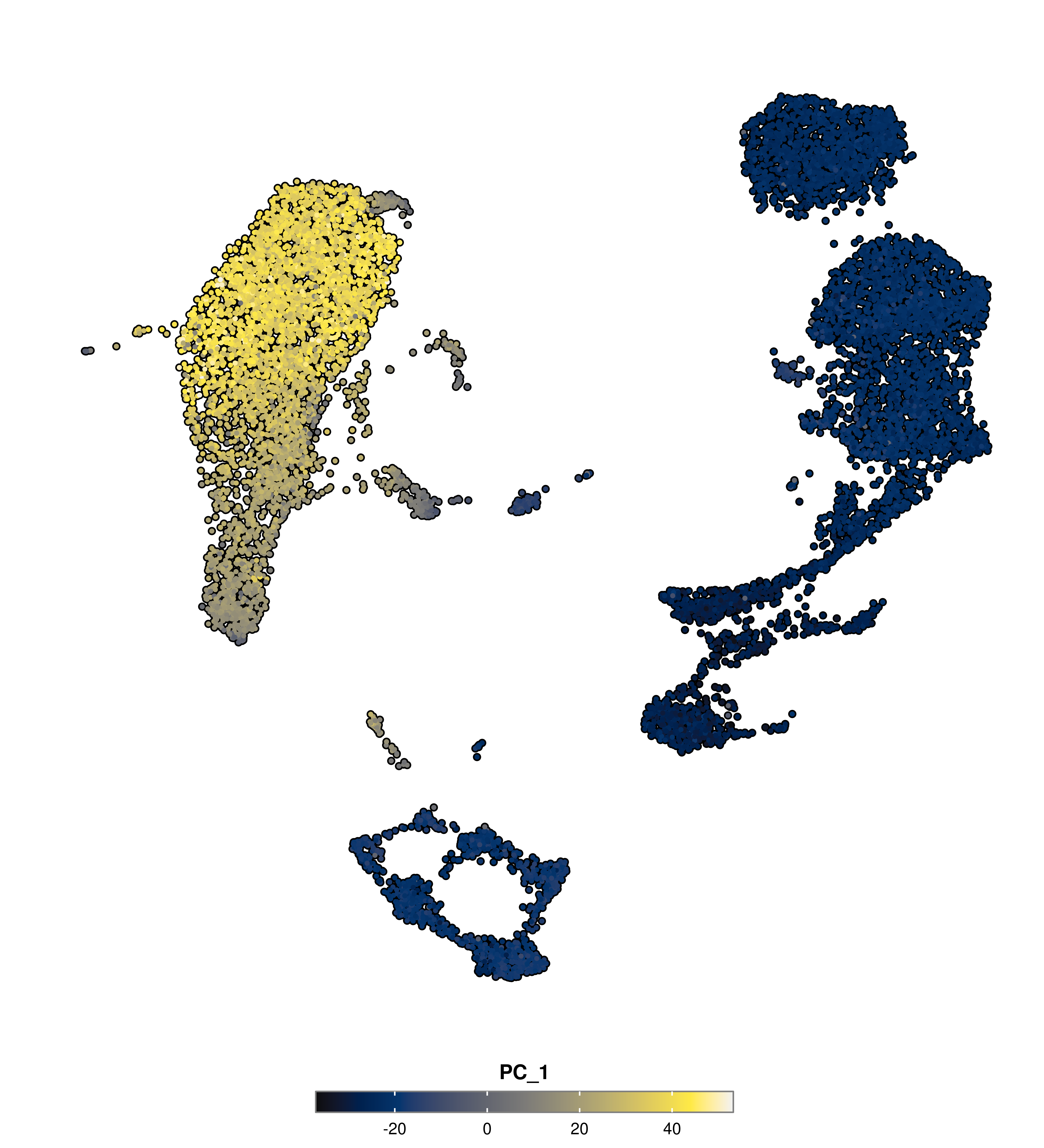
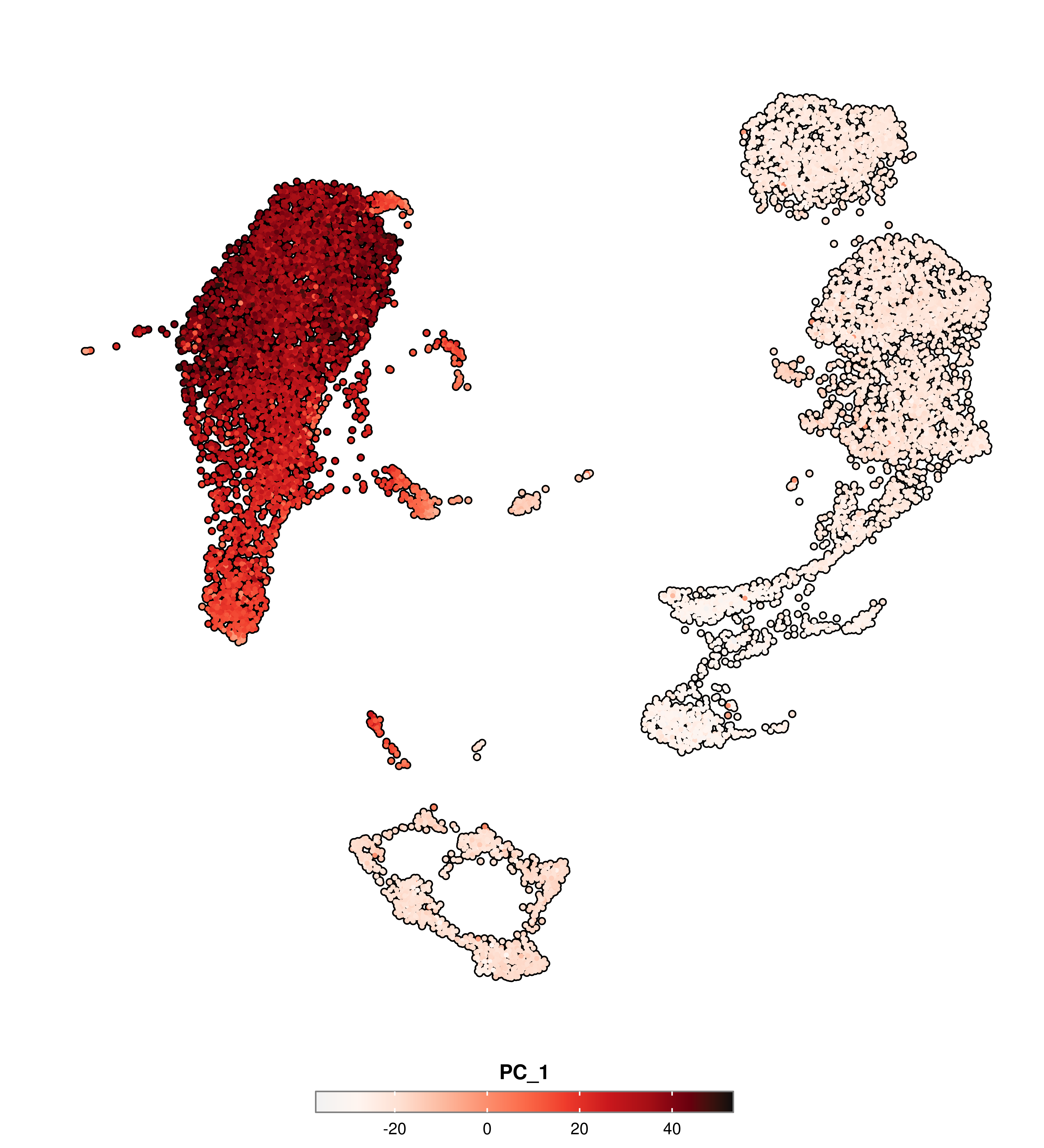
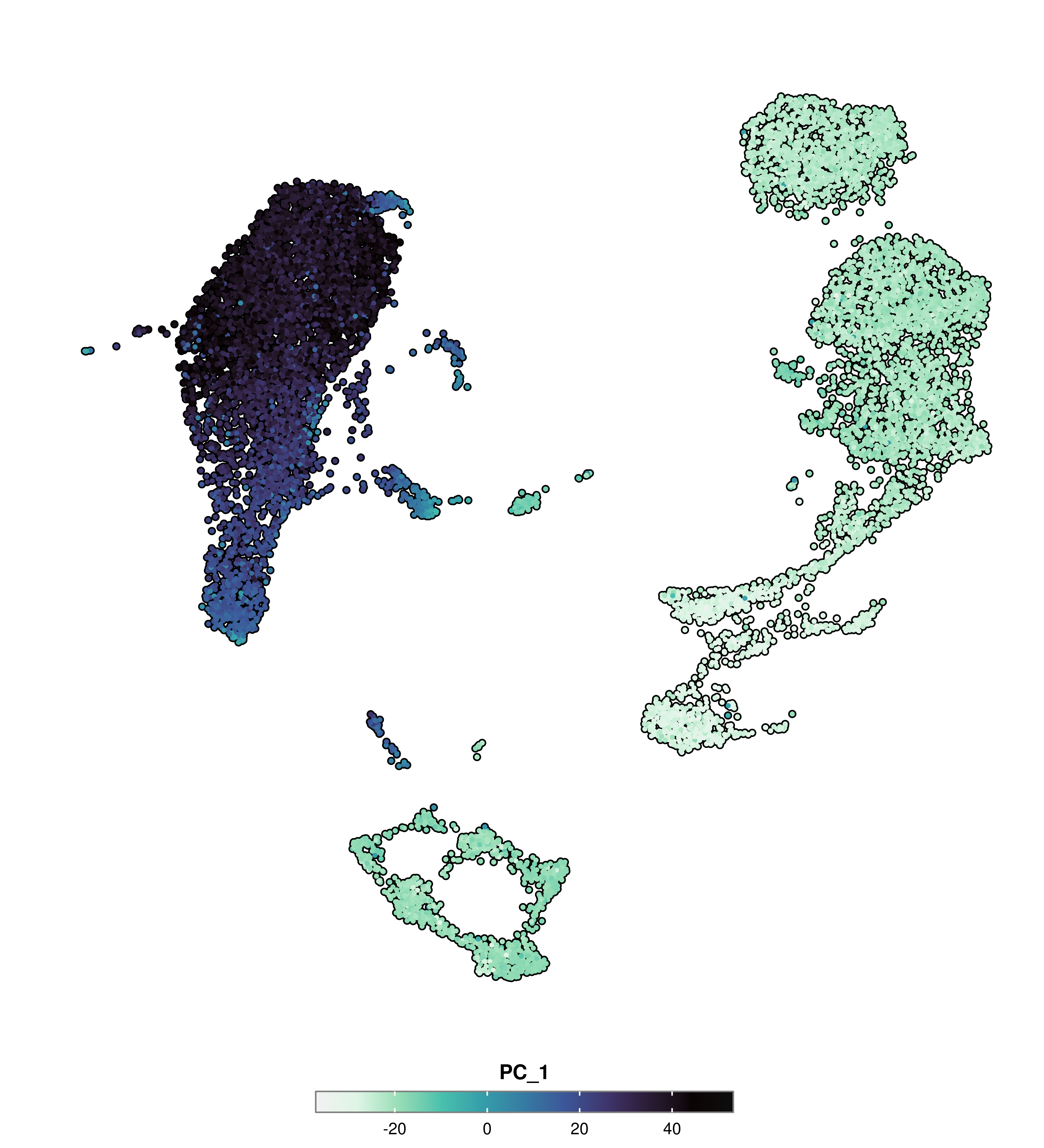
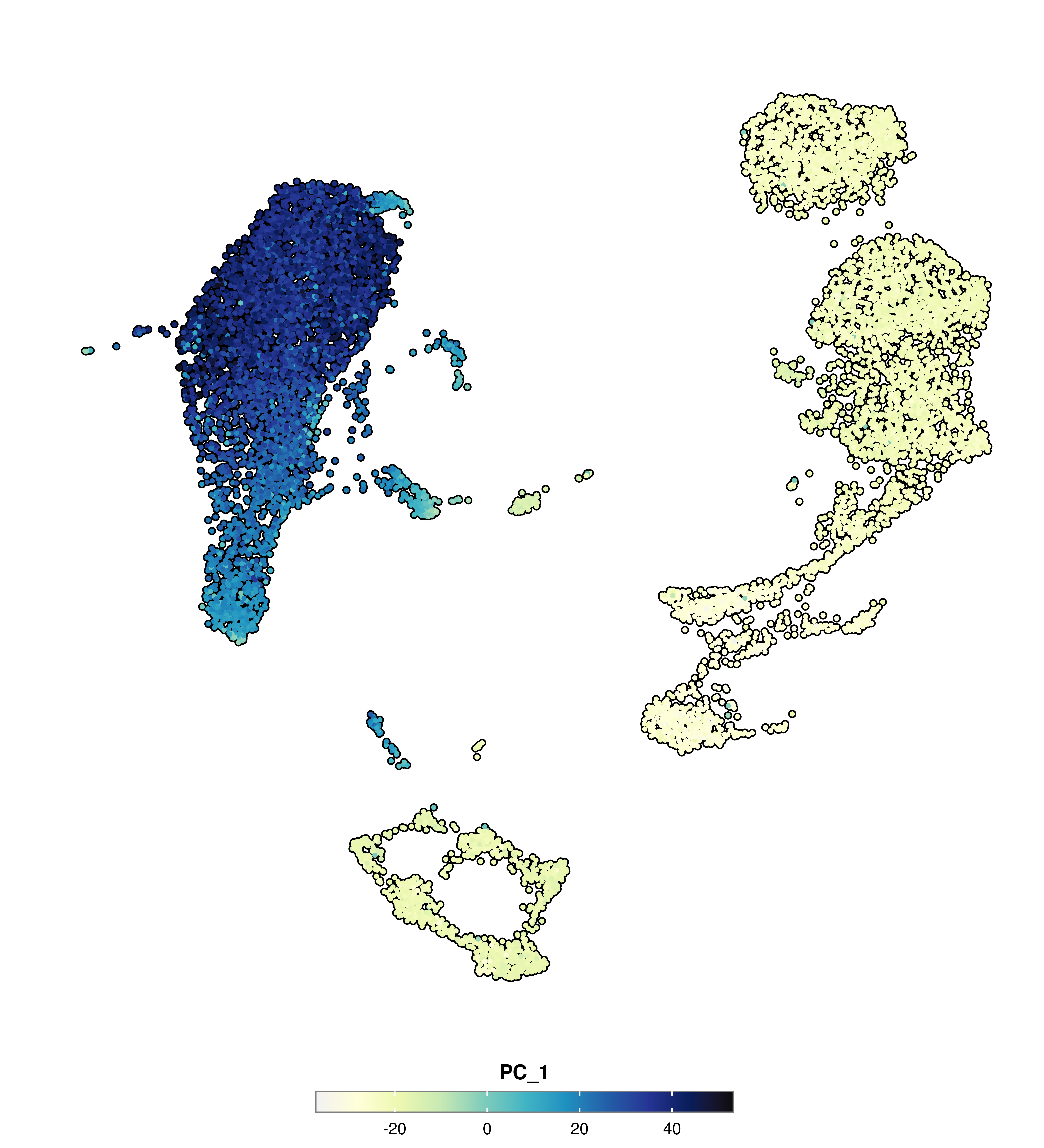
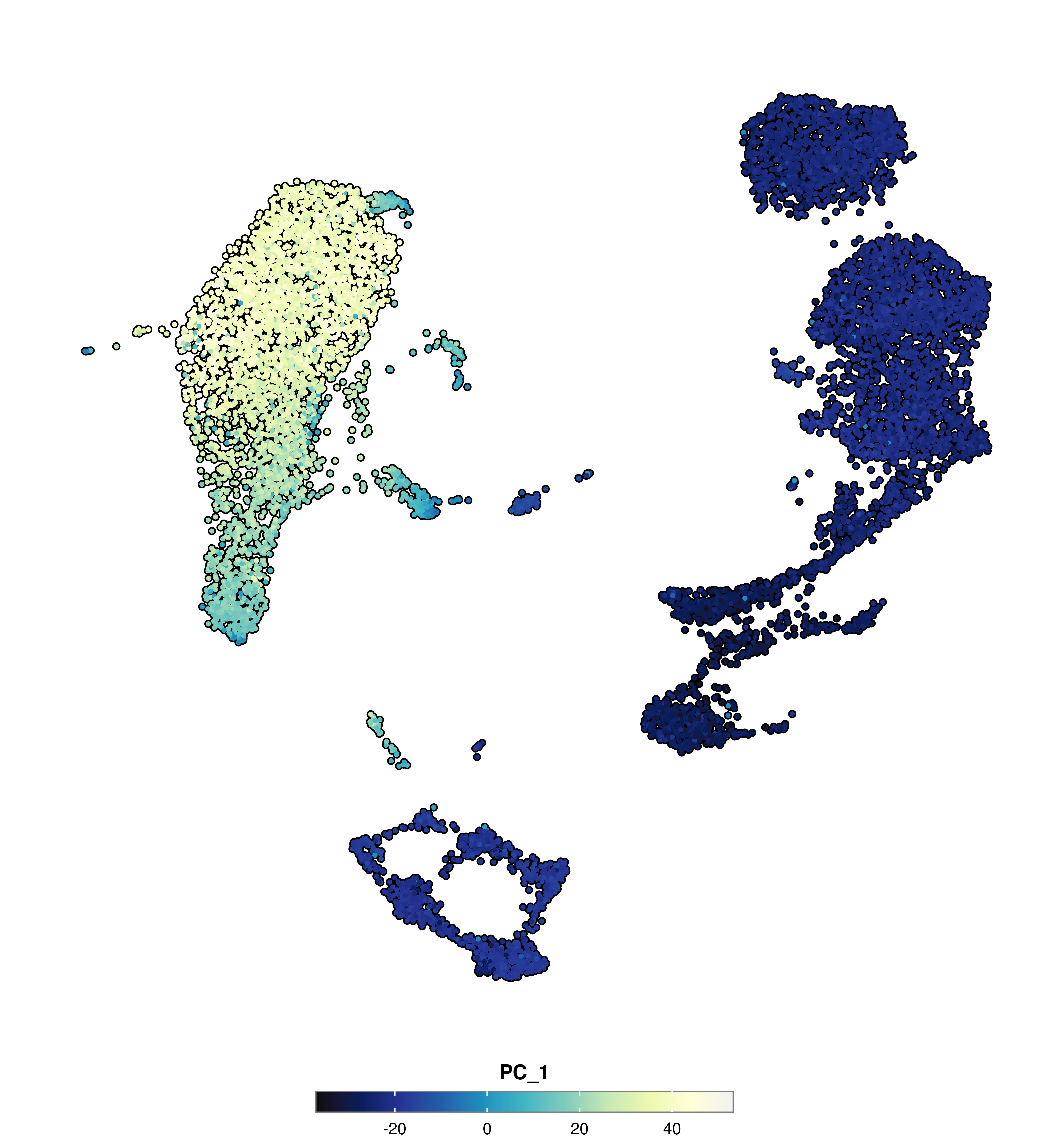
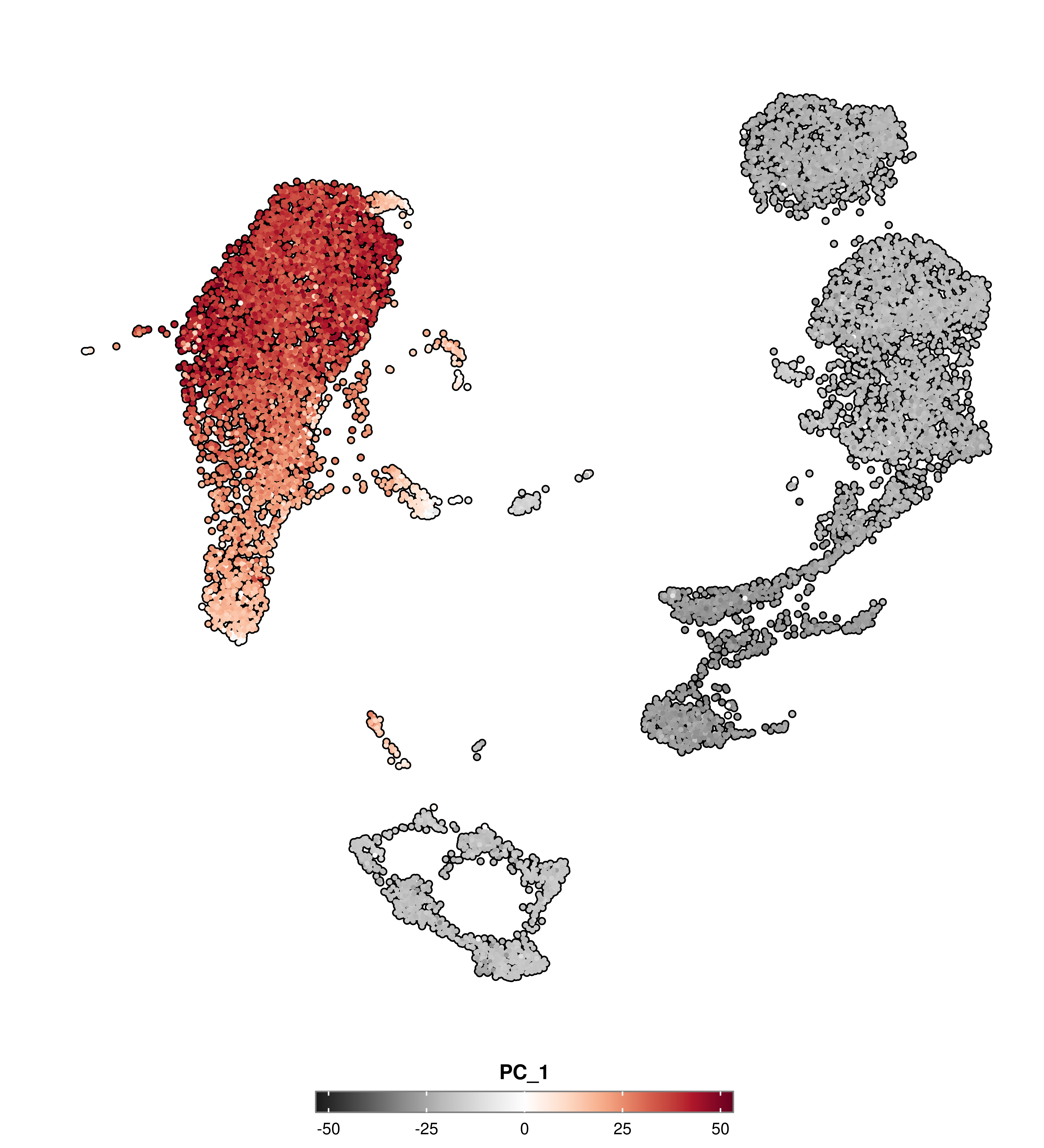
# BluesSCpubr::do_FeaturePlot(sample, features ="PC_1", use_viridis =FALSE, sequential.direction =1)
Code
# BluesSCpubr::do_FeaturePlot(sample, features ="PC_1", use_viridis =FALSE, sequential.direction =-1)
Please note that the direction is inverted between viridis and RColorBrewer palettes.
Change colors | diverging
Finally, there is a special case of sequential palettes in which there is a clear emphasis on the two ends of the scale. Those are called diverging palettes. This is a very usual case in scaled data. Normally the middle values are colored in a very light color in contrast with the two ends of the scale, which will have a very dark color. This can be used with the following:
diverging.palette: Which RColorBrewerdiverging palette to use.
In such cases, the color palette used is chosen among the diverging palettes in RColorBrewer and can be chosen using diverging.palette.
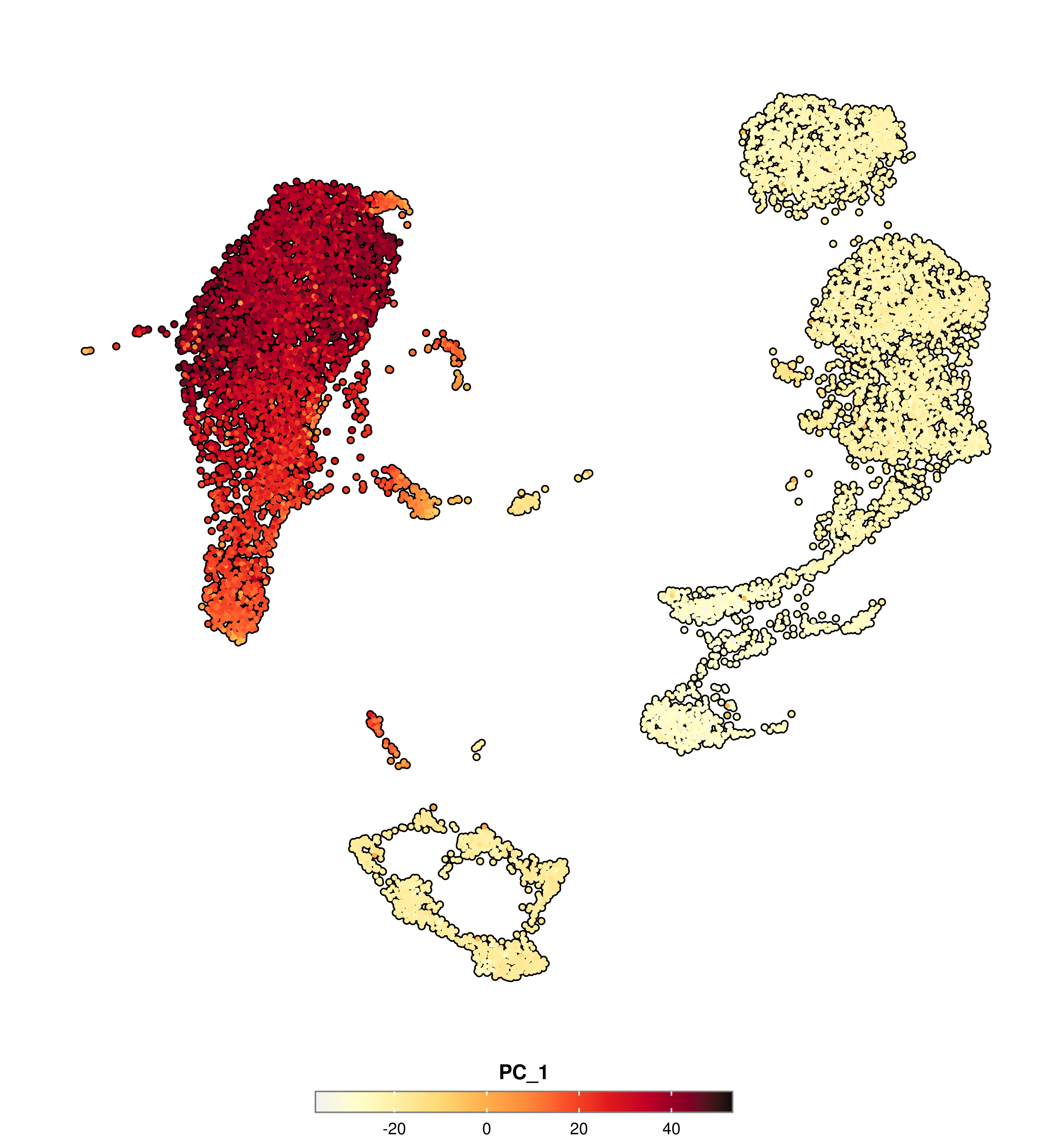
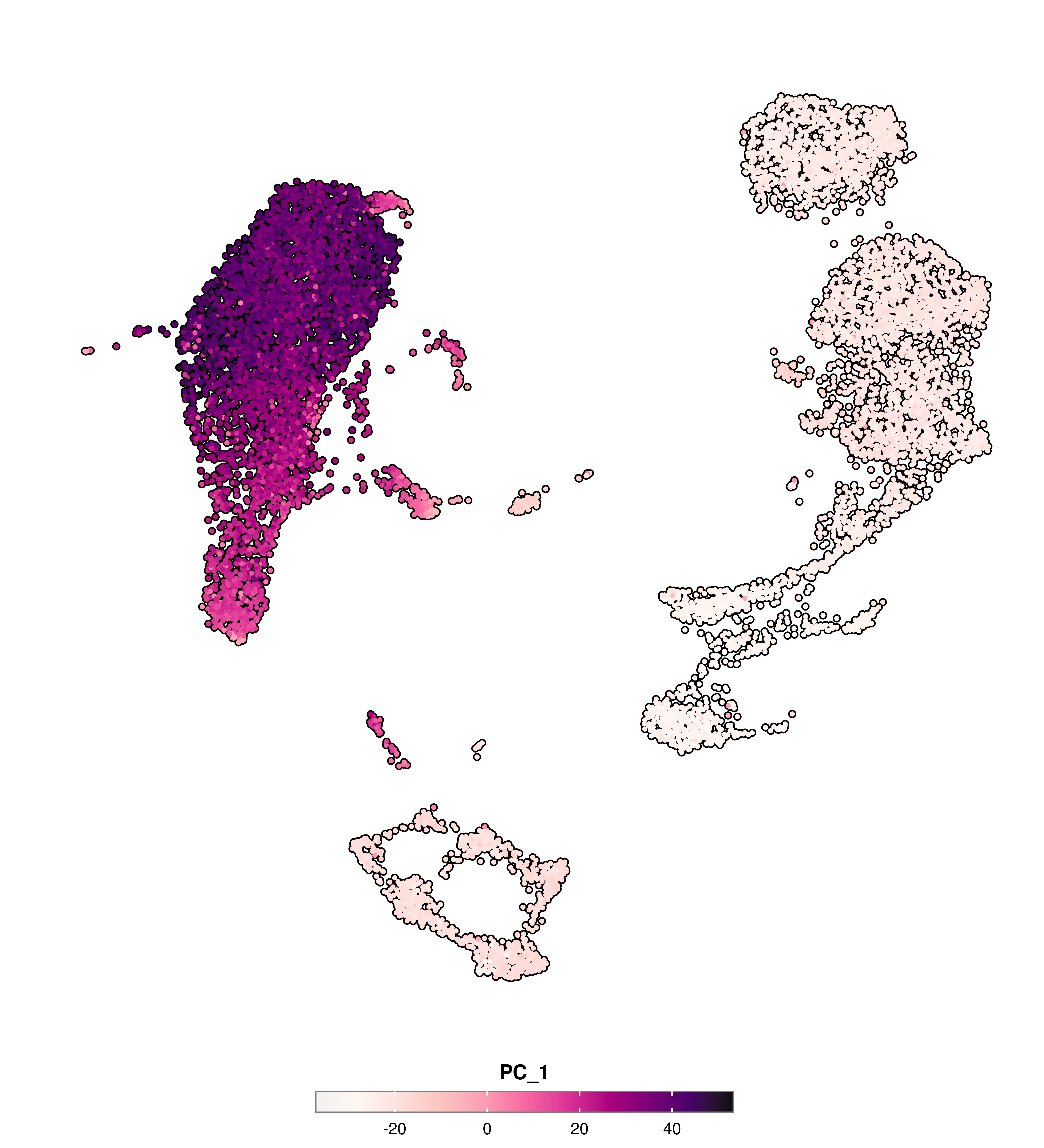
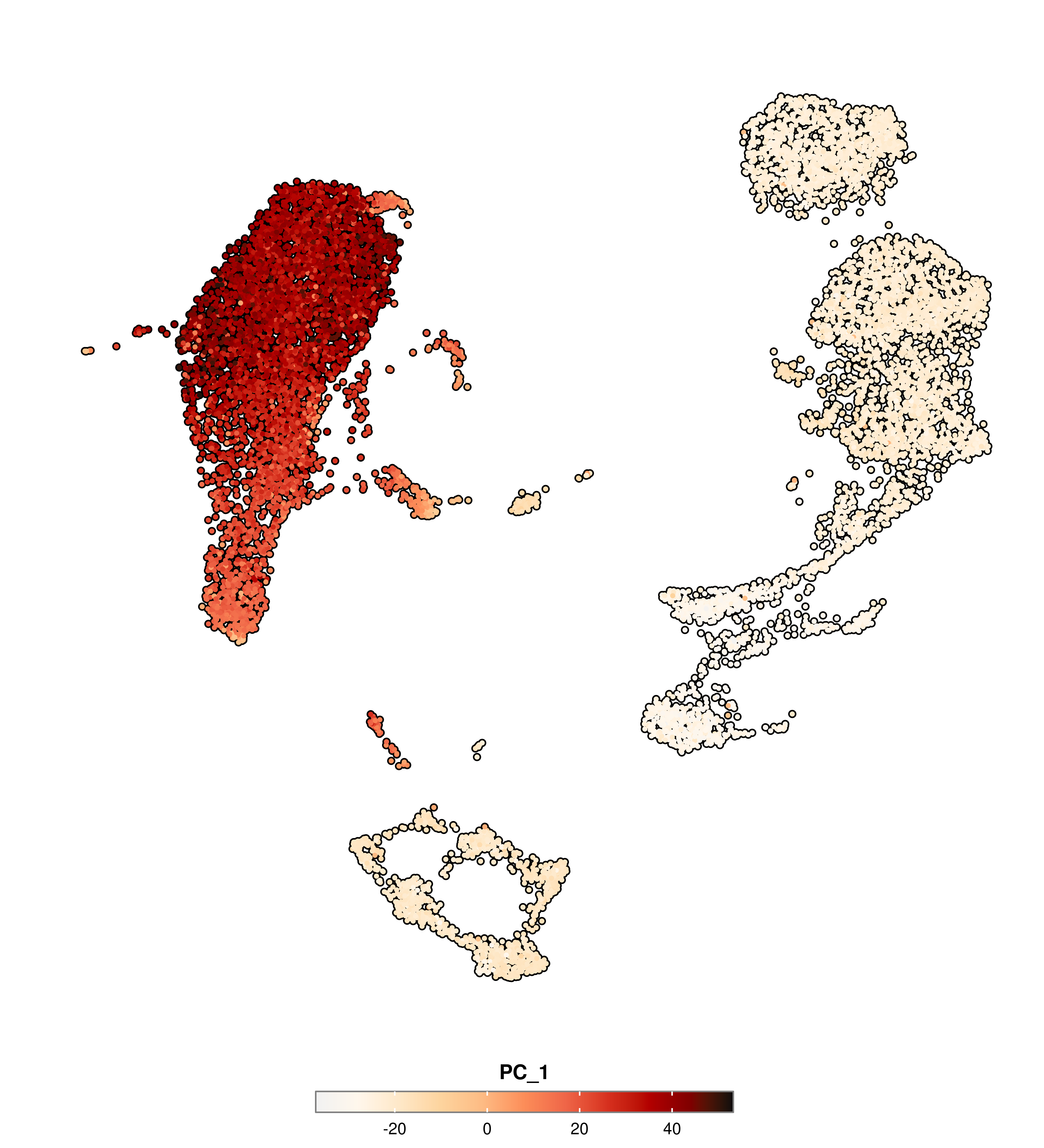
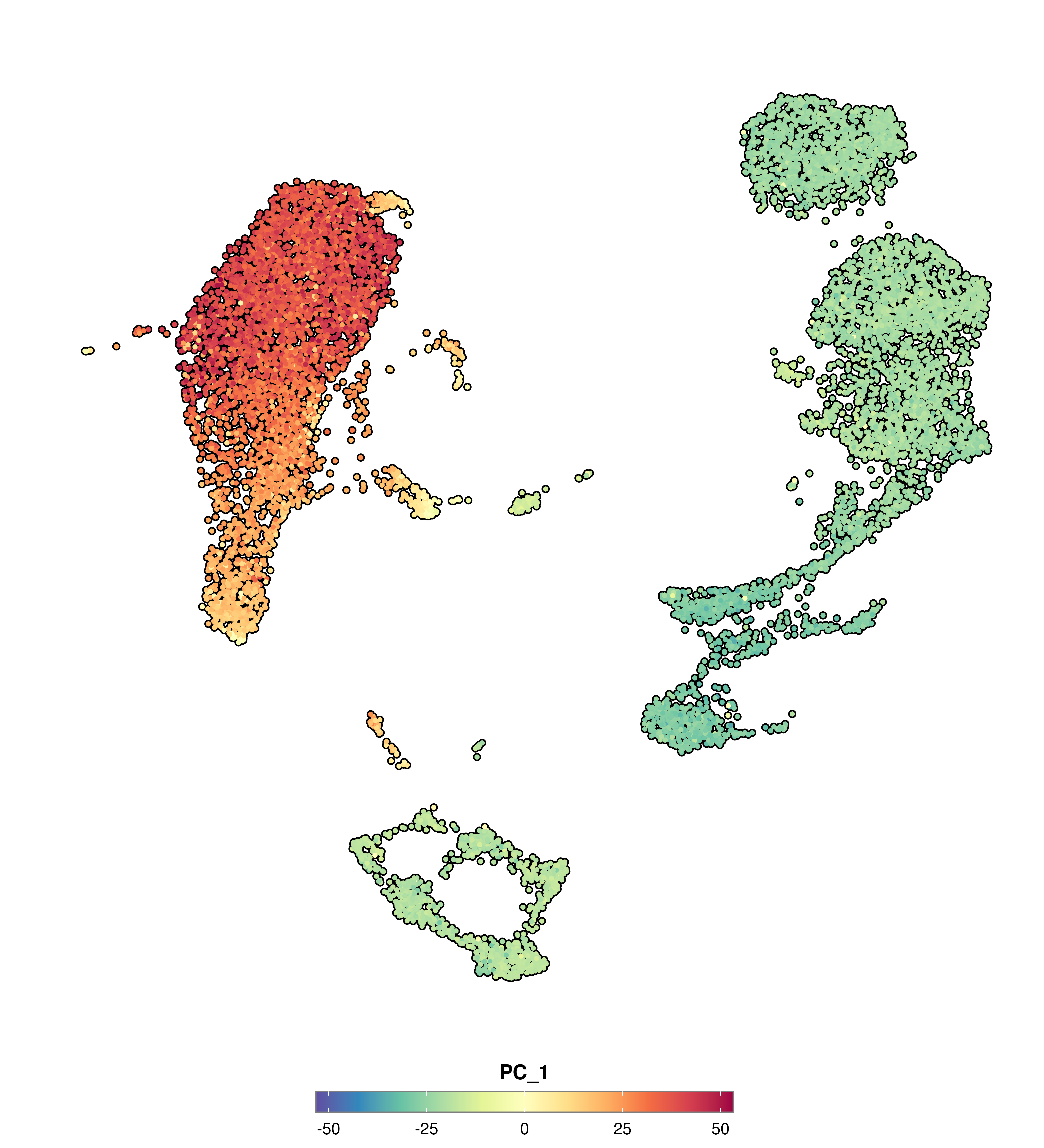
# SpectralSCpubr::do_FeaturePlot(sample, features ="PC_1", enforce_symmetry =TRUE, diverging.palette ="Spectral")
Code
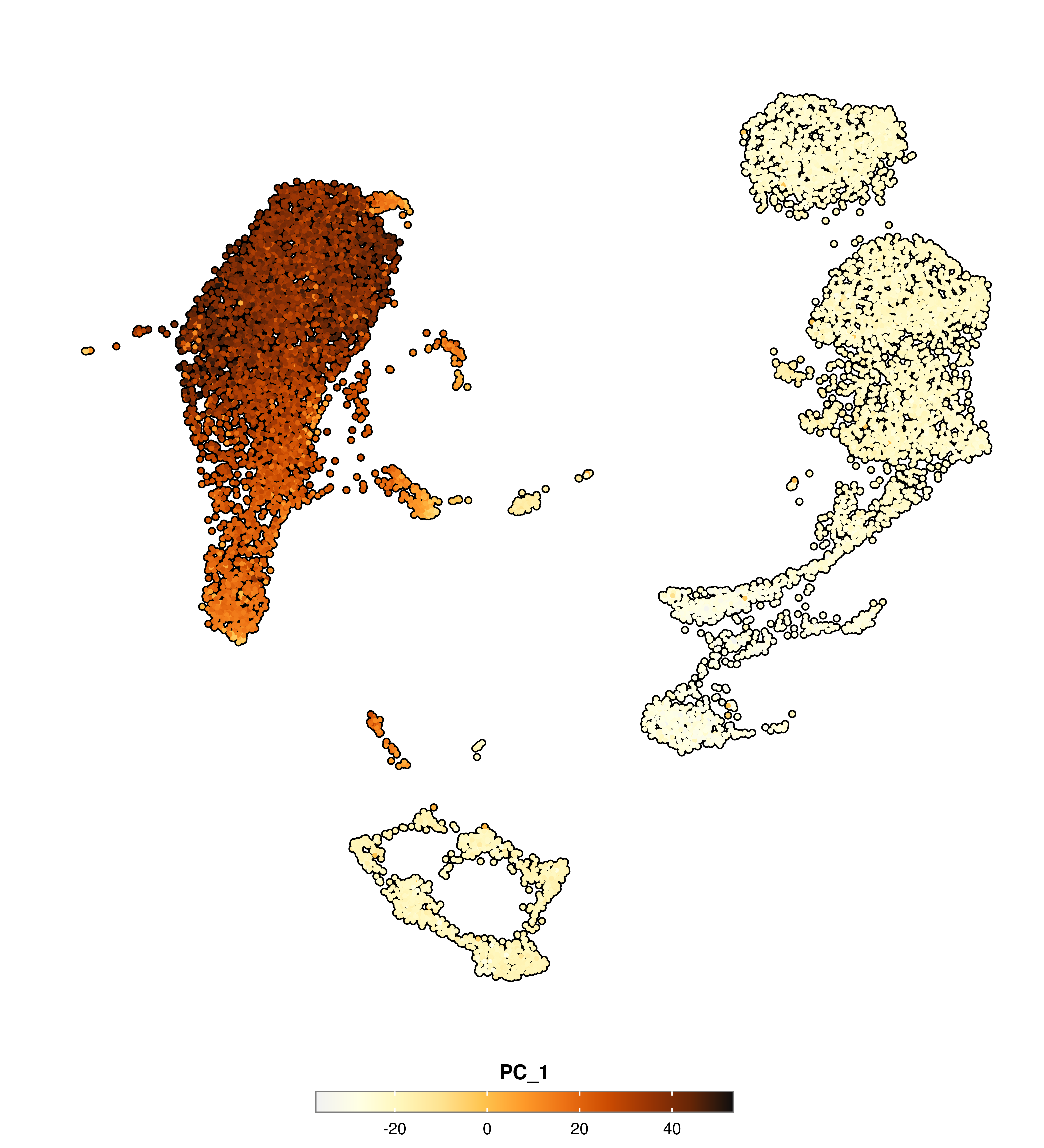
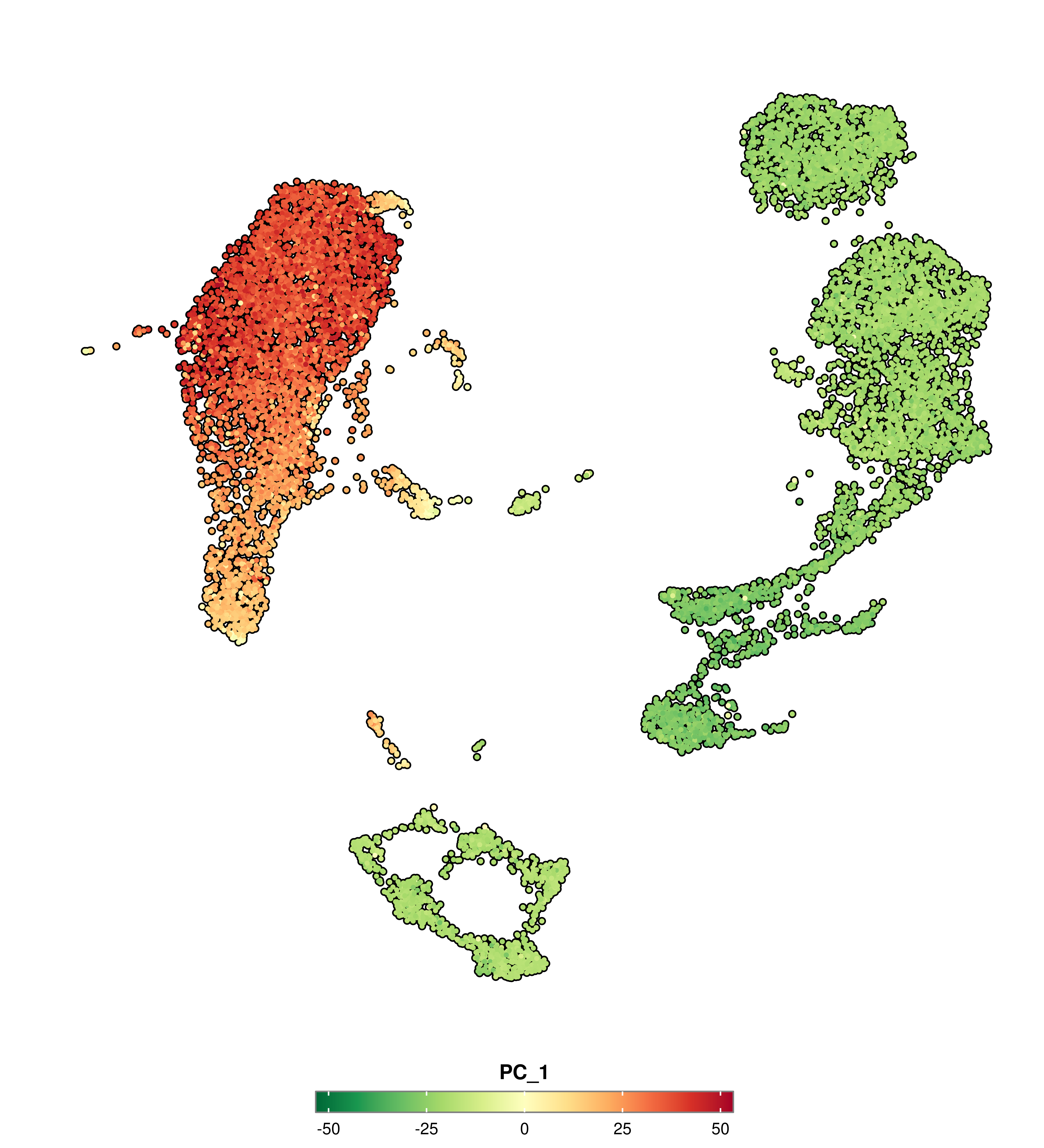
# Red --> Yellow --> GreenSCpubr::do_FeaturePlot(sample, features ="PC_1", enforce_symmetry =TRUE, diverging.palette ="RdYlGn")
Code
# Red --> GreySCpubr::do_FeaturePlot(sample, features ="PC_1", enforce_symmetry =TRUE, diverging.palette ="RdGy")
Code
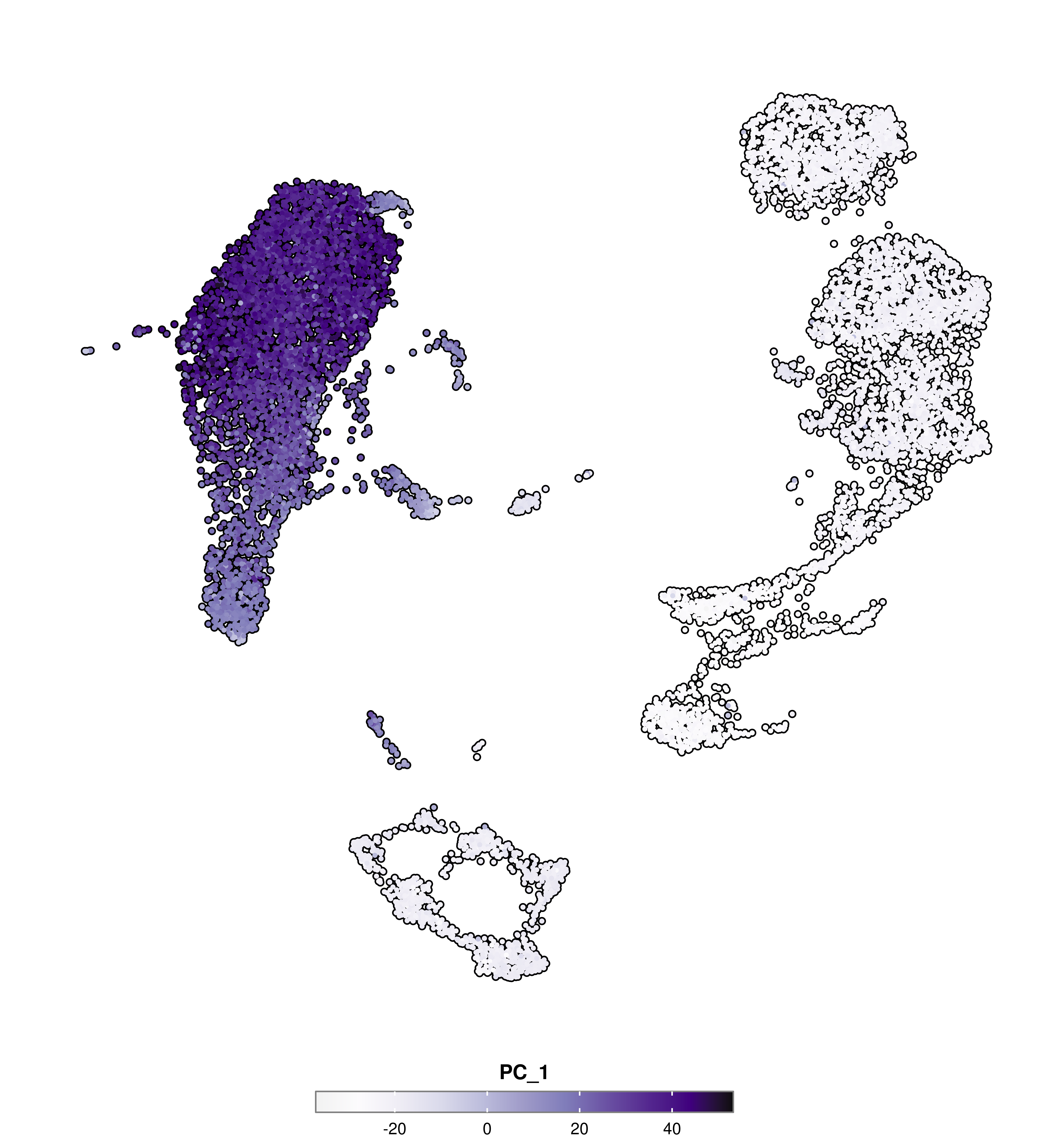
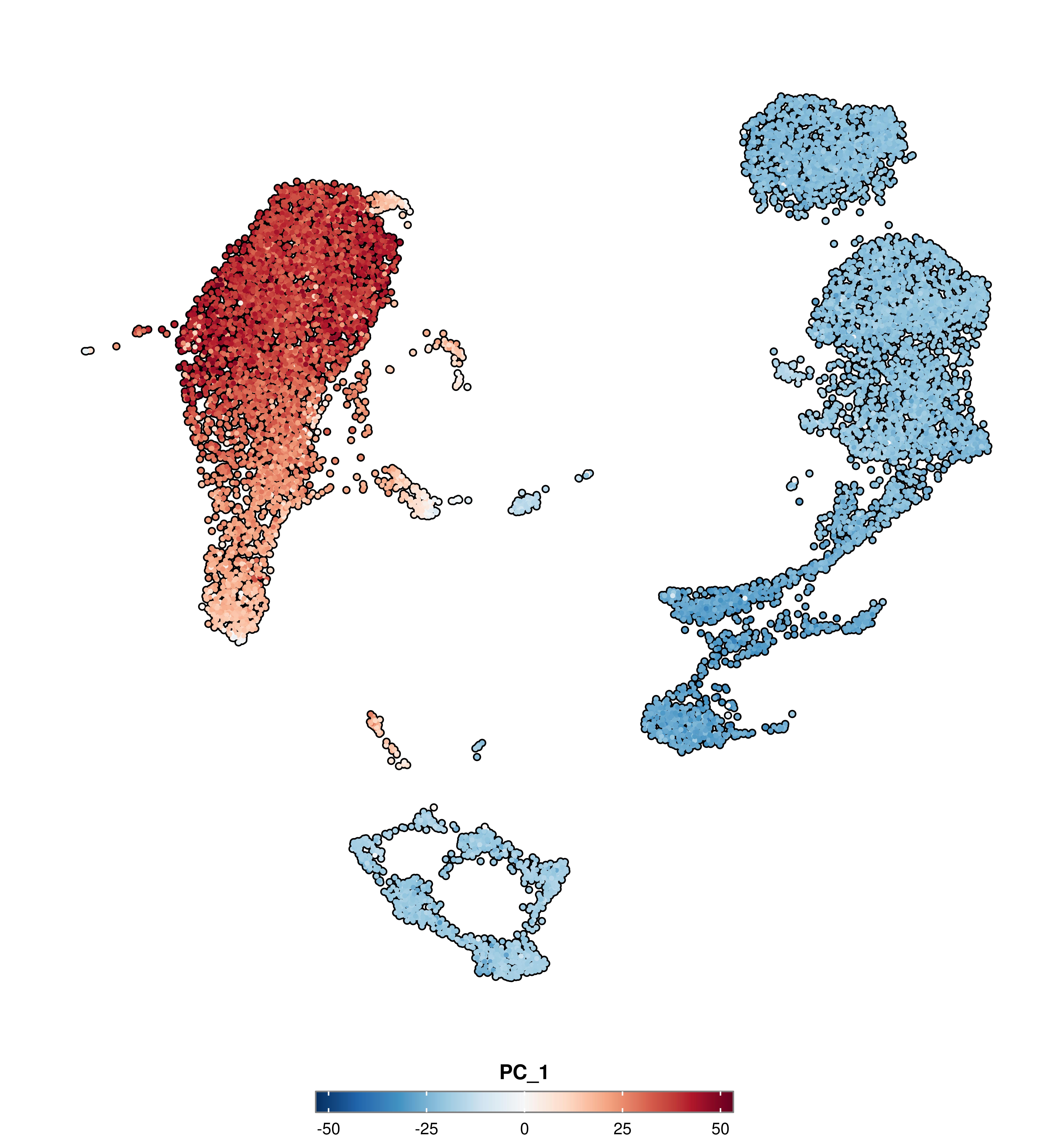
# Red --> BlueSCpubr::do_FeaturePlot(sample, features ="PC_1", enforce_symmetry =TRUE, diverging.palette ="RdBu")
Code
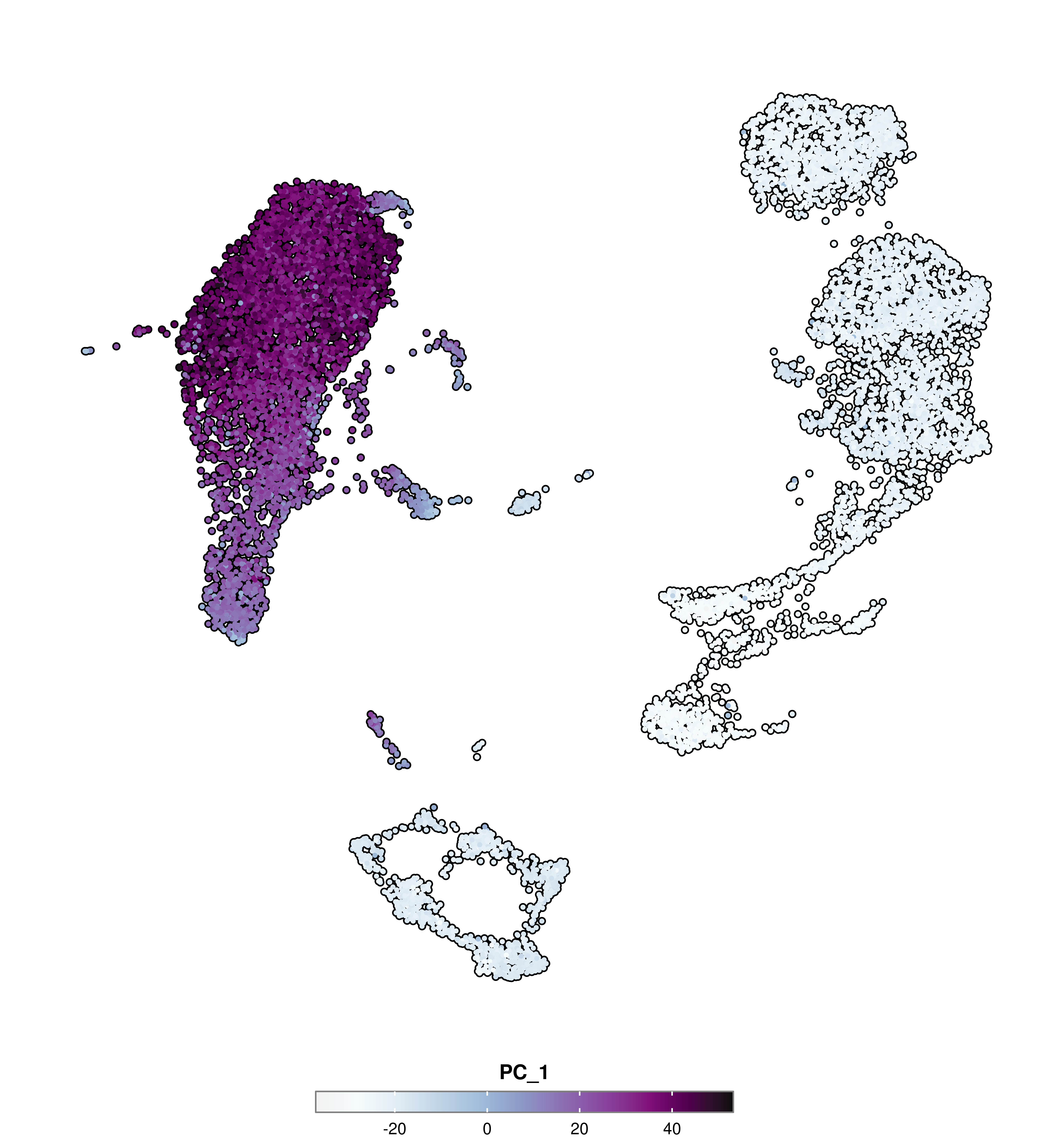
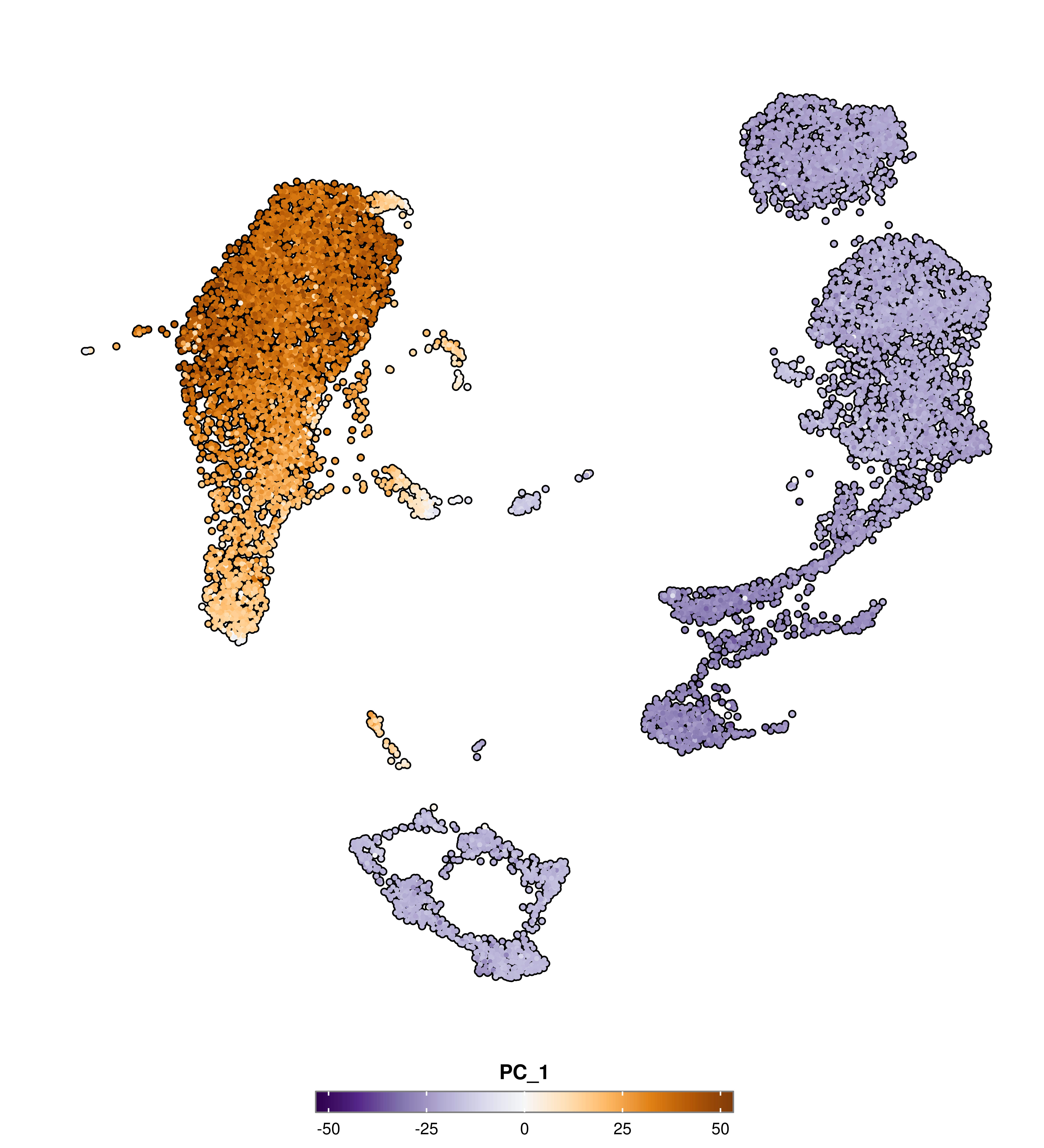
# Purple --> OrangeSCpubr::do_FeaturePlot(sample, features ="PC_1", enforce_symmetry =TRUE, diverging.palette ="PuOr")
Code
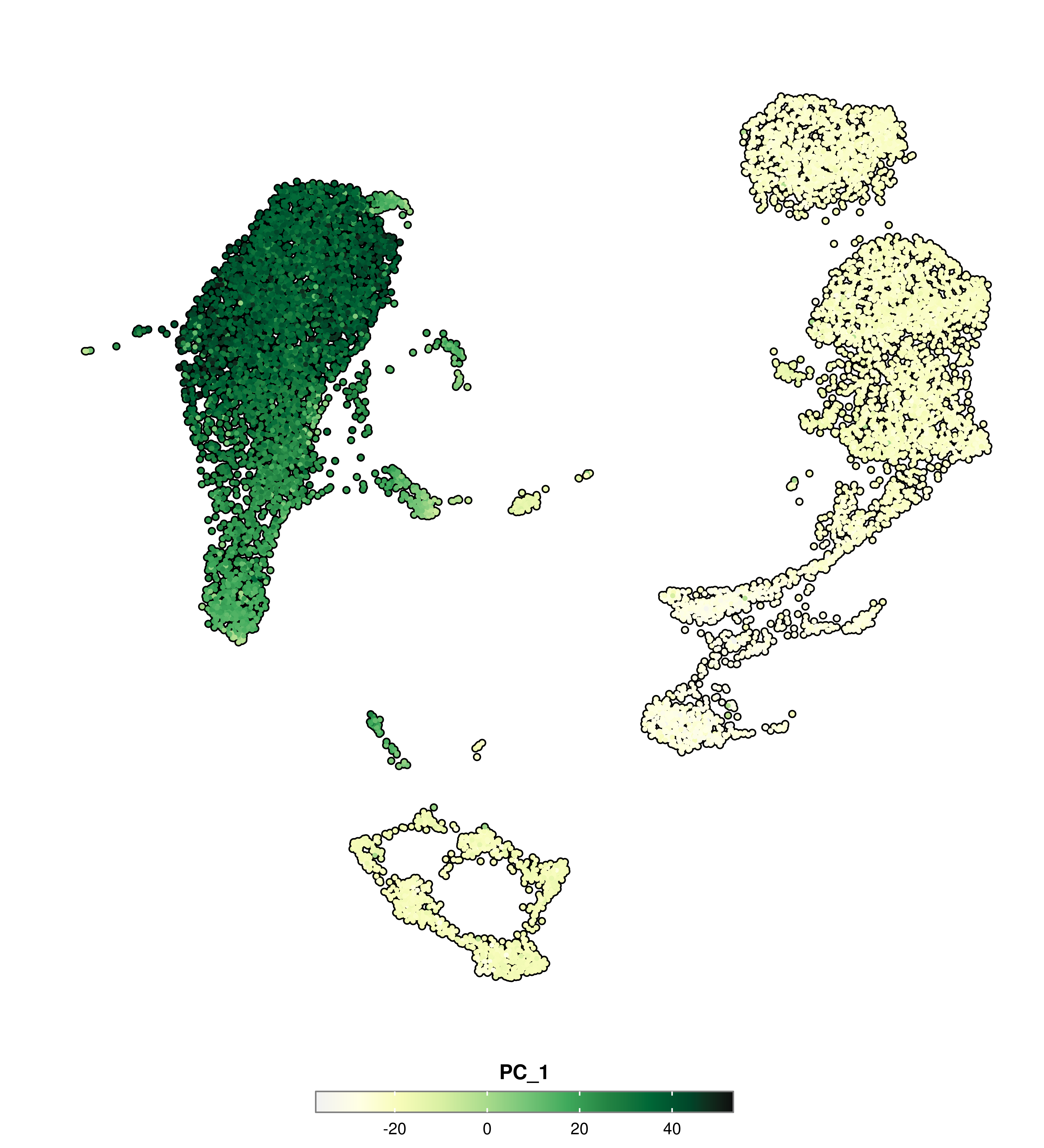
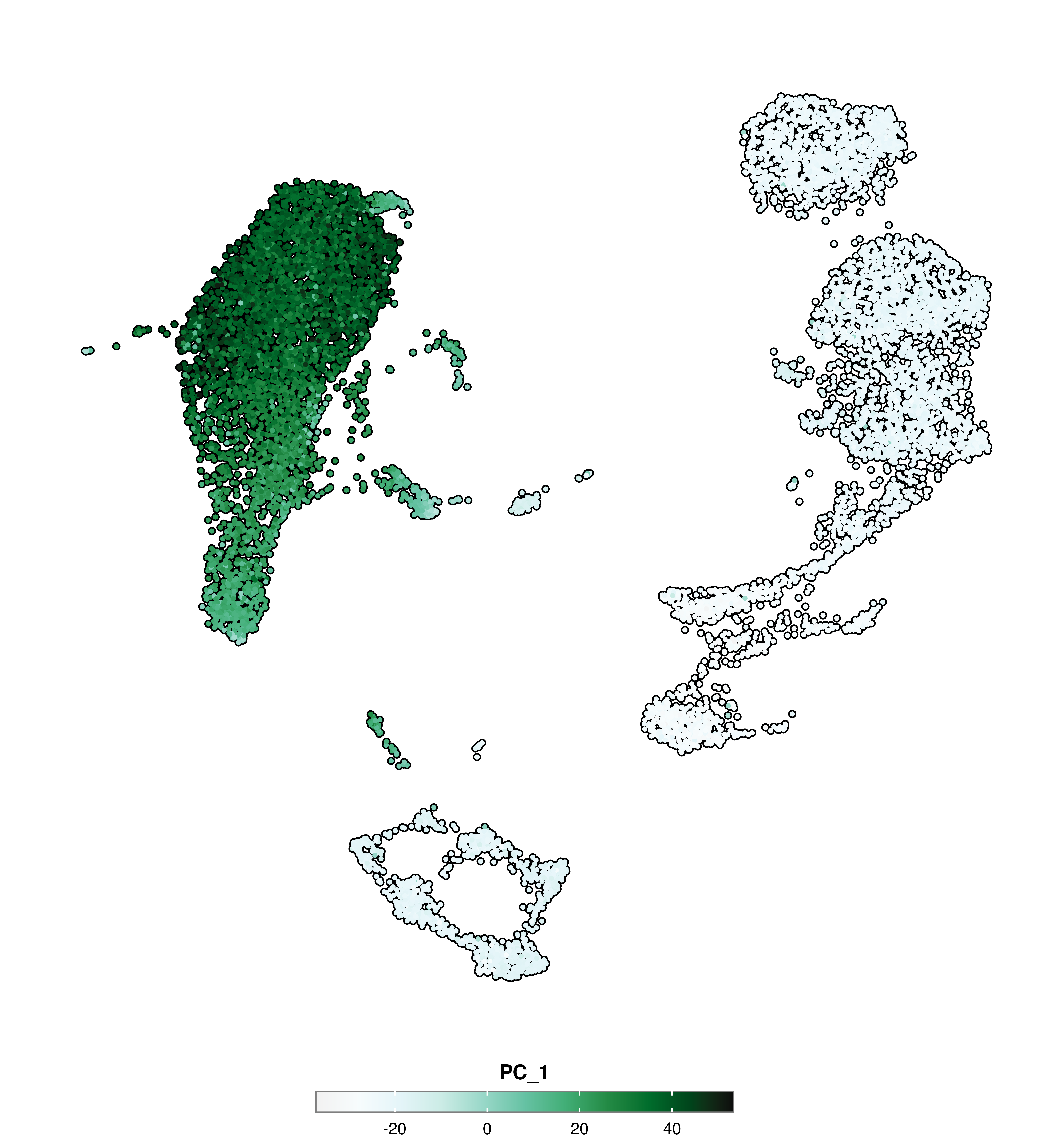
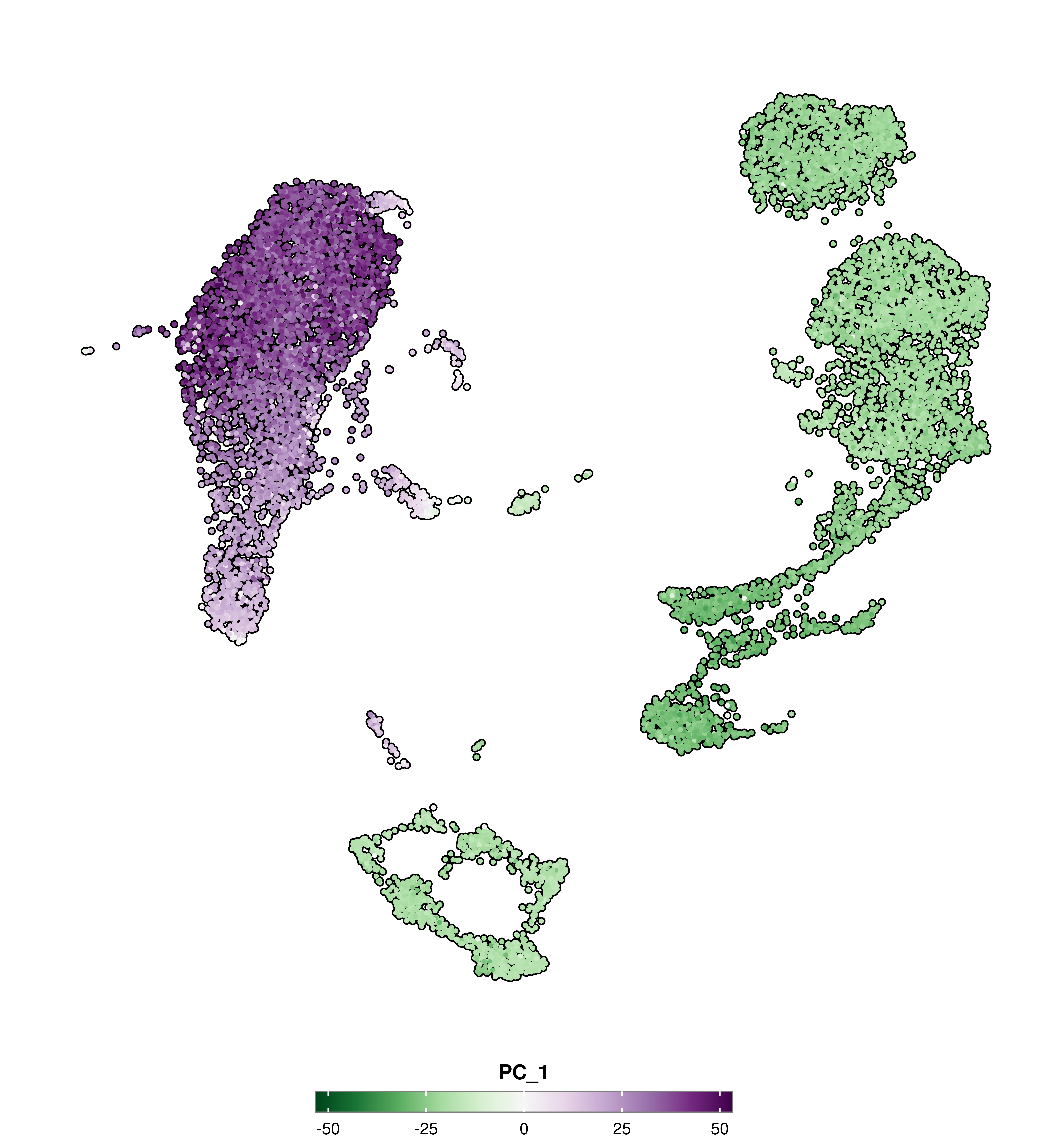
# Purple --> GreenSCpubr::do_FeaturePlot(sample, features ="PC_1", enforce_symmetry =TRUE, diverging.palette ="PRGn")
Code
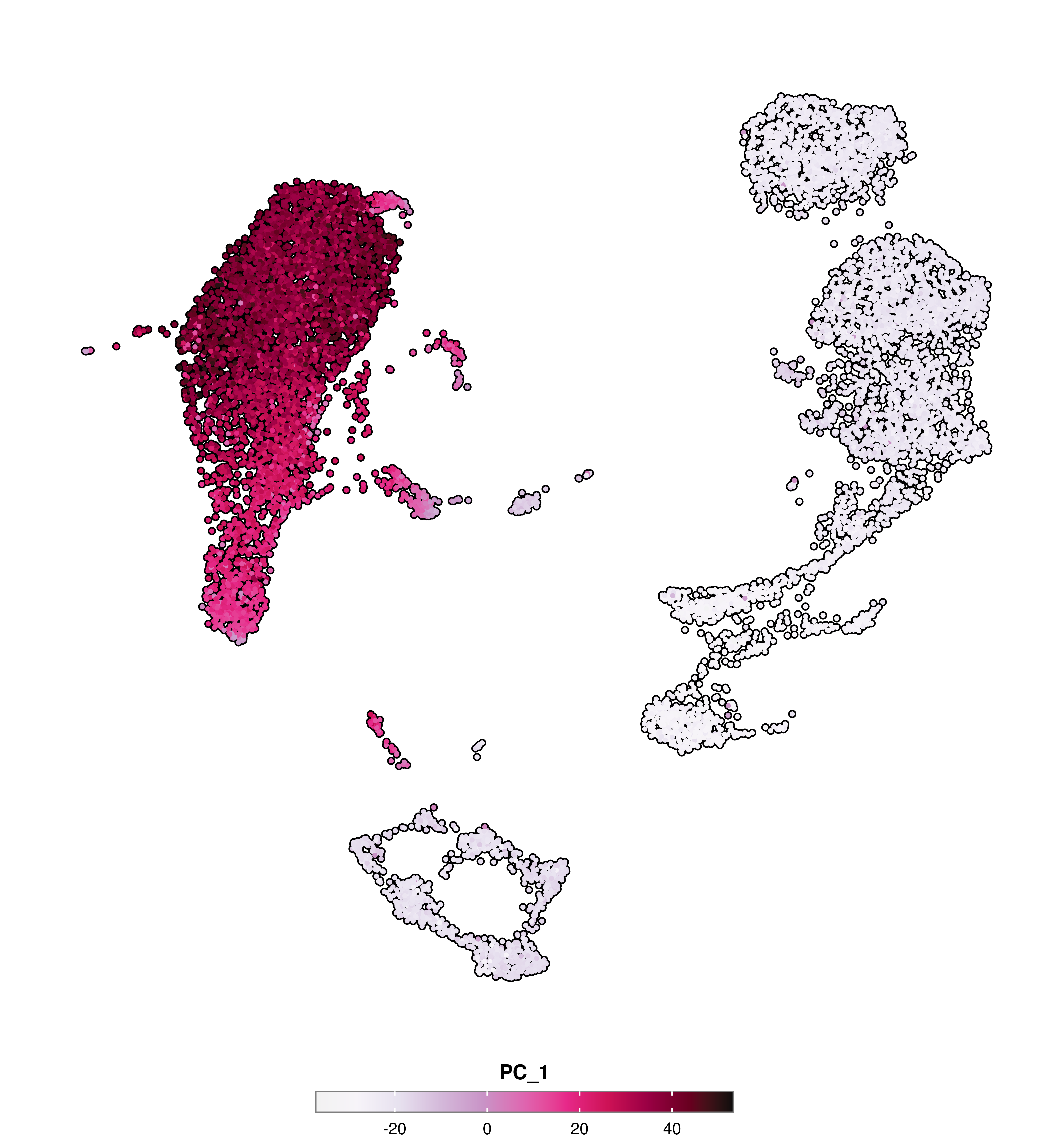
# Pink --> Yellow-GreenSCpubr::do_FeaturePlot(sample, features ="PC_1", enforce_symmetry =TRUE, diverging.palette ="PiYG")
Code
# Brown --> Blue-GreenSCpubr::do_FeaturePlot(sample, features ="PC_1", enforce_symmetry =TRUE, diverging.palette ="BrBG")
Symmetrical plots
Some visualizations have a tendencyto be symmetrical. While this is not always achieved naturally, they greatly benefit from it. One example are volcano plots, where having the 0 in the X axis in the center helps understanding the spatial disposition of the dots in the plot. Some other cases, we might be plotting a continuous variable that has a diverging nature, and we would like to have a diverging color scale used on it and the limits of the scale also being centered around the middle point. for this, we can use the following:
enforce_symmetry: Whether to make the plot symmetrical (TRUE) or not (FALSE). This varies depending on the function. It can make the axes symmetrical between them or make the color scale diverging and the limits centered around the middle value.
p1<-SCpubr::do_FeaturePlot(sample, features ="PC_1", enforce_symmetry =FALSE)p2<-SCpubr::do_FeaturePlot(sample, features ="PC_1", enforce_symmetry =TRUE)p<-p1|p2p
Set limits to continuous variables
Many times, we encounter plots where the color scale is completely driven by a single outlier in the data, therefore rendering the rest of values very difficult to visually compare. To solve this, you can use:
min.cutoff: Minimum value for the color scale.
max.cutoff: Maximum value for the color scale.
This basically performs a transformation of the values outside the defined range, turning them into either the minimum or maximum value designated by the user.
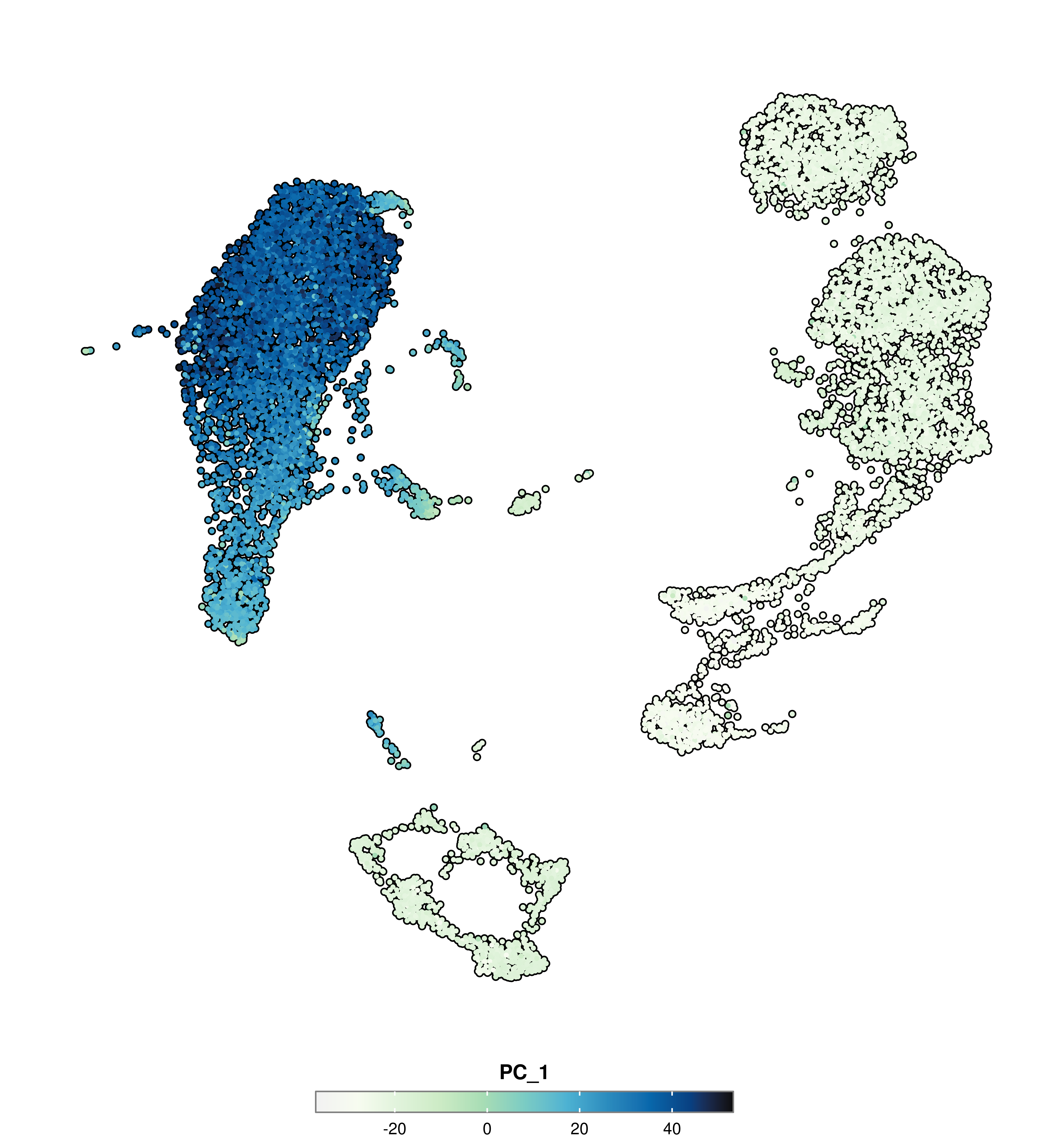
SCpubr::do_FeaturePlot(sample =sample, features ="PC_1", min.cutoff =0)
Code
SCpubr::do_FeaturePlot(sample =sample, features ="PC_1", max.cutoff =0)
Code
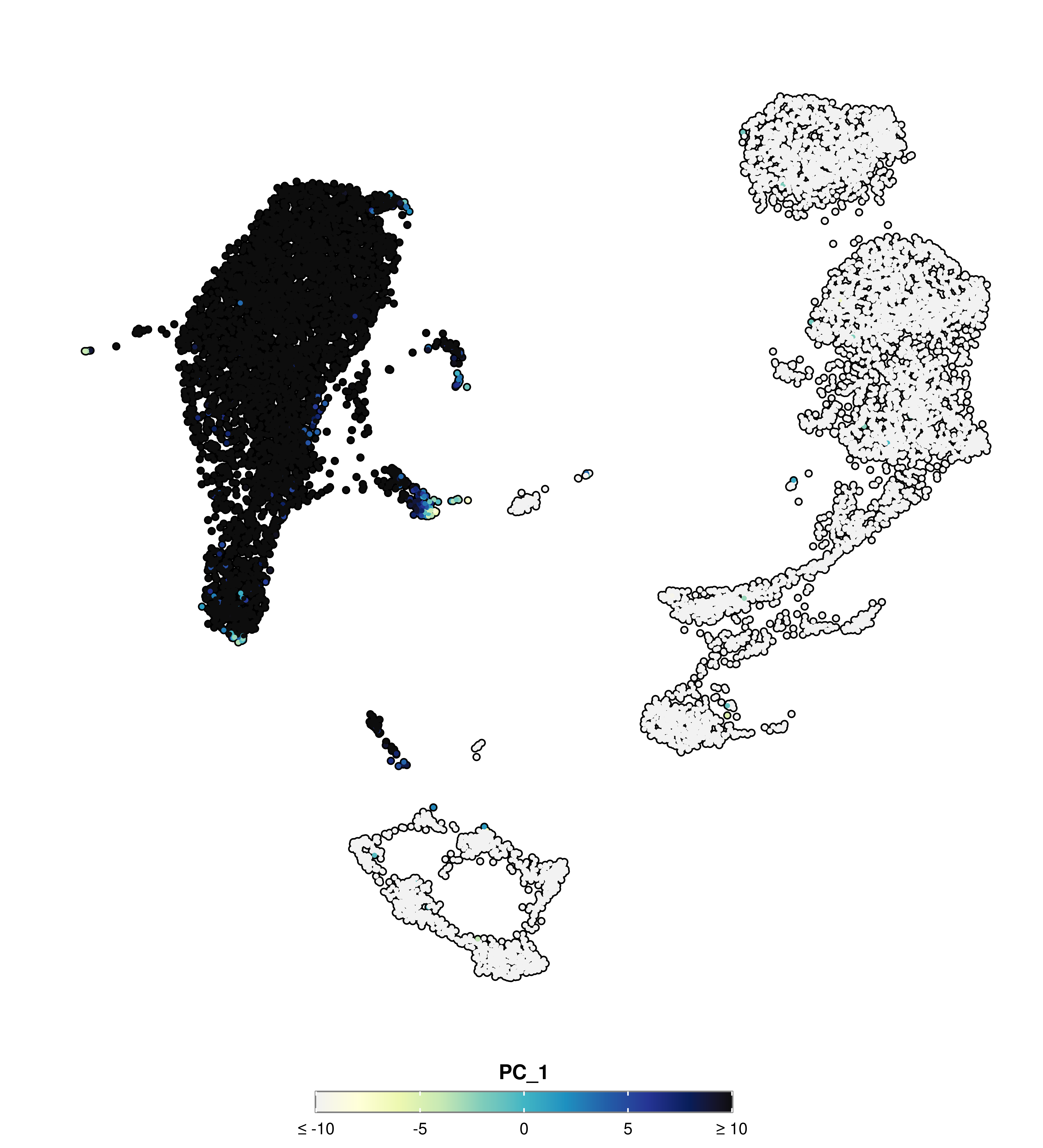
SCpubr::do_FeaturePlot(sample =sample, features ="PC_1", min.cutoff =-10, max.cutoff =10)
Flip the axes
In many cases, it is possible to completely switch the plot axes. Sometimes information can be more easily conveyed by using a X/Y setup rather than Y/X. This can be achieved by:
flip: Whether to swapX and Y axes (TRUE) or not (FALSE).
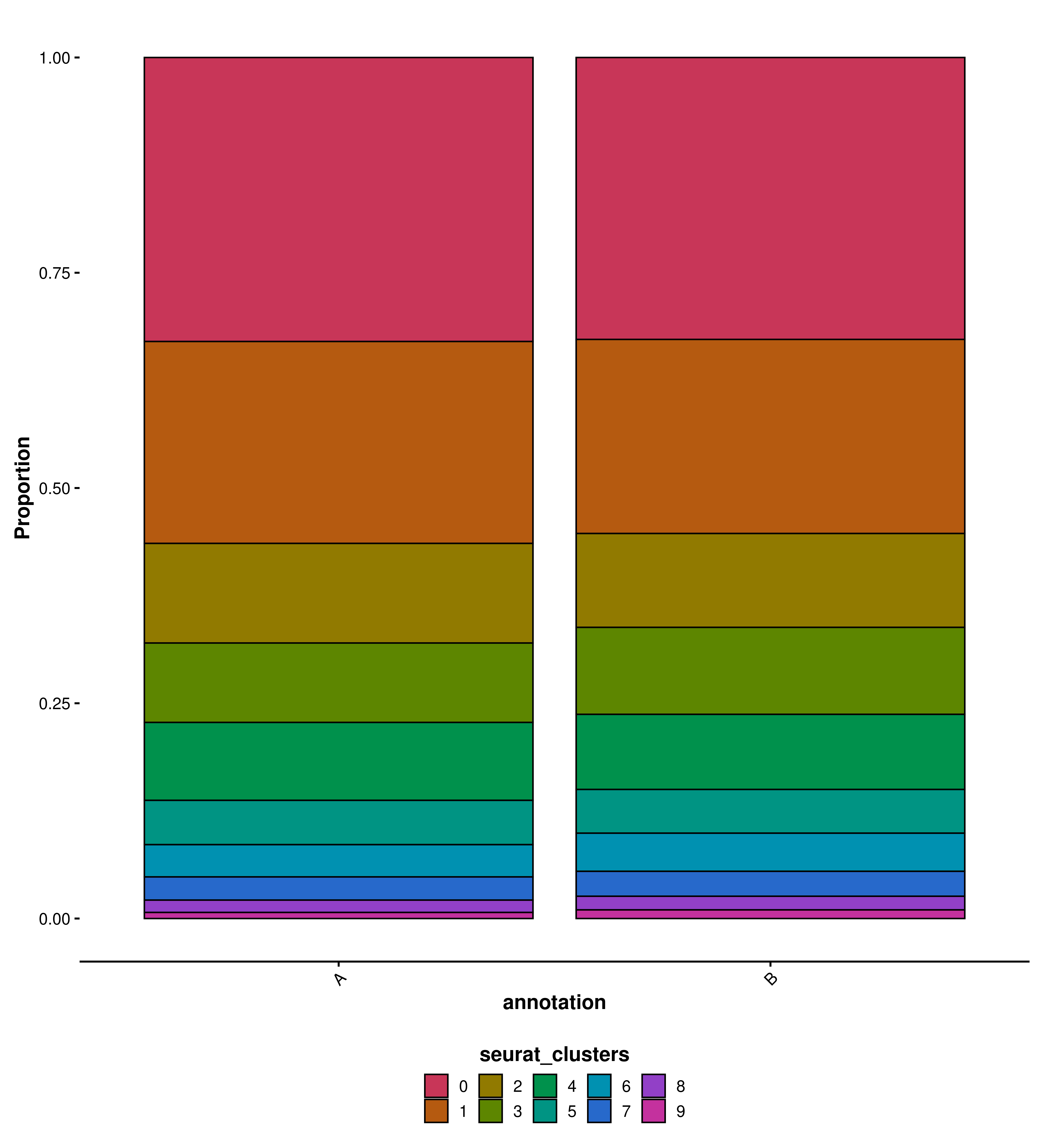
SCpubr::do_BarPlot(sample =sample, group.by ="seurat_clusters", split.by ="annotation", position ="fill", flip =FALSE)
Code
SCpubr::do_BarPlot(sample =sample, group.by ="seurat_clusters", split.by ="annotation", position ="fill", flip =TRUE)
Modify plot titles
When applicable (some functions might restrict the access to these parameters), the different titles of the plot can be modified by using the following parameters:
plot.title: Title of the plot.
plot.subtitle: Subtitle of the plot.
plot.caption: Caption of the plot.
xlab: X axis title.
ylab: Y axis title.
legend.title: Title of the legend.
Code
SCpubr::do_BarPlot(sample =sample, group.by ="seurat_clusters", split.by ="annotation", position ="fill", flip =TRUE, plot.title ="This is a title", plot.subtitle ="This is a subtitle", plot.caption ="This is a caption", xlab ="My X axis title", ylab ="My Y axis title", legend.title ="My custom title")
Control plot aesthetics
Pretty much mirroring the style of ggplot2::theme(), SCpubr offers a wide range of parameters to adjust the way text elements in the plots are displayed:
font.size: Controls the general font size of the plot. Different elements will have higher or lower font size to keep them coherent.
font.type: Controls the type of font used, can be one of: sans, serif, mono.
plot.title.face: Controls the style of the font of the plot title.
plot.subtitle.face: Controls the style of the font of the plot subtitle.
plot.caption.face: Controls the style of the font of the plot caption.
axis.title.face: Controls the style of the font of the axes titles.
axis.text.face: Controls the style of the font of the text displayed in the axes.
legend.title.face: Controls the style of the font of the legend title.
legend.text.face: Controls the style of the font of the text in the legend.
Can be one of: plain, italic, bold or bold.italic.
Code
SCpubr::do_BarPlot(sample =sample, group.by ="seurat_clusters", split.by ="annotation", position ="fill", flip =TRUE, plot.title ="This is a title", plot.subtitle ="This is a subtitle", plot.caption ="This is a caption", xlab ="My X axis title", ylab ="My Y axis title", legend.title ="My custom title", plot.title.face ="italic", plot.subtitle.face ="bold.italic", plot.caption.face ="bold", axis.title.face ="italic", axis.text.face ="plain", legend.title.face ="italic", legend.text.face ="bold.italic", font.type ="mono", font.size =15)
Control legend aesthetics
Apart from the parameters above, one can control other aspects of the legend with:
legend.position: Position of the legend in the plot. Either top, bottom, left, right or none to remove it entirely.
legend.title.position: Position of the title in the legend. Can be one of: top, bottom, right, left.
legend.icon.size: Size of each elements in the legend (for a categoricalvariable).
legend.ncoland legend.nrow: How many rows and columns the legend should have (in categorical variables).
legend.byrow: Whether the legend should be filled by rows (TRUE) or columns (FALSE).
legend.type: Whether to have a normal-looking legend (normal) or a bigger, more spacious colorbar (colorbar).
legend.tickcolor: Controls the color of the ticks in the legend (continuous variables).
legend.framecolor: Controls the color of the border in the legend (continuous variables).
legend.length: Controls the length of the legend (continuous variables).
legend.width: Controls the height of the legend (continuous variables).
legend.framewidth: Controls the width of the border line in the legend (continuous variables).
legend.tickwidth: Controls the width of the ticks in the legend (continuous variables).
number.breaks: Defines the number of breaks in the legend (might slightly vary).
Control grid aesthetics
In some plots, it is also possible to draw the grid lines to help guiding the user across the information displayed on them. The following parameters control the grid aesthetics:
plot.grid: Whether to show the grid (TRUE) or not (FALSE).
grid.color: Color of the grid lines.
grid.type: Type of lines used in the grid. Can be one of: blank, solid, dashed, dotted, dotdash, longdash, twodash.
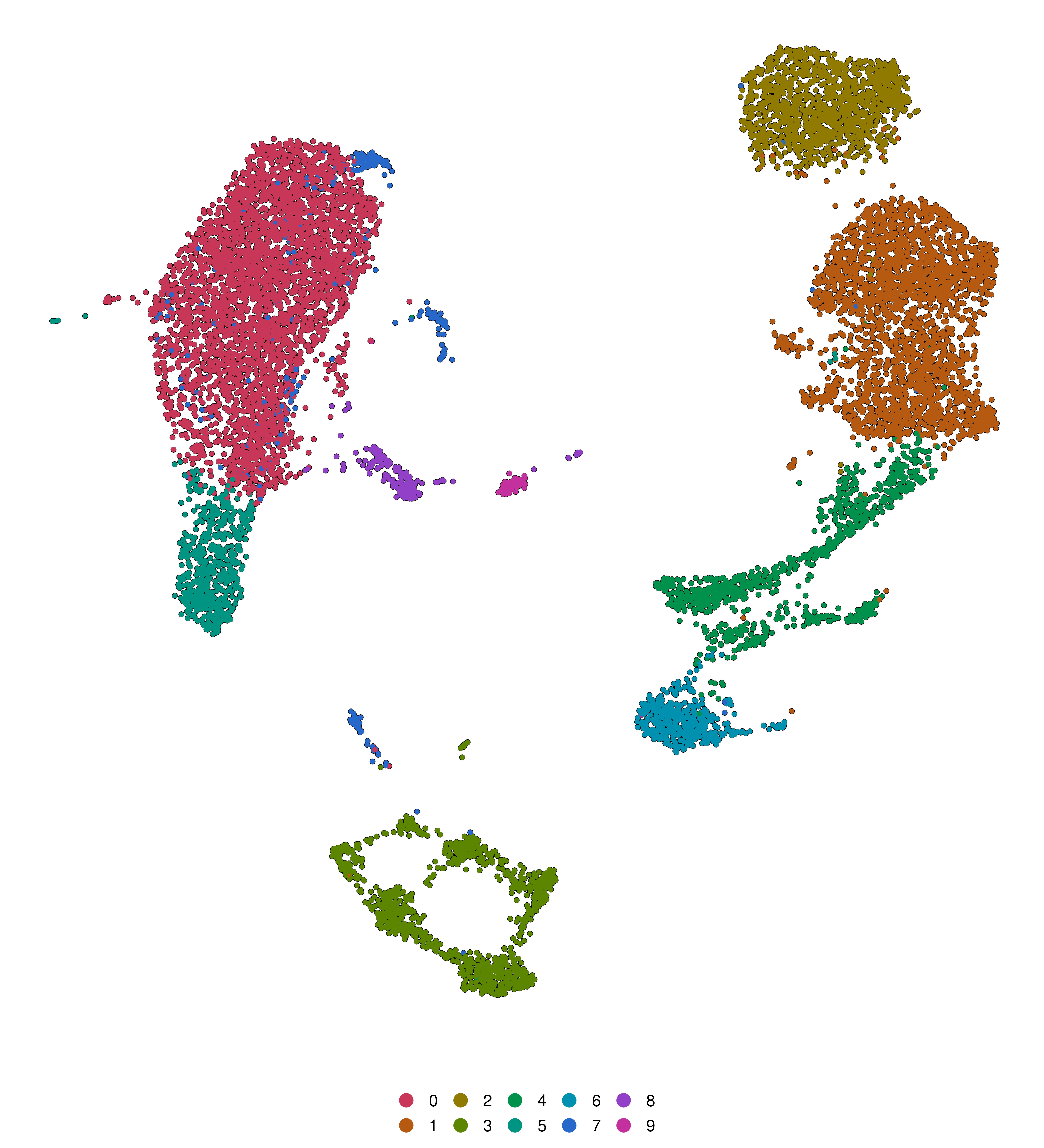
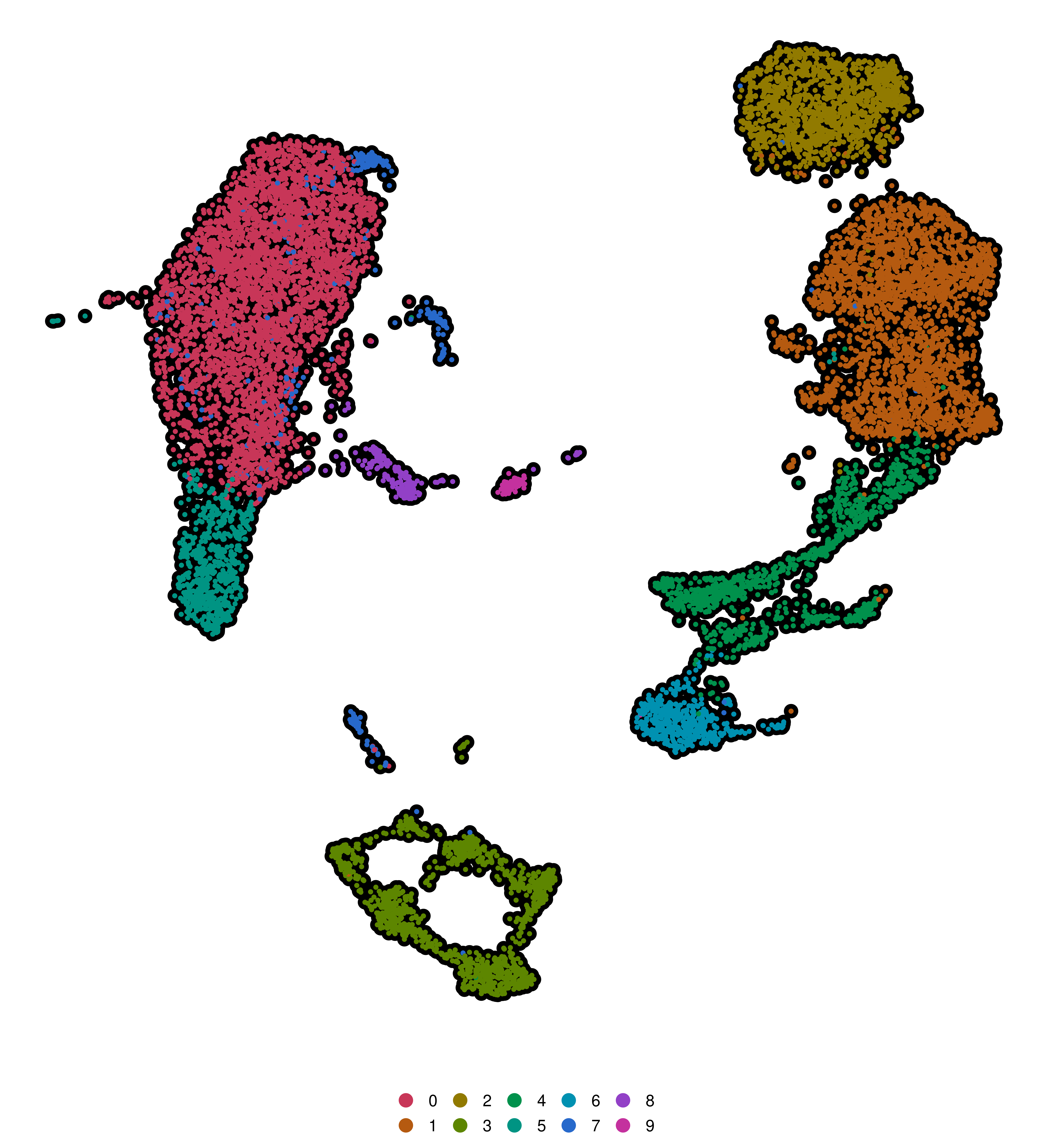
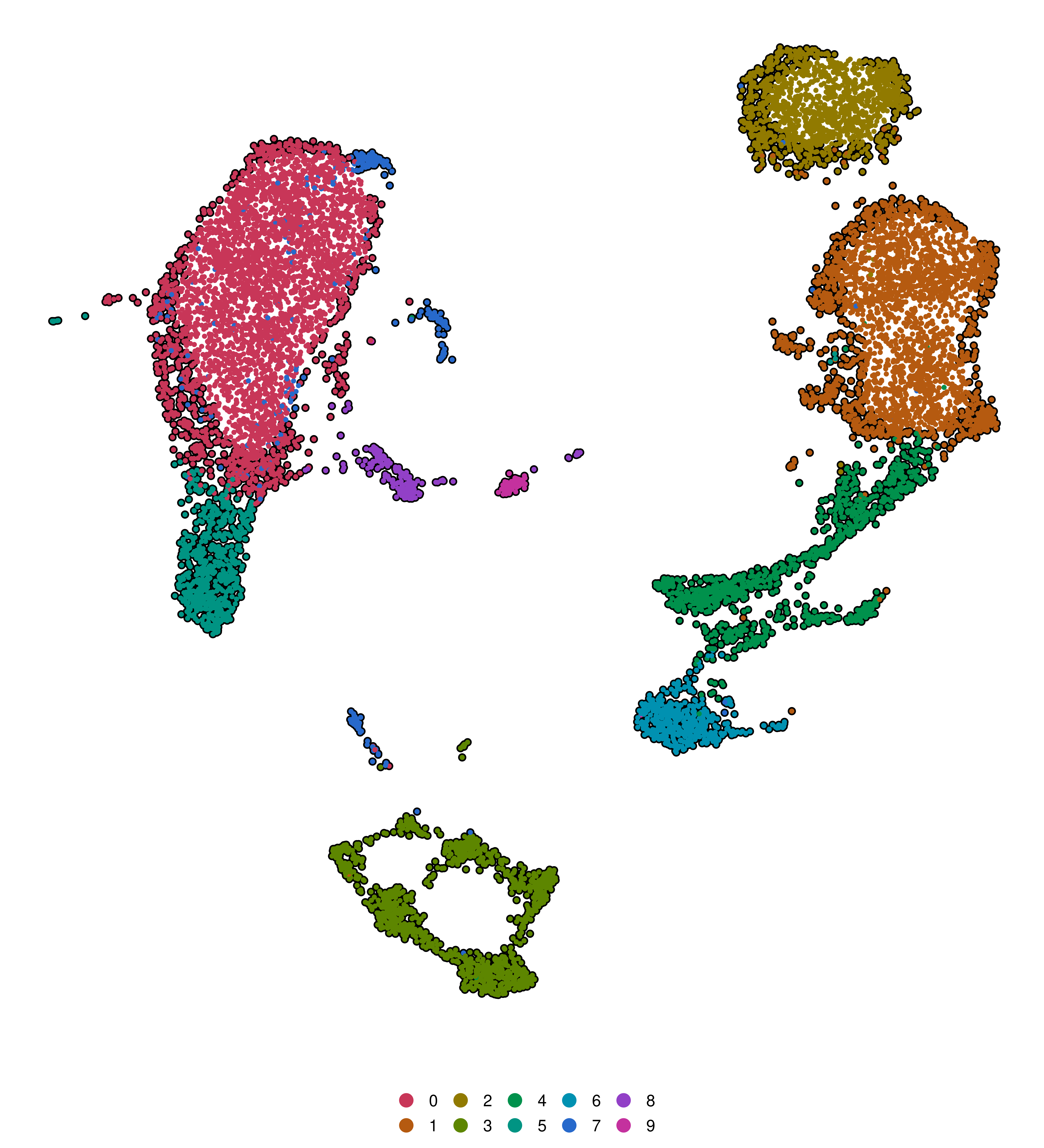
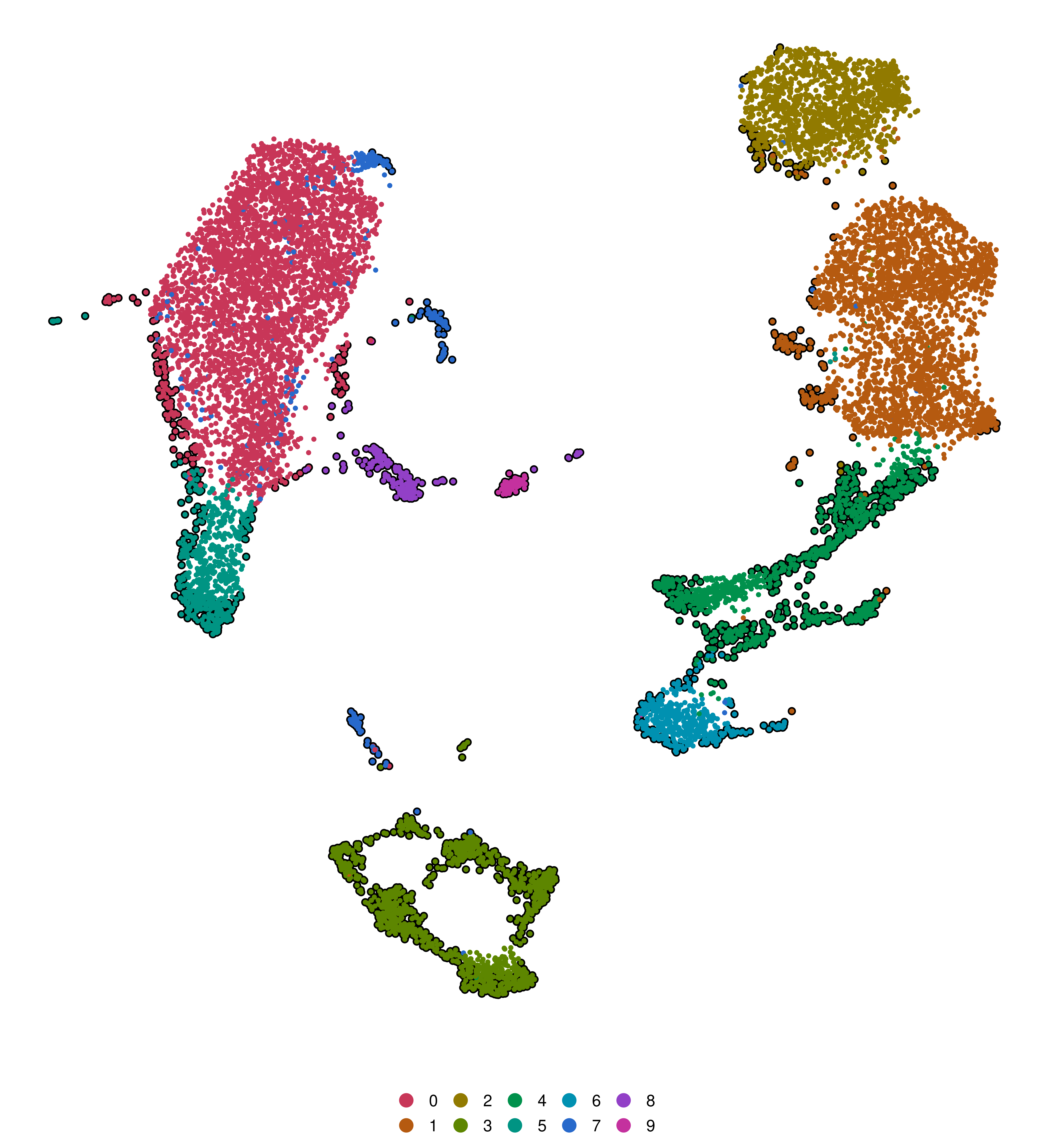
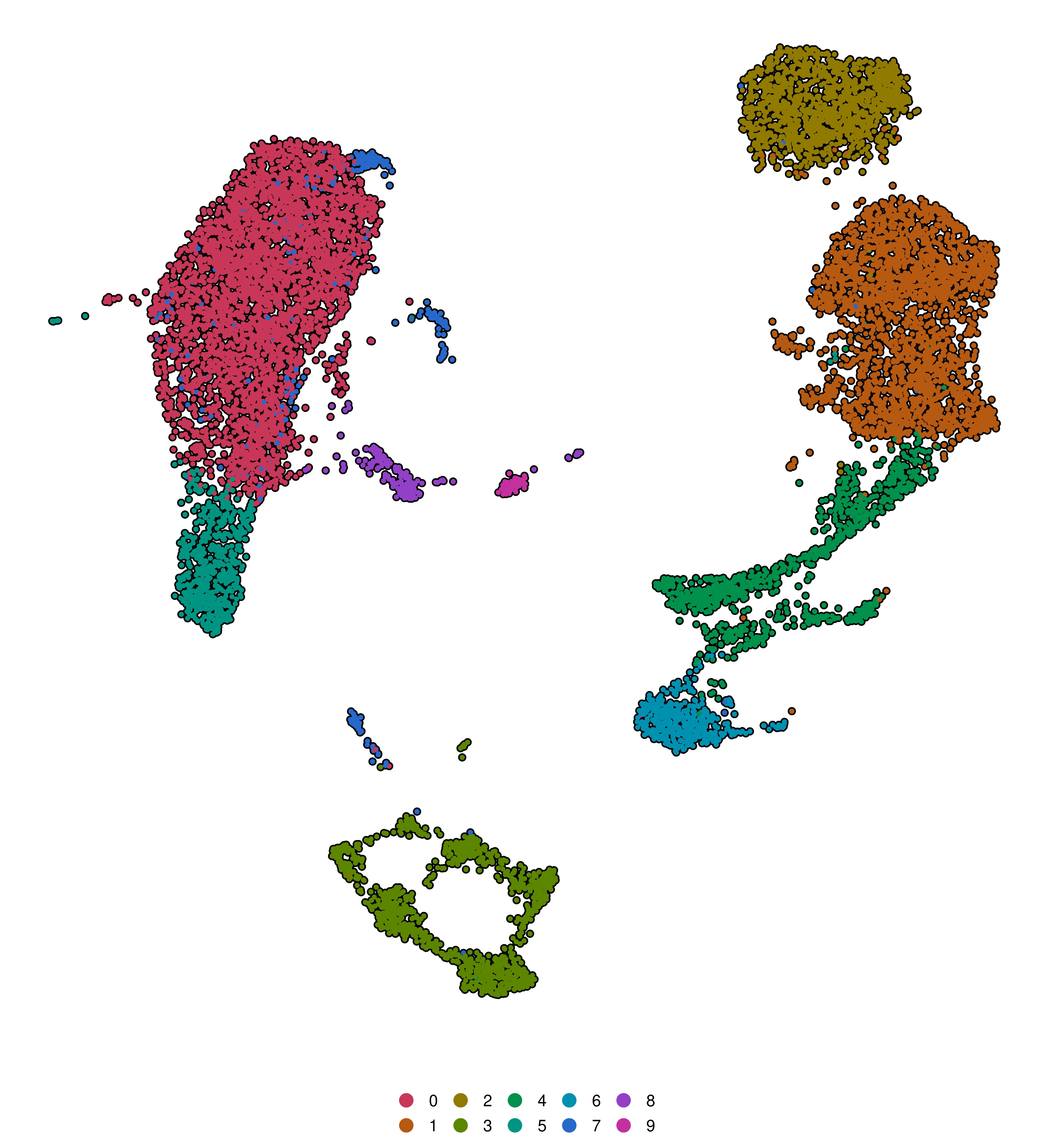
A very nice addition than enhances visibility of any plot where cells are drawn as dots is to add a black border around them. However, just changing the shape to a dot with border results in a very clogged visualization. It is more interesting to add another layer of black cells underneath the real plotting layer, so that only the cells on the edges will be visible, thus forming an outline border.
While this greatly increases the plot size, it is a trade-off one can consider when making a final figure for a publication. This behavior can be accessed via the following parameters:
plot_cell_borders: Whether to plot the cell borders (TRUE) or not (FALSE).
border.size: Size of the dots used for the cell borders.
border.color: Color of the dots used for the cell borders.
border.density: Controls how many cells are used to generate the borders. A value between 0 and 1`. It computes a 2D kernel density of the cells in the dimensional reduction embedding and based on this cells falling below the border.density quantile are excluded. This helps decreasing the added weight to the plot when plot_cell_borders = TRUE, but might result in an uneven border for the cells.
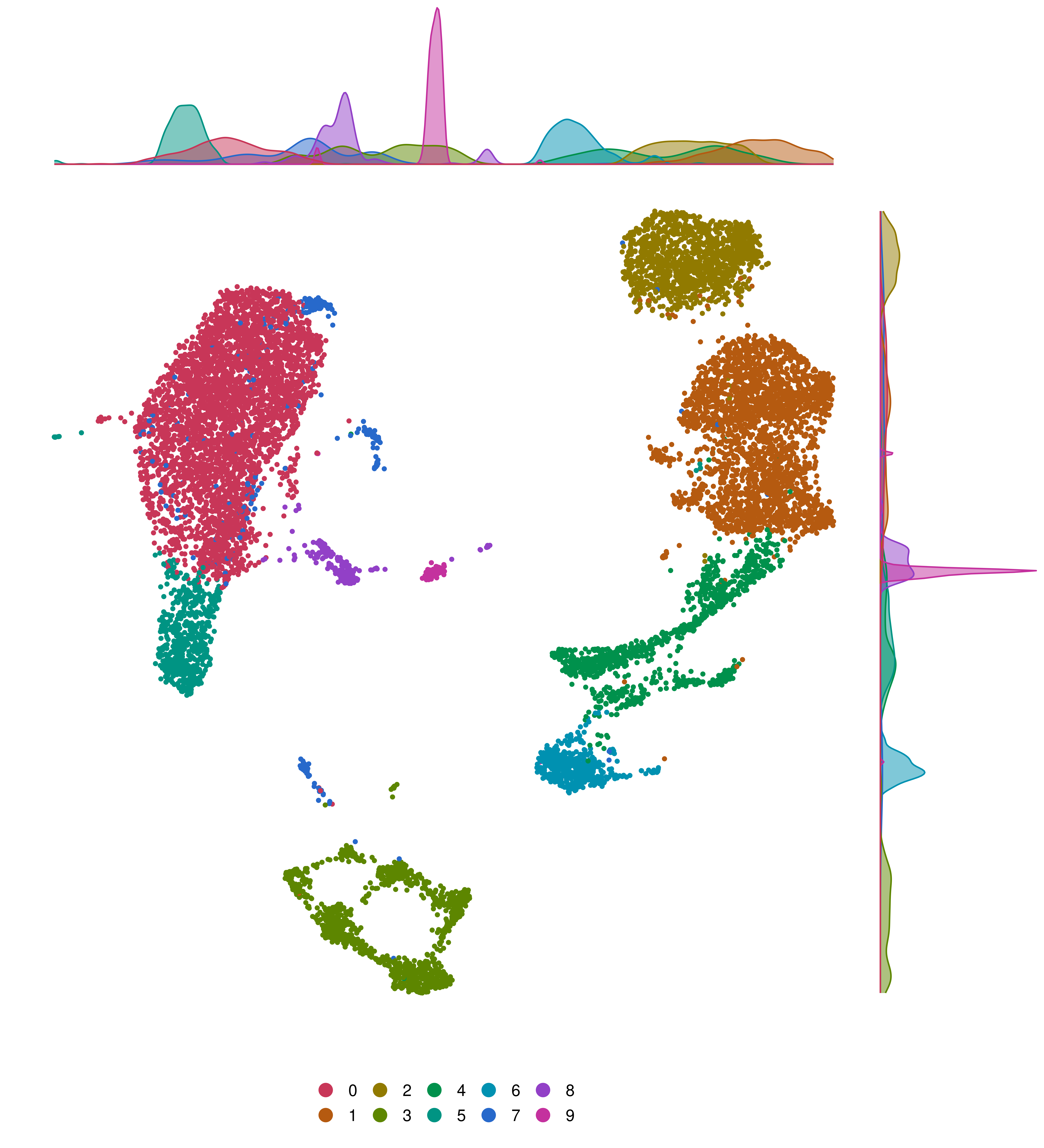
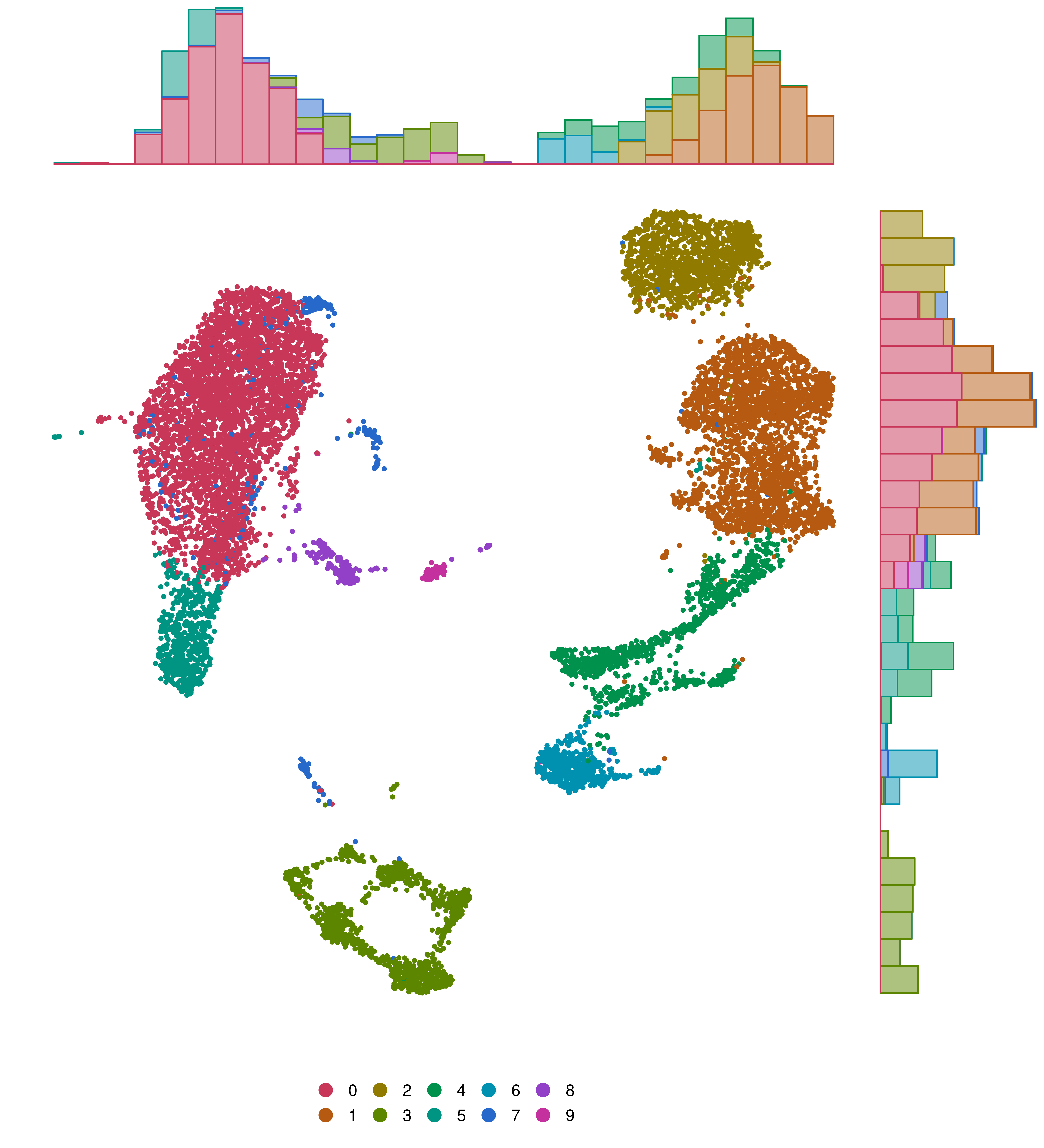
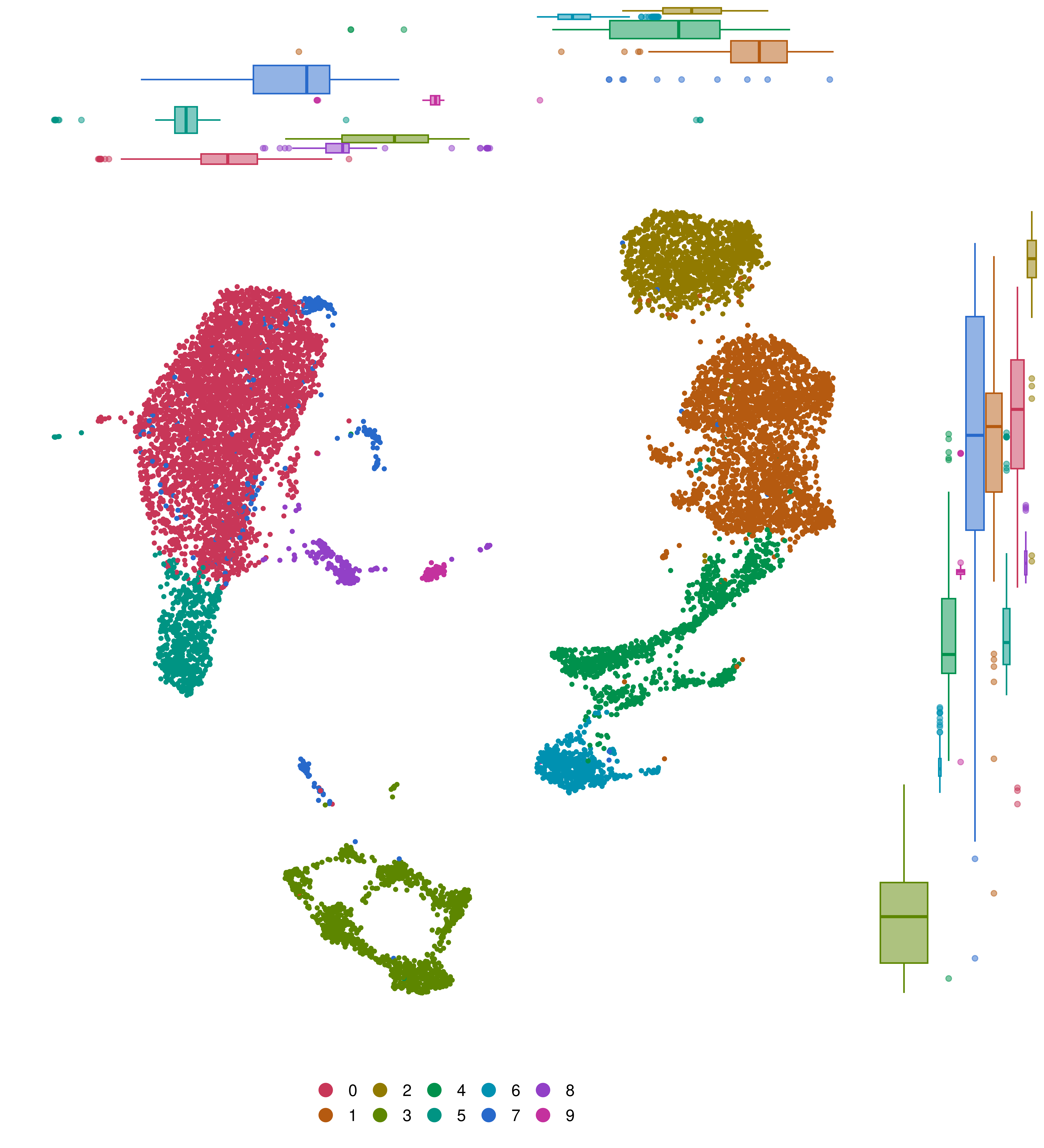
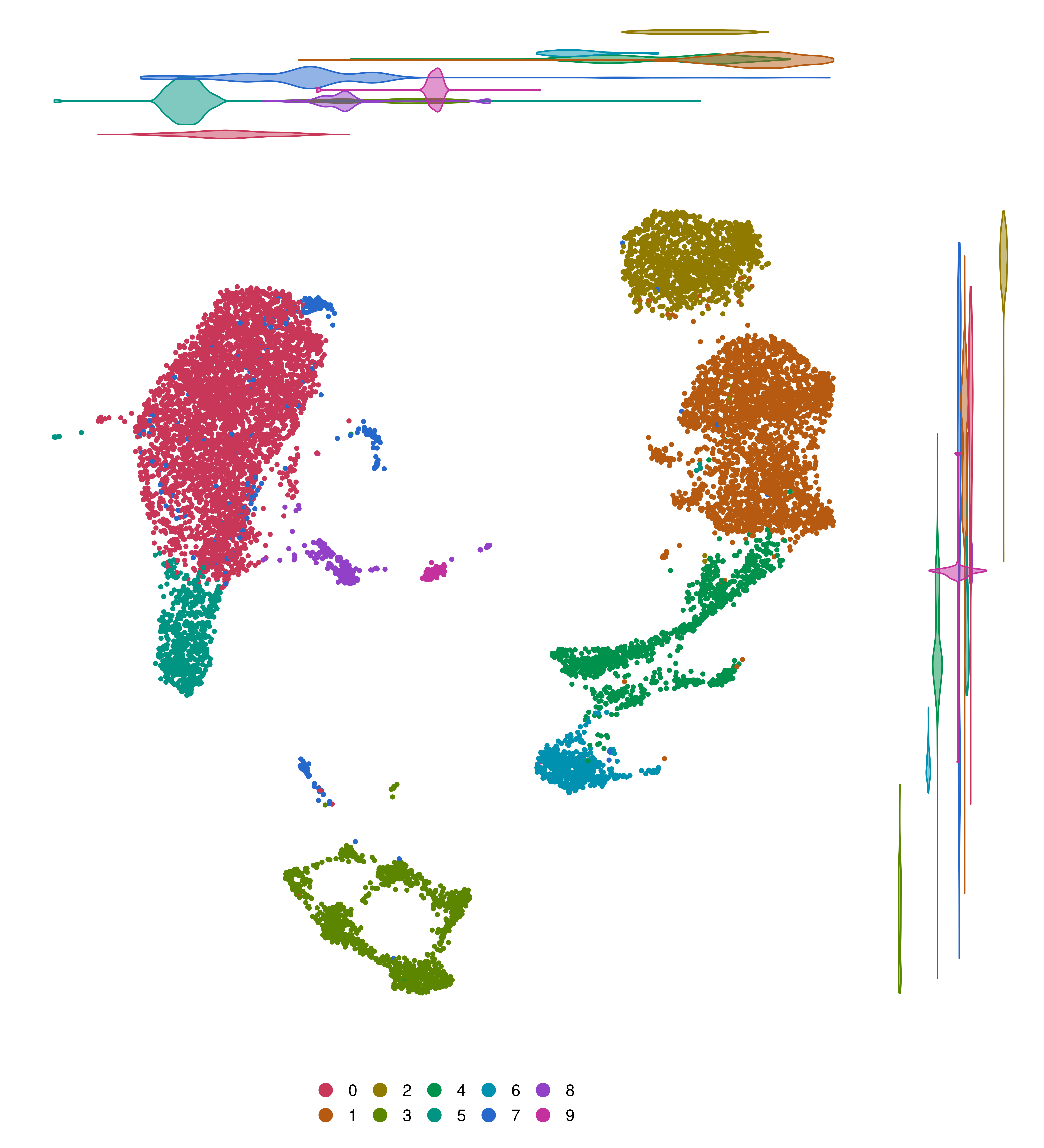
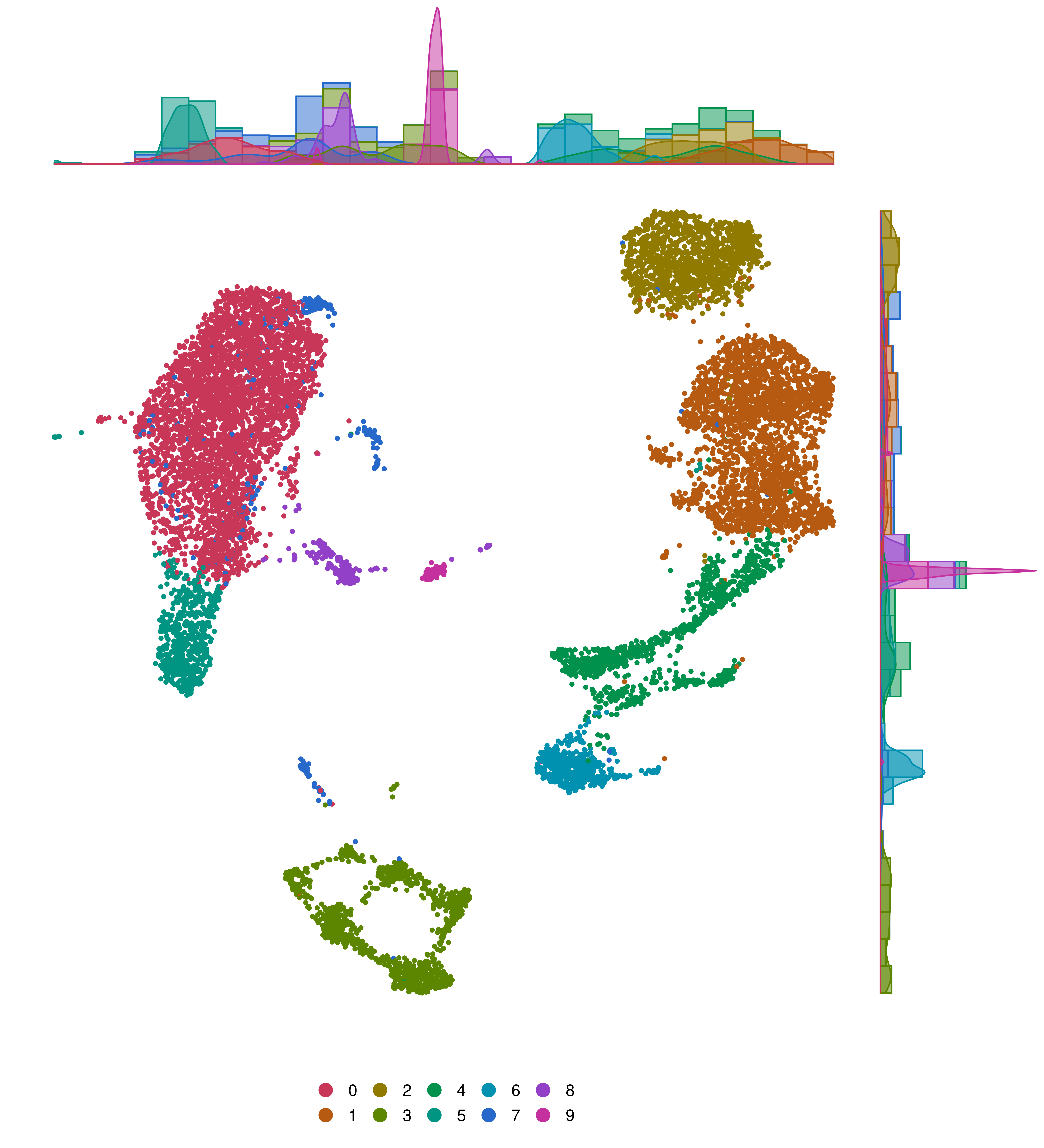
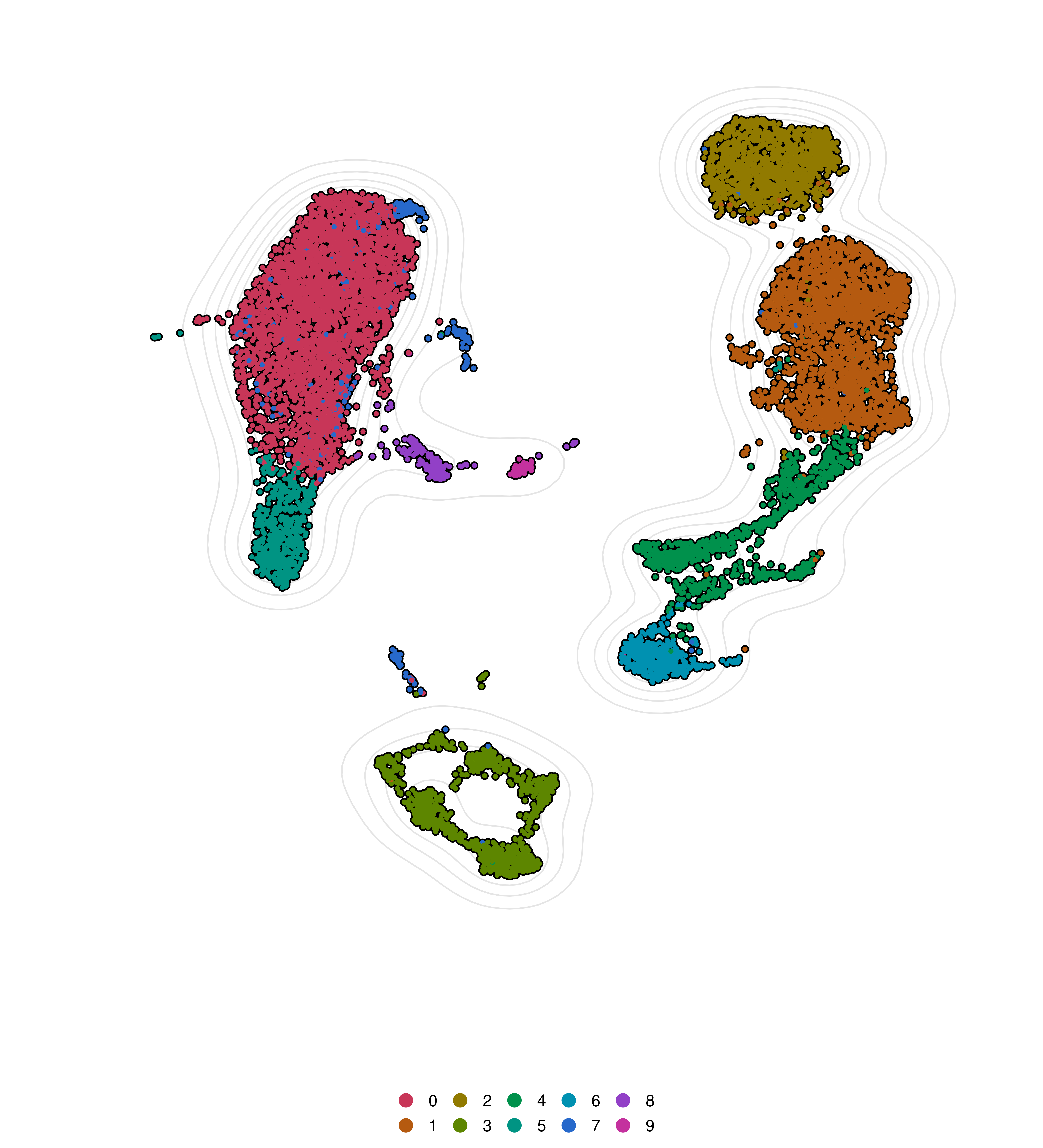
In some cases, it is also possible to plot marginal distributions of the density of the values in a scatter plot across a given axis. This is used by some functions in SCpubr and the functionality can be accessed by:
plot_marginal_distributions: Whether to plotmarginal distributions (TRUE) or not (FALSE).
marginal.type: Type of distribution to plot. Can be one of: density, histogram, boxplot, violin, densigram.
marginal.size: Size ratio between the main and marginal plots.
marginal.group: Whether to split the marginal plot by the current identities (TRUE) or not (FALSE).
There is a catch: marginal distributions cannot be computed alongside split.by or plot_cell_borders or cells.highlight/idents.highlight.
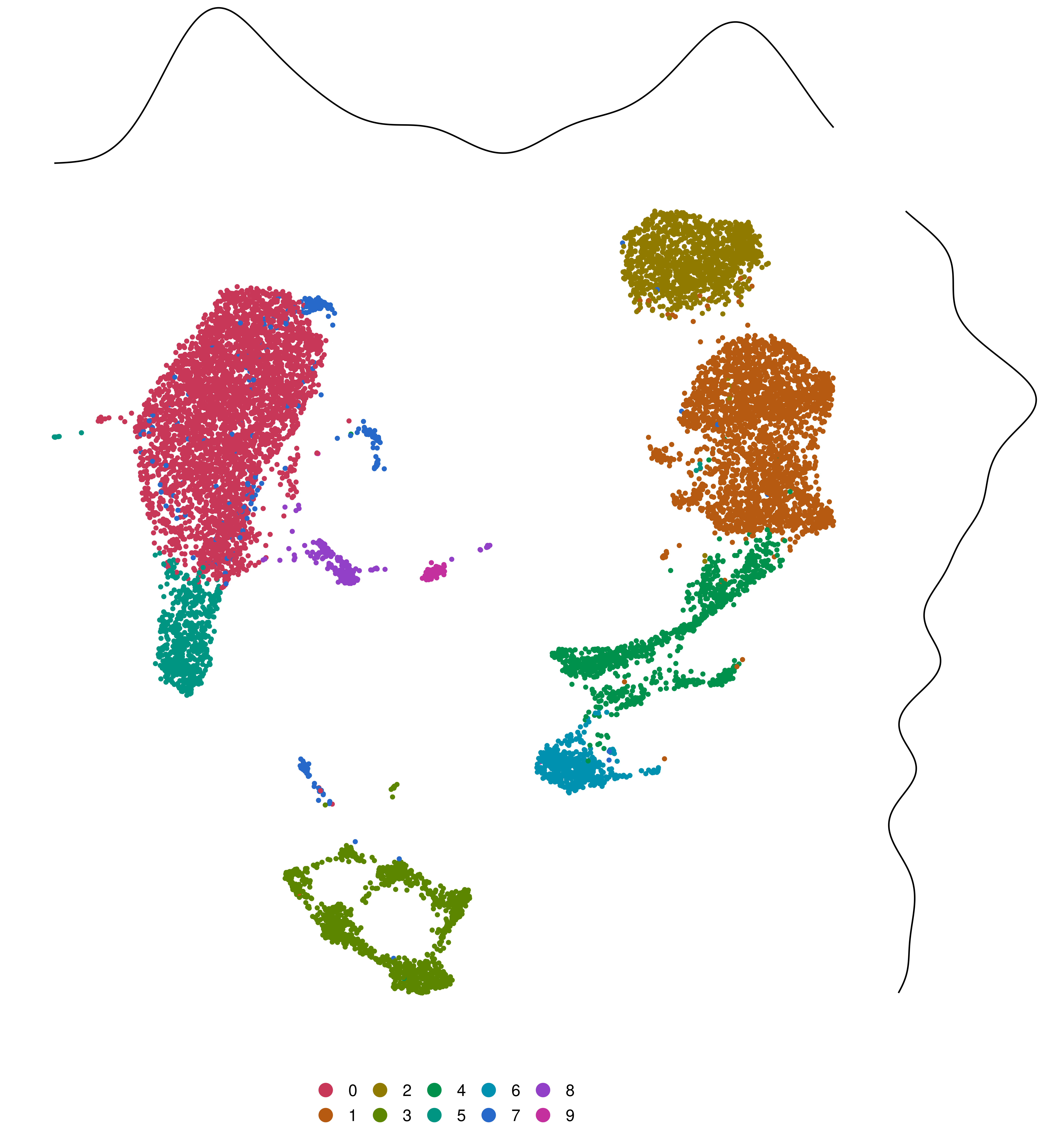
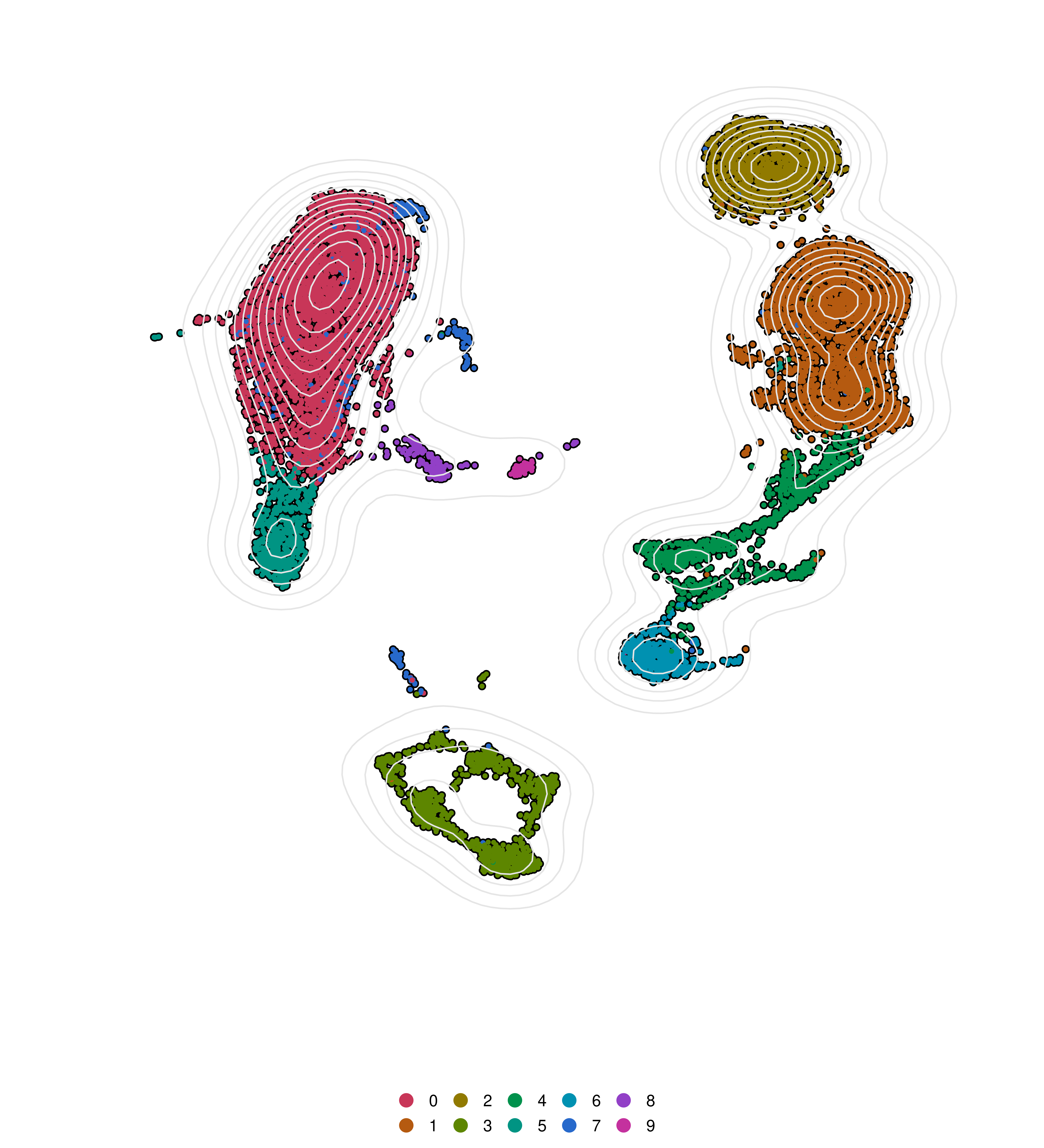
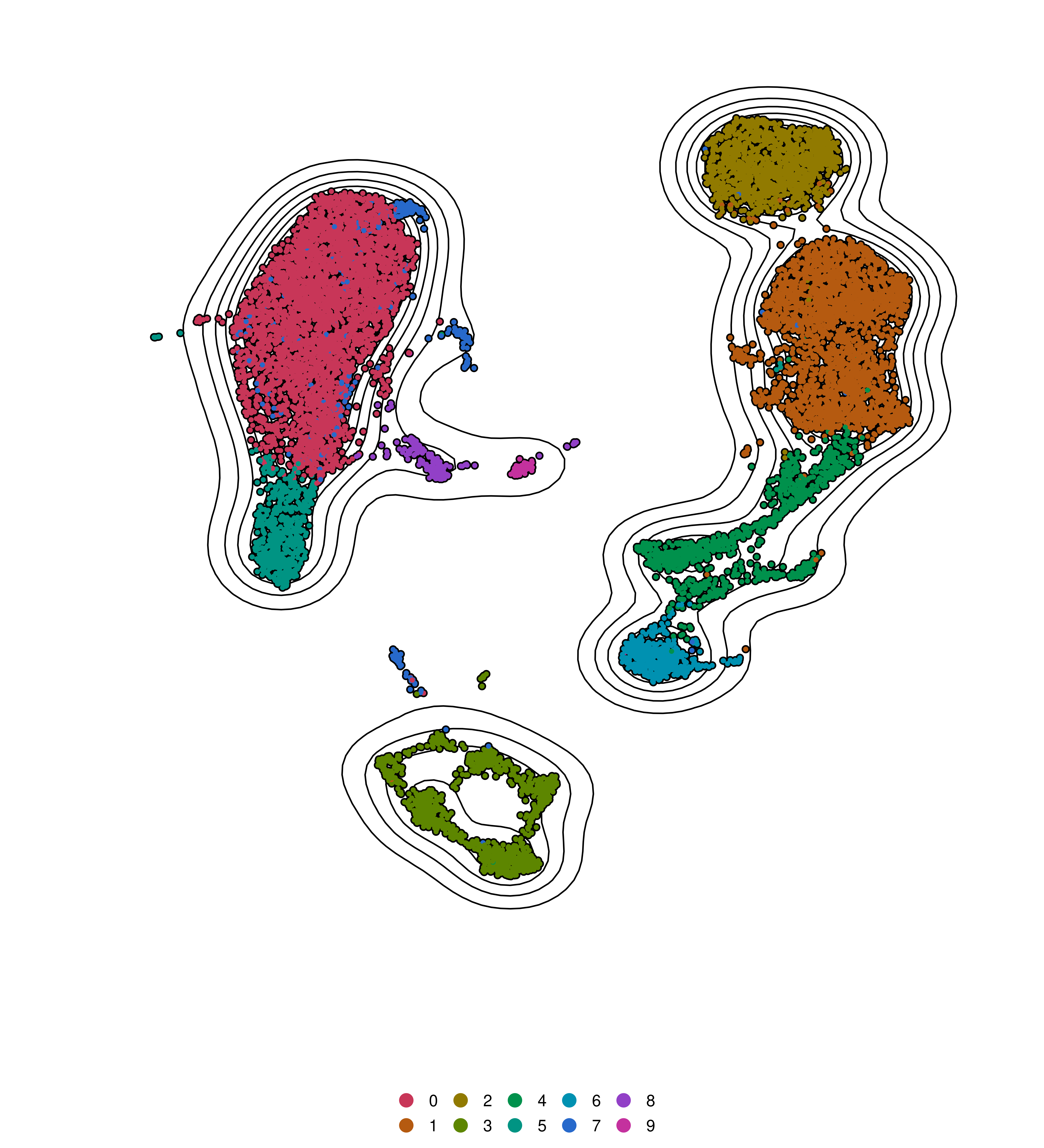
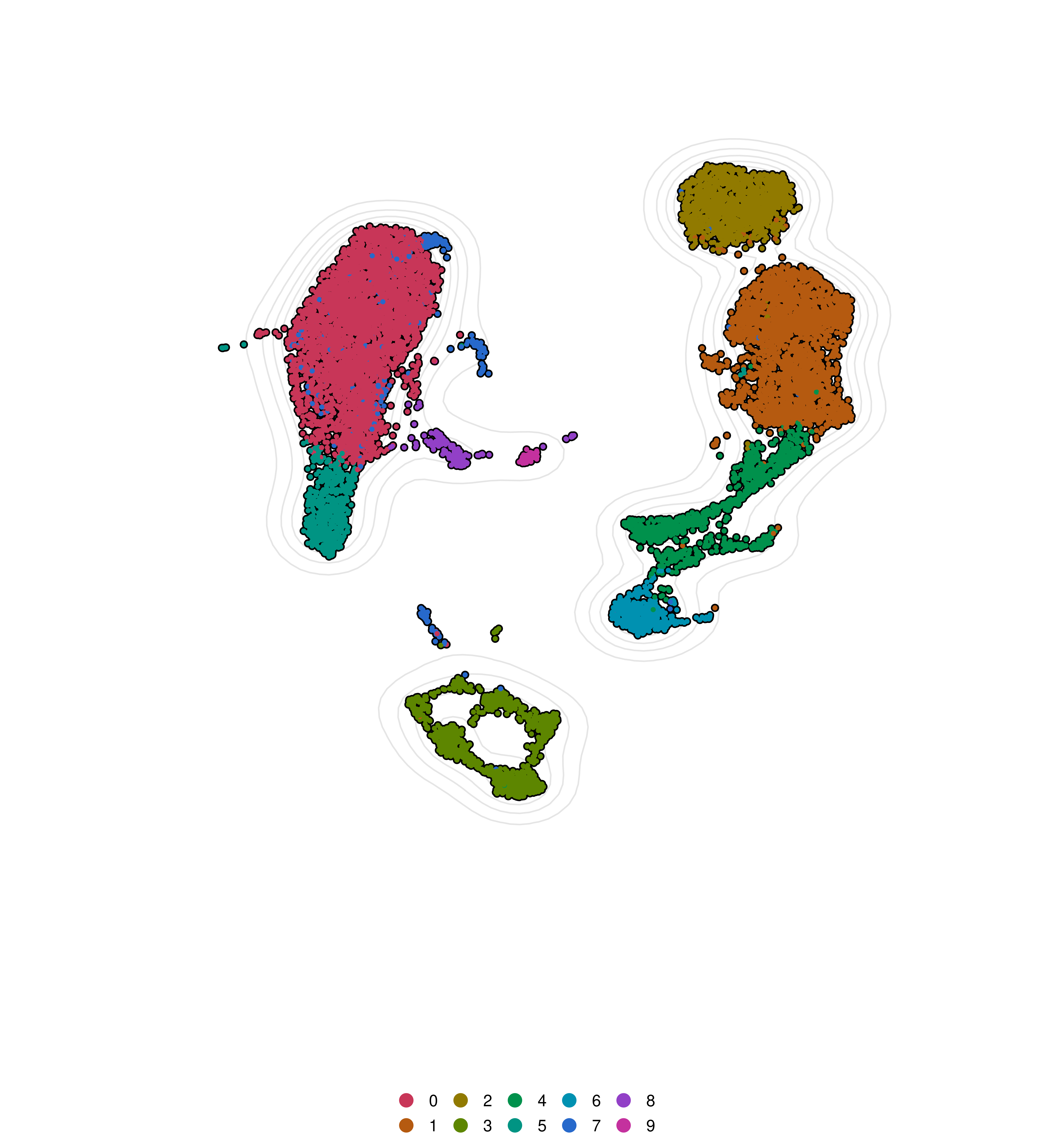
Plot density contours in dimensional reduction visualizations
Strictly pertaining to dimensional reduction visualizations, one can also plot density contour lines in these plots:
plot_density_contour: Whether to plot the densitycontours (TRUE) or not (FALSE).
contour.position: Whether to place the contour layer on top or bottom of the rest of the layers (this will make some of the lines visible or not).
contour.color: Color of the lines that draw the contour.
contour_expand_axes: Whether to increase the limits of the X and Y axes to make the contours fit the plot. This is a number between 0 and 1 and represents how much in proportion the axes should be expanded.